Hello!
Being a total paint geek, I’m always interested to see the color forecasts that come out from the different paint companies. Whether it’s the “Color of the Year”, or a complete set of palettes, I’m in. Sherwin Williams just released their color of the year – Poised Taupe – but they also released a full line of palettes that I’m excited to share with you. There are four palettes that are included in the 2017 Colormix Forecast – Noir, Holistic, Intrepid and Unbounded.
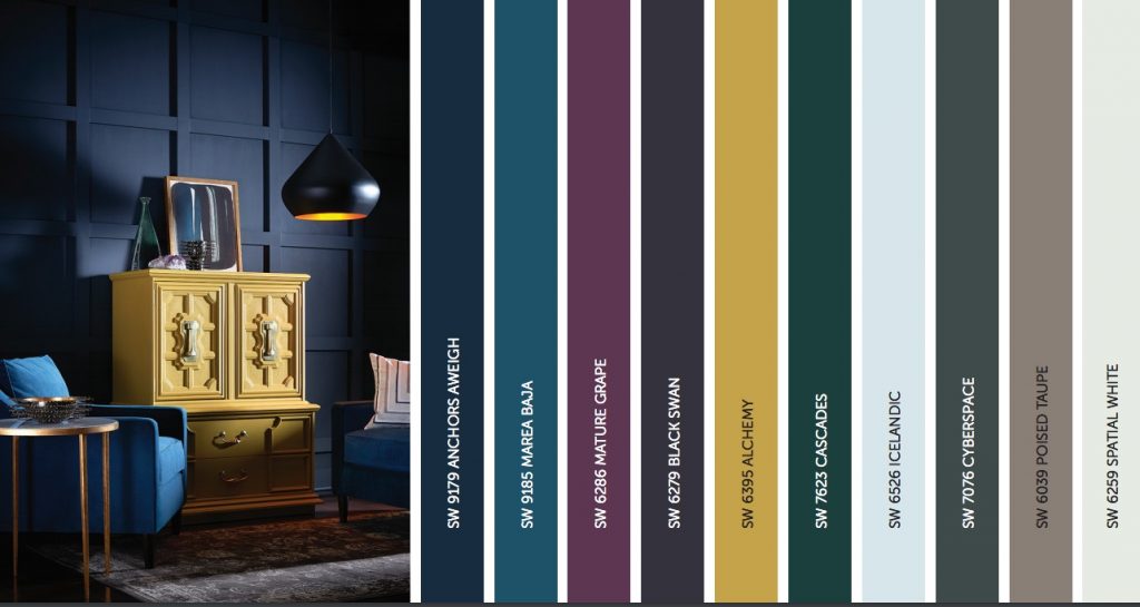
Noir
The Noir palette is full of deep, rich, moody colors, and I’m drawn to many of them right off the bat. You know how much I love a deep indigo blue, and shades of charcoal, and this palette has you covered. You’l also notice that their Color of the Year (Poised Taupe) is included in this palette.
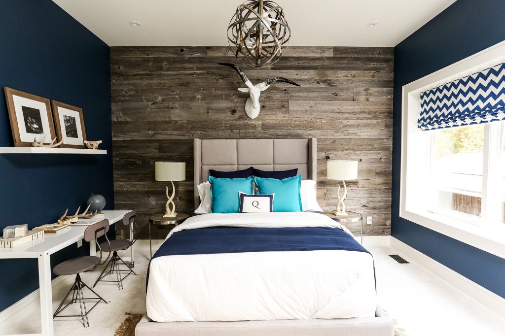
Some of the colors that catch my eye are Anchors Aweigh – love it in this bedroom, paired with the planked wood wall and crisp white accents. The headboard and stools (and the planked wall, actually) look like Poised Taupe and then the white keeps the whole room still feeling fresh and not at all dark.
Cascades looks beautiful with natural woodwork.
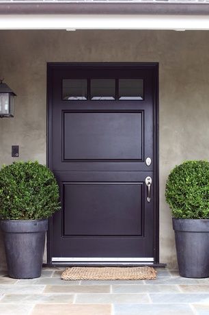
Black Swan makes for a great front door color, and you could incorporate other colors from the palette in the form of a wreath or maybe even a basket full of flowers. I could see one filled with yellow and purple ones to tie it all together, couldn’t you?
Holistic
This is another appealing palette to me – not so much with the colors individually, but how they work together as a whole. I could envision a room done with a mix of these colors together (as in the photo above), and the end result is fresh and modern, don’t you think?
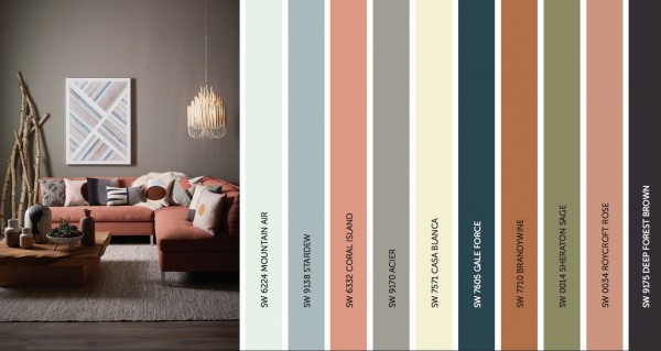
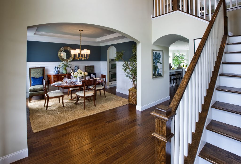
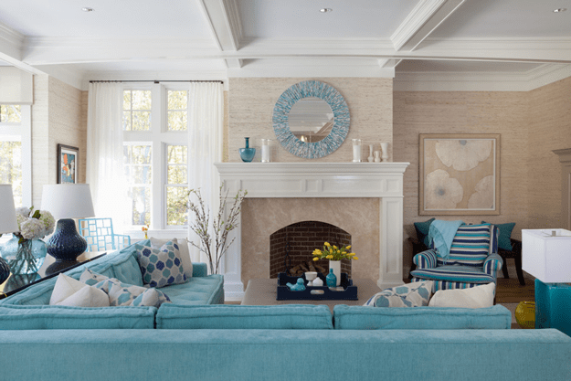
You know me and navy, I’m drawn to it like a moth to a flame. Can you blame me? Look at Gale Force. If you look closely, there are other colors brought in that are taken from this palette. The chairs bring in a shade of green, like Sheraton Sage, the crisp white wainscoting brings in Mountain Air, and the flooring keys off of Deep Forest Brown. Beautiful!
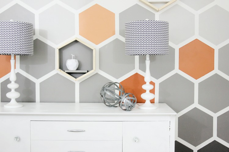
This amazing hexagon wall from Thistlewood Farms incorporates Acier as one of the medium grays, along with some of the corals from the Holistic Palette.
Intrepid
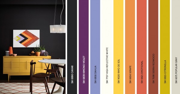
The Intrepid palette is filled with more vivid hues than the other palettes, but again, I love how they are pulled together in the photo above. If I were to incorporate these colors into a room, this is probably how I would approach it, as some of the colors could be overpowering as a wall color, and are better suited as accent colors.
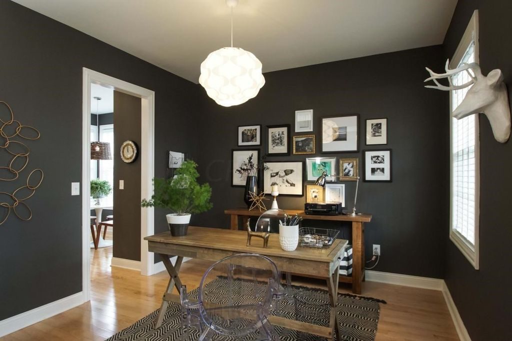
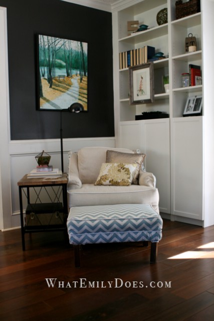
Caviar serves as a rich and dramatic backdrop for the punches of color in this palette. But it can also be used with some of the muted colors in this palette to create more of a tone-on-tone look. I love it in this office – the Caviar color allows the white/beige accents to pop.
If you lean towards neutrals, Popular Gray is a beauty. A great backdrop to any color you choose. You could bring in some of the Kimono Violet in the way of flowers or throw pillows. Or the shades of orange in large piece of artwork. Lots of opportunities to bring in color against these neutrals.
Unbounded
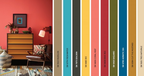
The Unbounded palette has a bold, worldly vibe to it, and makes me think of a Moroccan market, full of colorful rugs, baskets, throws and even spices. This palette is not for the faint of heart, but it can also be used in more subtle, muted ways.
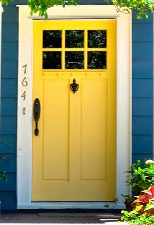
But look how fun a color like Adriatic Sea is when paired with a bright yellow like Bee. There is just something about a blue house with a yellow door that I just love.
Sealskin is another great color that provides a great backdrop for brighter accent colors.
If you want to use colors like Freshwater, you can do it with paint or through furniture and accessories.
So what do you think of the 2017 color trends? Can you envision using any of them in your home? I’m really drawn to the charcoals and blacks in these palettes and am tempted to give my powder room a(nother) repaint!
Jenny

4 Comments
Shelley @ Calypso in the Country
September 7, 2016 at 5:15 pmAlways fun to look at paint forecasts. I am a big fan of navy as well and have actually considered painting my existing red dining room a navy. I just have to decide if I want it to stay dark in there or if I want to choose a light color this time. Decisions, decisions…
Shelley
Jenny
September 7, 2016 at 9:08 pmYou know I love navy too – maybe add some wainscoting or molding to keep it from being to dark. I love that look!
Alicia
February 9, 2019 at 12:15 amHi! I am searching hard for a wall color, I realize this picture is a couple of years old, but do you have any idea what the main entry way wall color is in the pic showing the Holistic palette with the Gale Force dining room? The light one?? Thank you so much if you know!
Jenny
February 9, 2019 at 11:28 amI don’t know what color that is Alicia – it doesn’t look like it is part of the color palette they featured. Sorry!