Hello!
I know that I’m not the only one with Spring on my mind, which is why it seems fitting to choose green as the next installment in my Color Case Study series. If you missed the first installment, click here for Shades of Gray.
I’m so anxious for the outside world to come back to life again, which is why Spring is fast becoming my favorite season. We were in Florida for a long weekend for my birthday, and seeing green grass, leaves on the trees and flowers in bloom, really did wonders for my winter psyche.
I’m drawn to green hues that are both soft and soothing, but also bright, bold and happy. Long gone are the forest greens that I know many of us were drawn to back in the 90’s (myself included). Forest green and burgundy, remember that dynamic duo?
Here is a beautiful green that I love every time I see it – Sea Salt by Sherwin Williams. Such a soft and soothing green – I used it in my kids’ Jack and Jill bathroom.
Same room, different angle.
Another beautiful green is Restoration Hardware’s Silver Sage. Oh, how I never tire of this gorgeous color! (Hint: If you don’t have a Restoration Hardware nearby, Benjamin Moore’s Gray Wisp is almost a perfect match!)
It’s a great neutral, and changes beautifully with the light.
This color is a contender for our master bathroom, once I am up to the challenge of taking down the wallpaper, that is…
One more photo, and I’ll move on, I promise.
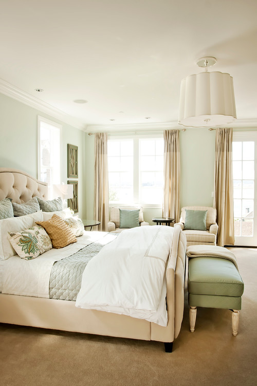
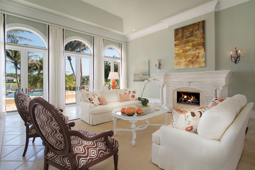
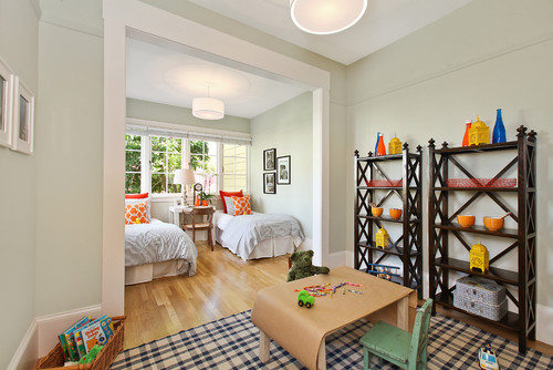
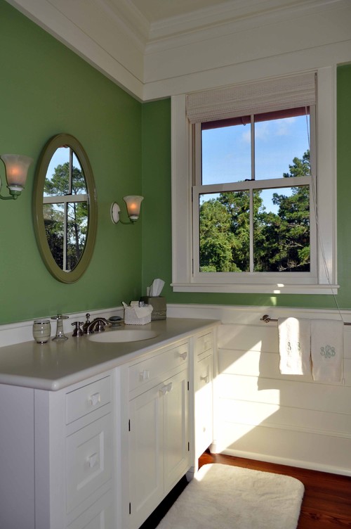
Here is another soothing green – Spring Valley, by Benjamin Moore.
In keeping with the soothing shades of green, Filmy Green, by Benjamin Moore is another one that hits the mark.
Brushed Aluminum, Benjamin Moore
Van Allen Green – Benjamin Moore
Slow Green – Sherwin Williams:
Argos – Sherwin Williams
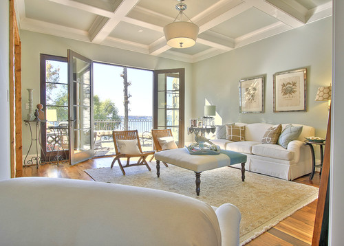
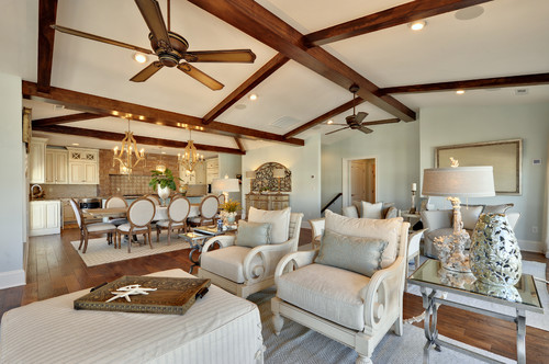
Is this room stunning or what? I love the contrast against the wood beams. Window Pane – Sherwin Williams.
The more I see the colors Farrow & Ball offers, the more convinced I am that they have some of the most gorgeous colors on earth. Teresa’s Green – Farrow & Ball:
Fleeting Green – Sherwin Williams:
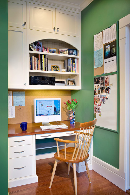
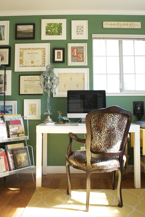
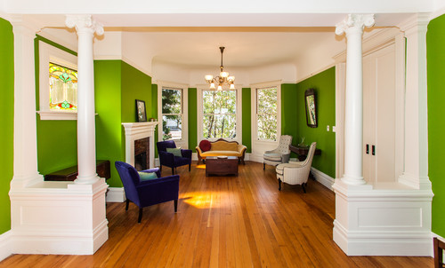
As much as a love these cool-as-a-cucumber greens, I’m equally drawn to some of the bolder hues. They’re just – happy.
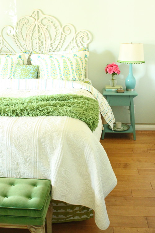
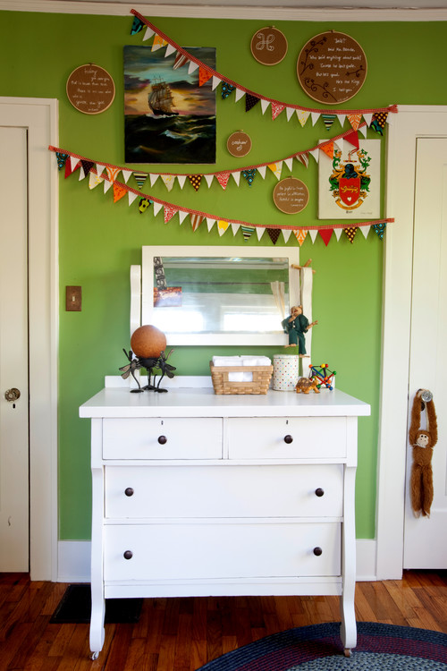
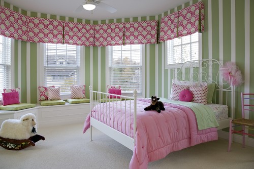
I used a bold shade of green in my daughter’s bedroom – Buckingham Gardens, by Benjamin Moore:
Webster Green – Benjamin Moore:
New Glarus – Pratt & Lambert
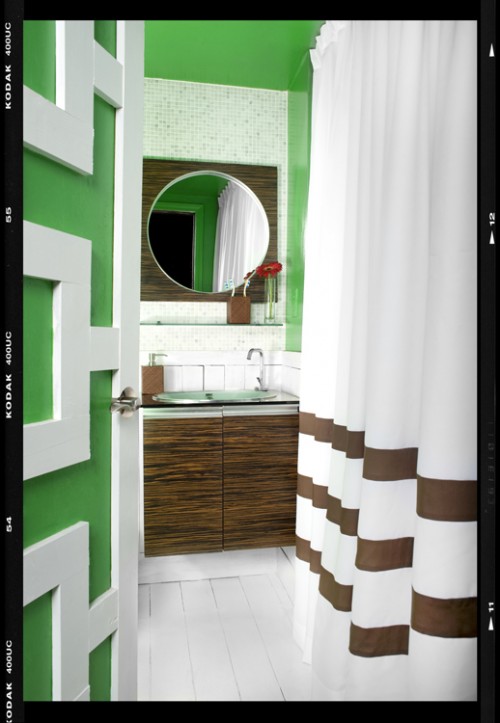
I’m not sure what the name of this color is, but I’m loving it in this bold bathroom:
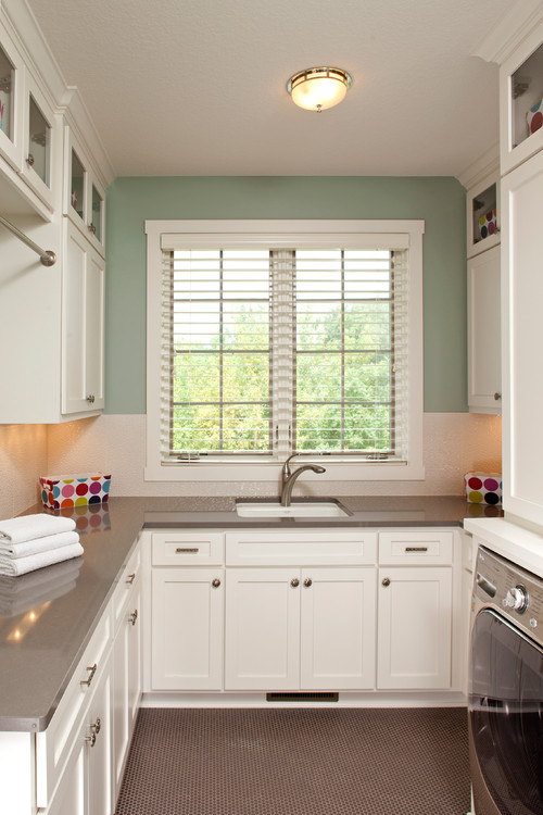
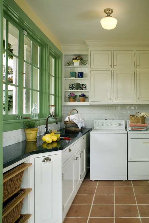
The green paint on this window trim is a custom color, but I love how this unexpected pop of color works in this lovely laundry room.
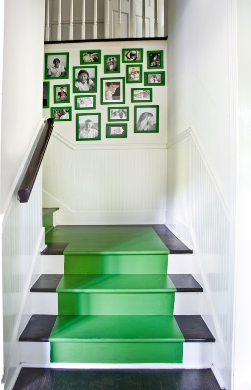
Another unexpected pop of emerald green on these stairs (and frames):
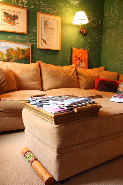
Why not kick it old school with some chalkboard paint in a traditional chalkboard color?
Kiwi – Benjamin Moore
Dill – Sherwin Williams:
Ball Green No. 25 – Farrow & Ball:
Apple Green – Benjamin Moore:
Basil Leaf – Benjamin Moore:
Woodland Hills Green – Benjamin Moore:
Are you a fan of green? Do you like the softer, more soothing hues, or do you prefer to go bold? Maybe a mix of both?





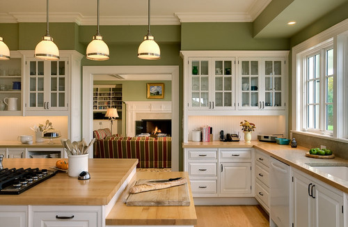
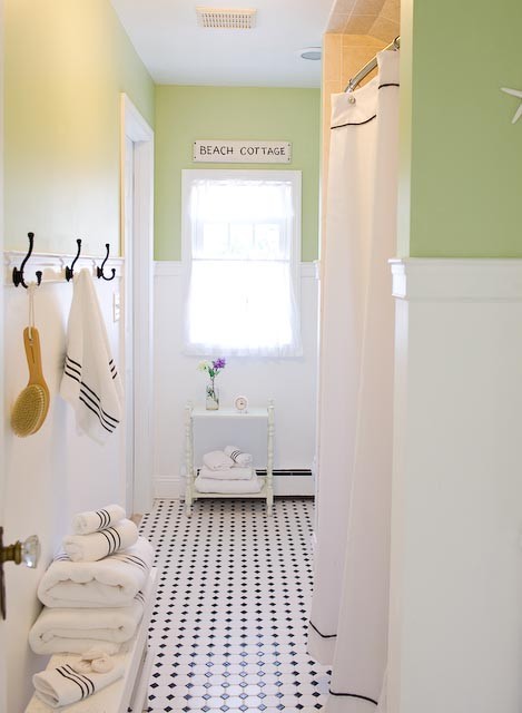

3 Comments
Andrea
March 10, 2014 at 1:14 pmLove all this green inspiration. I'm a big fan of Sea Salt and most soothing shades of green. I love a good pop of darker green in a room too. Can't go wrong with green!
Lisa @ Shine Your Light
March 10, 2014 at 1:56 pmI've used a lot of greens over the years. These days I am gravitating towards those bolder hues you shared; I love the one you chose for your daughter's room. However Sea Salt is really pretty and RH's Silver Sage never gets old does it?!
Vicki
March 12, 2014 at 3:41 amThanks for this – I've loved green ever since my newlywed days with my hunter green and burgundy towels! I recently painted my foyer a pretty gray-green, Moselle, by Pratt & Lambert. Looking forward to your next case study!