
So, for awhile now, I’ve been talking about getting my family room painted, and even met with a designer who has helped me with colors in the past – Carla – to try and nail down color choices that will flow with our open floor plan. We put together the beginnings of a color palette for the main floor anyway. I had big paint swatches on the walls and everything. With the help of Carla, I am stepping out of my comfort zone.
You all know that patience isn’t one of my virtues, right? Well, suffice to say, I went a bit off the reservation.
It all started with the niche around my pantry. We chose Benjamin Moore’s Mountain Laurel and I. love. it. It’s so rich and striking – perfect for this area. It will be going in my kitchen as well and I think it will look fabulous when we paint the cabinets.

I did an artwork change and hung the prints and frames I scored at Ikea. I thought with such a deep color that I should try to lighten up the artwork a bit.

I also painted my breakfast nook and used Benjamin Moore’s Palladian Blue My original intent was to start small, and I figured it would be a good place to “test” the paint colors to see if I liked them. And I did.
Once again, dark nighttime before pictures. The nighttime painting addiction continues to flourish.


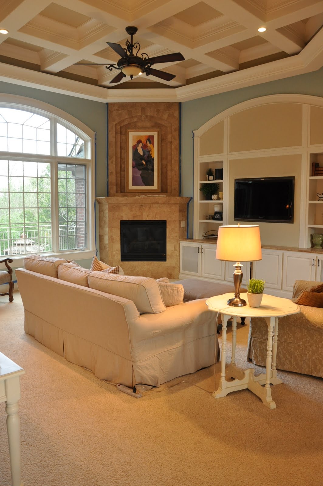
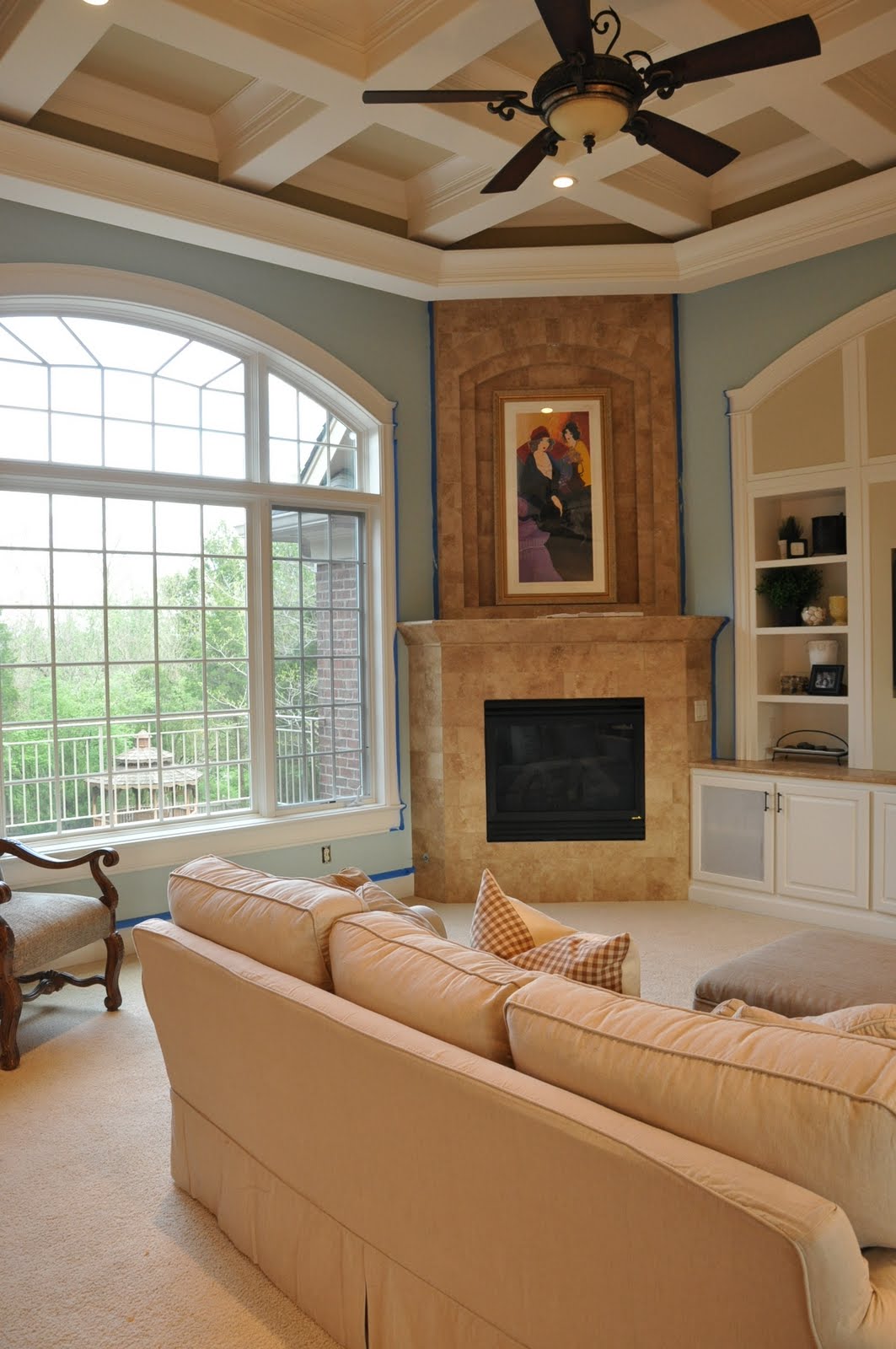
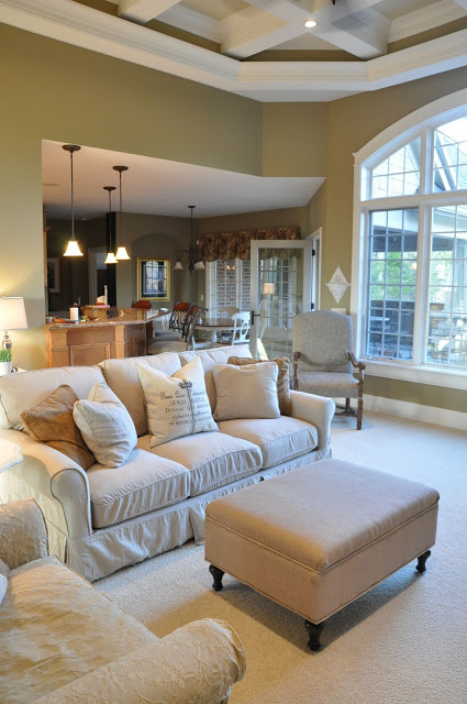
Much better, yes? So, since we liked it so much in the breakfast room, we continued it into the great room (according to plan). In some lights, I love it. In other lights, not so much. Have you ever had painter’s remorse?
I emailed Carla and told her my concerns. She’s helping to put my mind at ease:
“When you consider the overall color, I think you will enjoy it when you see it with your new sofa. This color won’t fight with anything and it is a NATURAL blue, so it will become a background over time and read as more of a neutral landscape color. It is dramatic to you now because your brain is reading the dramatic change. It has so much more light reflecting value, hard not to focus on the blue – but the blue is so clarified, I think it is calming myself.”
I am liking it more and more as the days go by. It truly does change with the light, and one wall can look completely different from another. Here is a peek at the family room (try to ignore the painter’s tape – I’m still working). But, you get the gist. The entertainment center area will be painted, as will the ceiling – I think I’m hiring out that job!


I’m really looking forward to getting the sectional so that the room will fall together a bit more. Soon. Again, patience is not a virtue of mine.
So, have you ever had painter’s remorse? Did the color grow on you, or did you repaint?

39 Comments
ℳartina @ Northern Nesting
April 27, 2011 at 1:03 pmJenny I LOVE LOVE LOVE the new color!! It makes everything look so light and bright, I think you made the perfect choice. Martina
Tonya
April 27, 2011 at 1:06 pmLove the new color! Its gorgeous!! I also LOVE the ceiling in your family/living room! So cool!!
Becky
April 27, 2011 at 1:14 pmI *love* that living room color. It looks fantastic. Wow, good job picking it out!
Angeline
April 27, 2011 at 1:34 pmSo beautiful – the blue is so fresh and neutral, too!
Kathy @ Creative Home Expressions
April 27, 2011 at 1:34 pmI have, but I usually go about two weeks to see if I change my feelings. I definitely did about a teal I did in my master bedroom. Hated it! I wound up going with a soft blue gray. Love it! I think it also takes some getting used to when you go from warm colors to cool colors. I do like your color and I hope it grows on you.
Krystal Leigh
April 27, 2011 at 1:43 pmWonderful! I LOVE it! I also know how it is waiting on a sofa. I waited six weeks on my leather sofa from Crate and Barrel. My patience is not so good myself. Now it's time for me to paint and I can't decide on colors. I have swatches everywhere. Don't worry though you made a fantastic choice it looks beautiful!!!
Andrea
April 27, 2011 at 1:54 pmI think it's beautiful! I think Carla's right, your brain just needs to adjust to the new color. I'm sure having everything else in place will help bring it all together for you. Great choices!
Lisa
April 27, 2011 at 1:55 pmI am a huge fan of BM's Palladian Blue to begin with, and I love it in your space with all the light colored furnishings and your amazing windows! See how you feel about it after your sectional comes in. Sometimes when it's all pulled together a color can, like your decorator said, become a background color and now a show-stealer.
PS I am know for painting rooms, hating the color, and repainting….my father in law says I shrink the square footage of every house I live in with all the coats of paint on the walls! 🙂
Lisa
April 27, 2011 at 1:55 pmThat's supposed to say NOT a show stealer!
Anonymous
April 27, 2011 at 2:07 pmNew here, HI! I love your style! I have had colors grow on me and I have also repainted. But I agree that once you have decorated again is the only time you can really tell.
I love this blue!!! I have been thinking about using it myself.
Kerry
April 27, 2011 at 2:15 pmI love that new colour, it is so fresh! It really brightened up your breakfast nook, and it does look fantastic in your great room!
Pam
April 27, 2011 at 2:28 pmIt looks great! I really like the new color. When we moved into this house, our basement was painted almost the same color. I love that any furniture we use in there works with the wall color and I love that it's bright and cheery all the time.
I don't blame you for hiring out the ceiling. That looks like a big job!
Have a great day.
Pam
Morgan
April 27, 2011 at 2:39 pmI think it looks beautiful! So serene and fresh. I've actually been considering using that color for our future home office. =]
Colleen
April 27, 2011 at 2:48 pmfor me no. I ended up changing it. It was in our old house. I am picky like that : )
I am loving this color. May have to consider it for our master remodel.
A Vintage Vine
April 27, 2011 at 2:53 pmWOW…it is so striking! Way to go with these choices!!!
Bee
April 27, 2011 at 5:46 pmThis looks gorgeous!! those colors are beautiful and your kitchen looks much bigger! great pics- and I think you will get used to is soon:)
marty (A Stroll Thru Life)
April 27, 2011 at 5:52 pmLove your home and the new colors are gorgeous. So relaxing and light. I can't wait to see it all finished. Yes, I have had painters remorse many times. Hugs, Marty
lauren@WESTFURNITUREREVIVAL
April 27, 2011 at 7:07 pmlove the new color…
lisa
April 27, 2011 at 7:20 pmit looks so fresh and airy, keep the color!
Passionate for White
April 27, 2011 at 8:54 pmIf you're not loving it repaint it.
Nikki Green Caprara
April 28, 2011 at 2:44 pmI love blues! They are so calming, but neutral at the same time. I think you'll love it!
Cherie
April 28, 2011 at 4:47 pmI love the blues. that is a great color.
Robyn
April 29, 2011 at 5:18 amIt's looking truly gorgeous! I'm also SO over the neutral look all over. The blues look ah-mazing!
Emily @ A Well Dressed Home
May 1, 2011 at 10:45 pmI think it looks fabulous! I too had painter's remorse with a color that I had done throughout my entire home…but now, I love it!! Sometimes you just have to live with it for a bit…
Emily Hewett
A Well Dressed Home
awelldressedhome.com/blog
Little Miss Penny Wenny
May 3, 2011 at 6:12 amOh my gosh please don't change it, this looks absolutely FABULOUS! Yes I do feel your pain though, I had remorse over the deep blue I painted in my master bedroom and ultimately changed it (after about 8 months of living with it). For me, it was the best change I could make. If you don't absolutely love the color, I think you should change it for your own peace of mind and ability to love it. I, however, LOVE the color and hope you keep it 🙂
xoxo
Jen
SHERRY HART
May 3, 2011 at 10:22 pmOne of my favorite colors…I really like it in your room.
tale of many cities
May 5, 2011 at 4:33 pmreally love it.. really LOVE!
Kristin @ My Uncommon Slice of Suburbia
May 10, 2011 at 5:50 pmI'm in love, it's so pretty!!!
XO
Kristin
Kristin@FavoritePaintColors
May 11, 2011 at 5:10 amI featured your room on my blog today – it is beautiful and everyone who I have heard from thinks the same. I know paint can be hard to get right, especially if it's something that's out of your comfort zone but it looks so good in your room and is a great complementary color. You did a wonderful job!
Sheri @ Design Pop Interiors
May 12, 2011 at 2:26 amI'm really starting to like blue again. Lovely.
Camille
November 11, 2011 at 4:47 pmOh this is so funny. I just found your blog and was DYING over your blue color as I'm in the search of the perfect blue for our little master bedroom. Talk about painters remorse, I just painted and REPAINTED the bedroom because the blue looked amazing on the swatch but was too intense for the small room. Guess what color it was… PALLADIAN BLUE. But your rooms look AMAZING!!! The tall ceilings and huge windows make all the difference. What a beautiful home!
Chad
December 22, 2011 at 4:19 amLooks wonderful – I love the blue! Would you happen to recall the name of the beige/tan accent color on the ceiling and entertainment center? It complements it marvelously!
Anonymous
February 3, 2012 at 10:41 pmIt doesn't seem to flow with your board and batten hallway colors(which I love).
Joan Kosmachuk
April 26, 2013 at 6:43 amI just painted our living room Palladian Blue and one minute I think I love it and the next I think I've made a terrible mistake. Do you still have the color and how long did it take before you stopped questioning your choice? I think for me, it's when it looks very aquamarine (at certain times of the day) that I think there's WAY too much of a teal tone and not the neutral blue I thought it would be.
Joan Kosmachuk
April 26, 2013 at 6:44 amI just painted our living room Palladian Blue and one minute I think I love it and the next I think I've made a terrible mistake. Do you still have the color and how long did it take before you stopped questioning your choice? I think for me, it's when it looks very aquamarine (at certain times of the day) that I think there's WAY too much of a teal tone and not the neutral blue I thought it would be.
Andrea Welch
April 28, 2014 at 3:06 pmI have to laugh at some of the comments about this color. I painted my chocolate brown bedroom which has 11 foot high walls all Benjamin Moore Palladian Blue. It has an unexpected intensity that I was not prepared for! When you're in my bedroom now you think "HEY I'M IN A BLUE ROOM". It's not the quiet color that I thought I saw on the paint chip. And it's a huge departure from the warmth of the brown I had before.
However… it has been 2 days and I'm starting to really like it. It's a real robin's egg blue type of color which is hard to hate. So fresh! Once I got the artwork and shelves back on the wall, it broke up the color, which make a big difference. I went from thinking "WHAT HAVE I DONE GOTTA GET NEW PAINT NOW" to "Why was i freaking out, this is really pretty." For anyone who is feeling remorseful about Palladian Blue, I would say, give it a few days. It's not the muted shade that it looks like on the chip but so pretty. And like everyone has mentioned, depending on the lighting, it changes so much. It's an interesting color.
Unknown
August 20, 2015 at 7:08 pmI'm suffering from painters remorse in my living room right now. The teal I went with is a bit too bright. I'm currently debating whether I should go darker, like your niche wall, or lighter with the Palladian Blue. When I saw the sample at the story it looked more green, but all the pictures online looked like the shade of blue I'm looking for. Does it ever feel more green to you once it's on the walls?
Cris
March 13, 2018 at 9:11 amI actually also used Palladian Blue, but in my half-bath and I do have a bit of painter’s remorse as the room gets only indirect natural light and with my current light bulbs it is too green. It almost looks like a color you’d see in a hospital-so I’m not pleased. I have been thinking of ways to change it without having to hire a painter again, maybe an accent wall in the half-bath that is more gray? Or art work to tone down the blue. I’m not sure. But your rooms look fantastic!
Jenny
March 13, 2018 at 10:05 pmPart of the issue I had is that I went through many gallons of paint at the time, and some of the paint didn’t match! As a result, it looked way more blue than it should have.