Hello!
I have been out of commission this week due to the “Thanksgiving Plague” that I picked up while visiting my brother-in-law over the holiday. We left early after his family started dropping like flies, but alas, we were not spared. I usually avoid these nasty bugs (my husband refers to me as “The Carrier”), so it’s been a tough week! I’m still not 100%, but I’m at least semi-functioning today, thank goodness.
I hope you’ve been enjoying all of the Christmas tours – I certainly have. So much goodness out there!
Amanda’s tour at Amanda Carol Interiors was so gorgeous and classic:
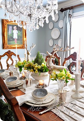
Then we popped over to Dixie Delights to see Amanda’s home decked out to the nines:
She had so many beautiful elements, I couldn’t pick a favorite!
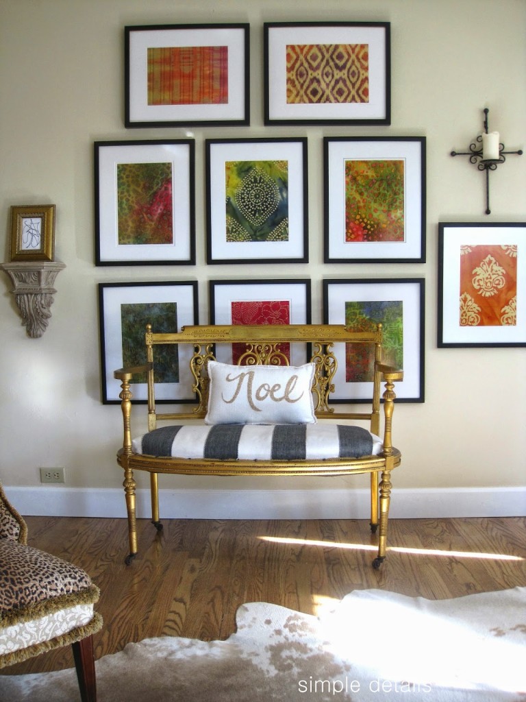
You won’t want to miss Pam’s tour at Simple Details. She never ceases to amaze me with her eye for mixing patterns and adding unexpected elements to her designs. Love it.
Don’t miss the full line up – you won’t be disappointed!
12/1- Evolution of Style: https://evolutionofstyleblog.blogspot.com
12/2- Amanda Carol: https://blog.amandacarolinteriors.com
12/3- Dixie Delights: https://dixiedelights.blogspot.com
12/4- Simple Details: https://simpledetailsblog.blogspot.com
12/5- Shine Your Light: https://www.shineyourlightblog.com
12/8- Driven by Décor: https://www.drivenbydecor.com
12/9- Dimples & Tangles: https://dimplesandtangles.blogspot.com
12/10- The Creativity Exchange: https://www.thecreativityexchange.com
12/11- The Little Black Door: https://thelittleblackdoor.blogspot.com
12/12- Steward of Design: https://stewardofdesign.blogspot.com
12/13- Oak Ridge Revival: https://oakridgerevival.blogspot.com
12/14-Day for you to link up! (Check back here for details)
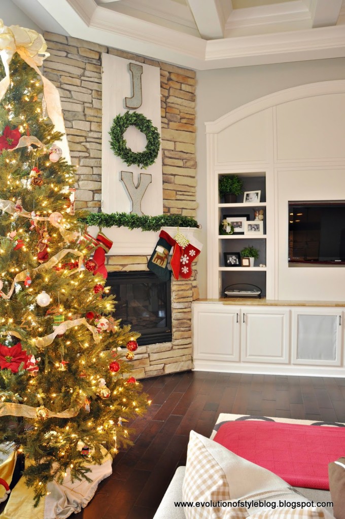
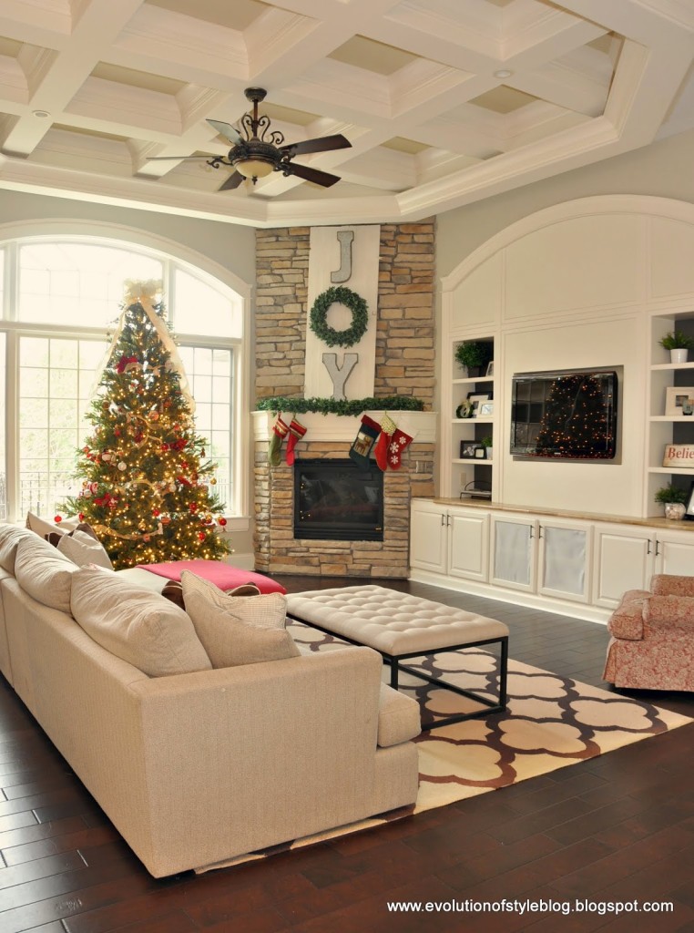
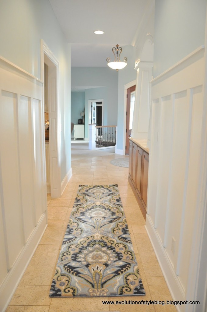
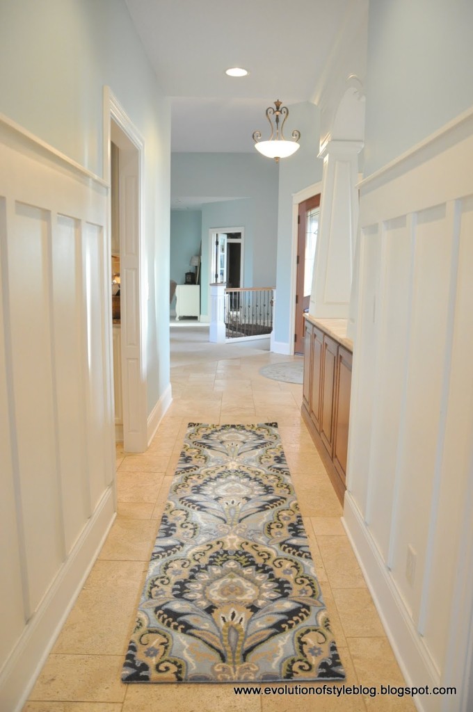
Since I made some paint changes to my home this year, I thought it would be fun to do a little flashback to last year’s holiday decor and compare it to this year. While I really loved the color it used to be (Palladian Blue), I’m really thrilled with the new look, as it gives me a more neutral backdrop to work with.
Last year (yes, I love those large scale chalkboard engineering prints):
This year:
Last year:
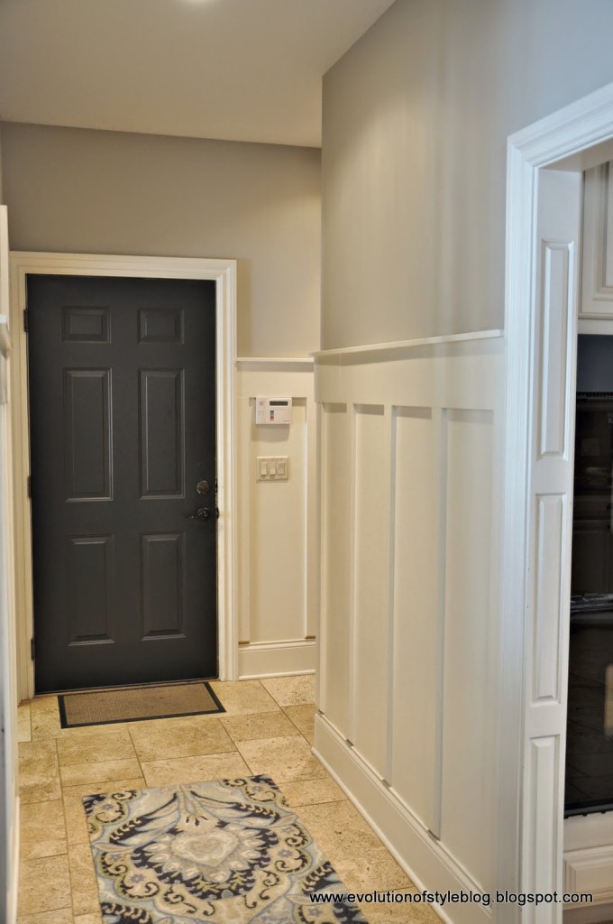
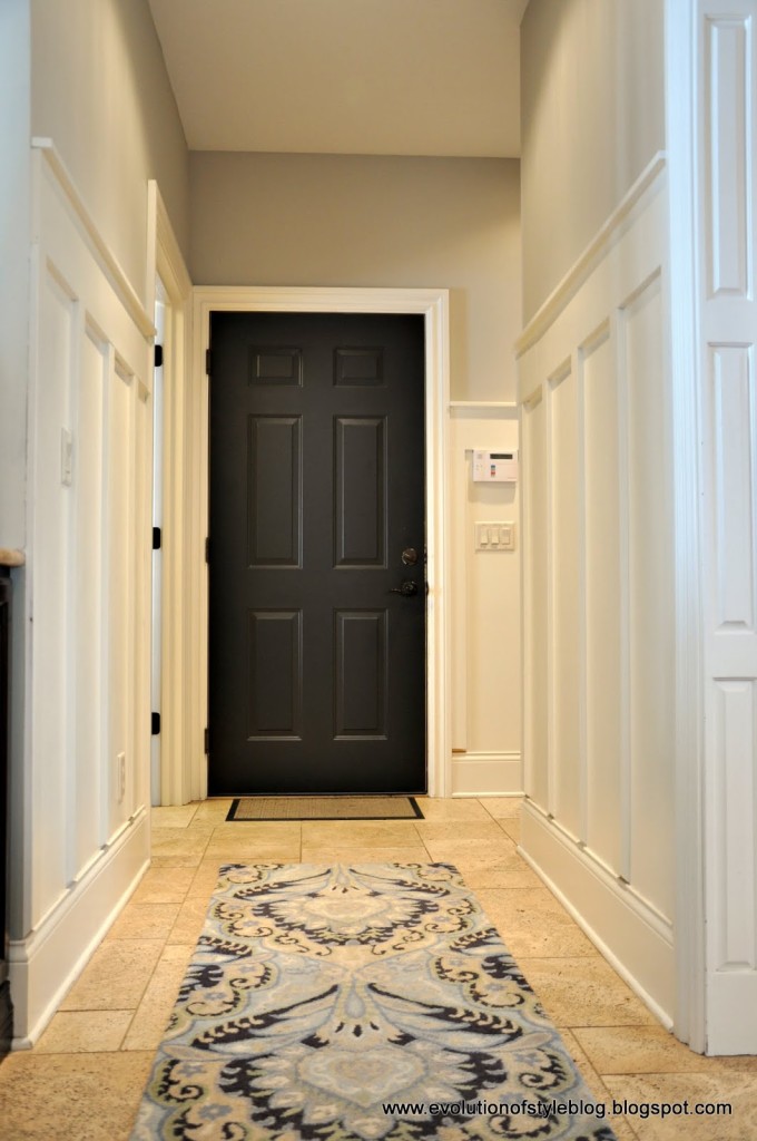
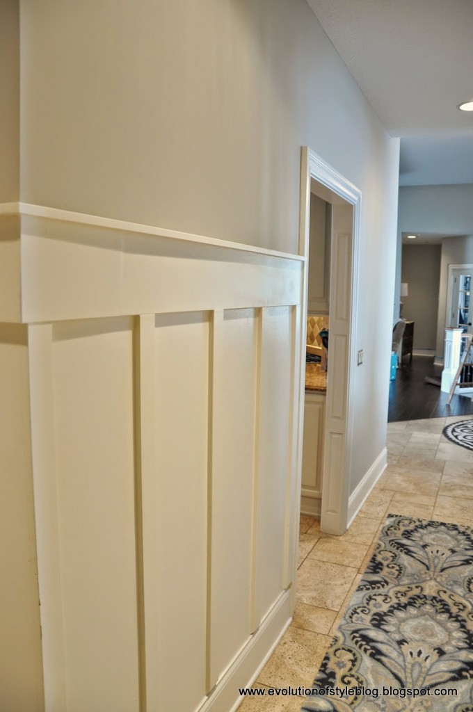
This year – welcome Revere Pewter! It really does live up to its reputation.
Then:
Now:
You have to love the power of paint!
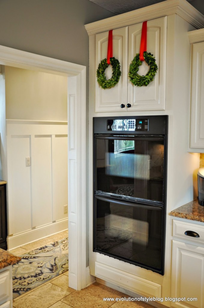
The kitchen has gotten a lift as well – more on that room soon. But you can see that the colors really work well together (Revere Pewter in the background hallway). I’m loving it.
Have a great day!
Linking up:





6 Comments
Robin Warzywak
December 5, 2014 at 12:27 amI love the new paint color! I have Revere Pewter in several rooms of my house too! You just can't go wrong with it.
http://www.designbyrobinsnest.blogspot.com
Lisa @ Shine Your Light
December 6, 2014 at 4:31 amI thought your old colors were sooooo pretty but I agree, it's so much easier to have a neutral backdrop, isn't it? Especially for us serial redecorators? The Revere Pewter looks great with your board and batten and all your crisp white trim!
Calypso In The Country
December 6, 2014 at 7:00 pmEvery time I see Revere Pewter, I love it more…I have to get it into my house somewhere!
Shelley
Timeless and Treasured, Photography by Heather
December 8, 2014 at 7:27 pmI think I've decided on Revere Pewter now for my bathroom redo. I keep seeing it everywhere and this just convinced me – gorgeous! I love your before color, but the gray is so much better.
tony wu
December 12, 2014 at 3:56 amRefer some more useful information on granite tile
Cindy
January 17, 2015 at 3:40 amYour Revere Pewter is really pretty, I also love the turquoise in those rooms too…I have turquoise in my kitchen and trying to find the right grey for my living/dining room.