
Spending a vacation at the beach always seems to relax and inspire me, as I have time to actually sit and think. A luxury to be able to do it for more than just a few fleeting minutes, given all of the back-to-school/off to college hulabaloo that’s going on right now. A walk on the beach collecting shells got me to thinking (again) how you need not look any further than Mother Nature to come up with a beautiful color palette – for your home, a piece of artwork, or even for a piece of furniture. I thought it would be fun to use the shells that we found as a beach inspired color palette.
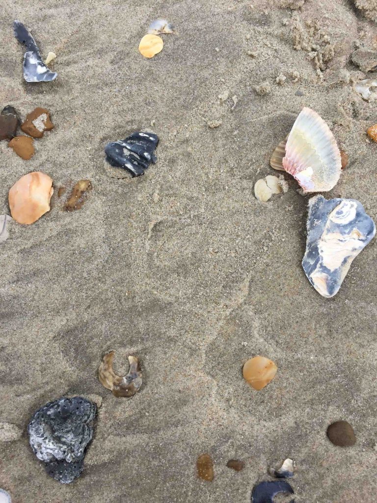
The shells you find seem to vary, depending upon the beach that you’re searching. In Outer Banks, I found a lot of black, blue/white, gray, brown and different shades of pink and coral thrown in. The beach sand even serves as a beautiful backdrop for all of these pretty shell shades.
The way I see it, you can create a beach inspired color palette with paint colors, or with your furniture and accessories. Let’s start with a peek at some pretty beach homes that emulate the beach colors that surround it.
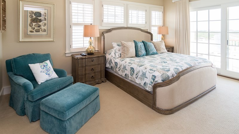
Look at this gorgeous bedroom. The walls and floors are the perfect sandy beach backdrop for the pops of blue in the bedding and chair, along with the pale coral lamp shades.
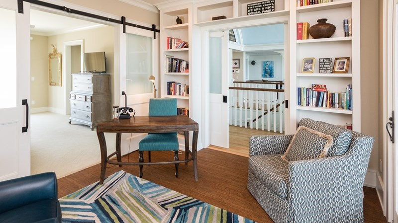
This hip and fun office area is another great example of incorporating a beach color palette into your home (although I hope no one was working too hard while on vacation).
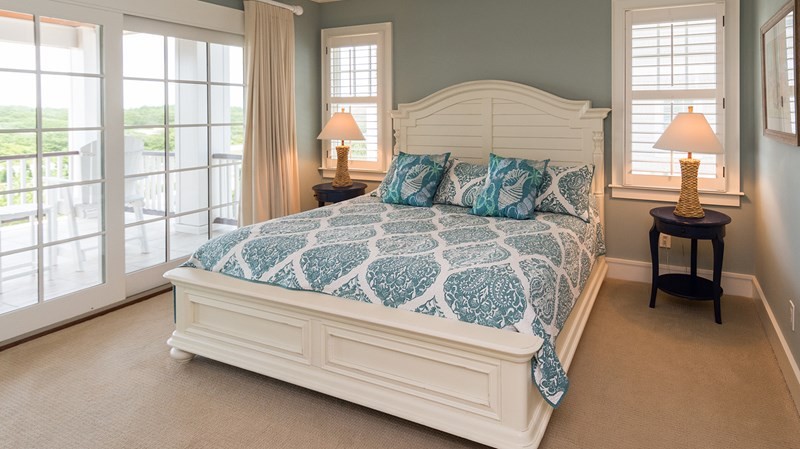
I, of course, was drawn to the blue and white shells, so you can see why I would love this bedroom. So tranquil and restful.
I love how so many rich and gorgeous ocean colors were incorporated into the tile feature of this home. If you want the full tour of this beach house, you can see it all here.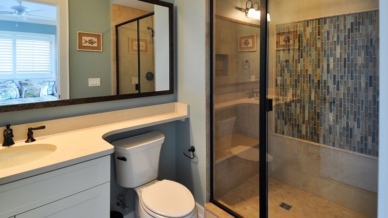
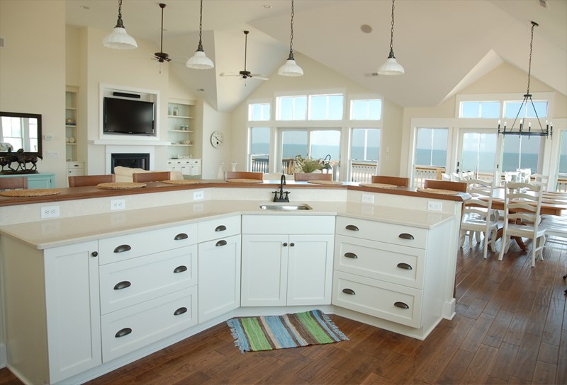
This kitchen and living area are beachy perfection in my opinion.
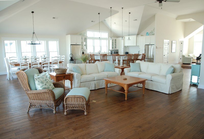
This gives you a better view of the room as a whole. The only thing I would add is an area rug – so pretty. See more of this beach front beauty here.
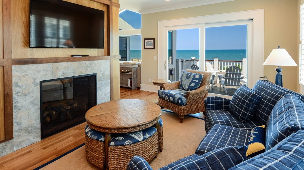
Another beautiful example of rich wood tones combined with navy and crisp white.
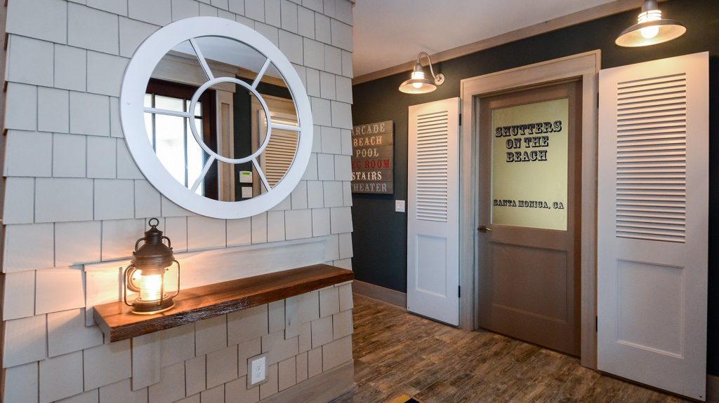
And then I couldn’t resist sharing these spaces. How fun, whimsical and unexpected! The shingled wall, the detail on the glass paned door and the fun lighting are just too cute.
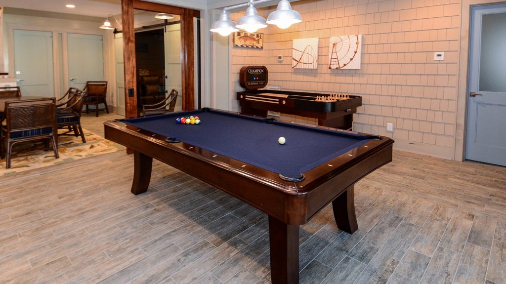
This theme is carried through to the pool table area. I love it. Check out the full house here.
If you’re looking for some paint color ideas based upon the beautiful beach shells, there are lots of apps out there that will allow you to upload an image, and then provide some color inspiration. Here’s what I got based upon my photo.
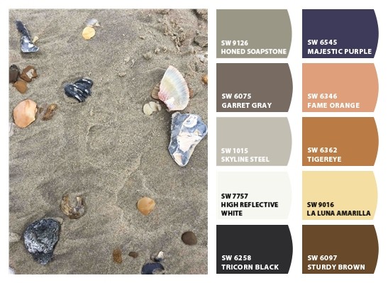
Not a bad start, don’t you think? The colors on the left are definitely a great start for neutrals, along with some other accent colors that you could incorporate. I used the Sherwin Williams’ ColorSnap tool to pull this together. Super fast and easy.
Would you consider a beach inspired color palette in your home? Or would you need a beach house to have ongoing inspiration?
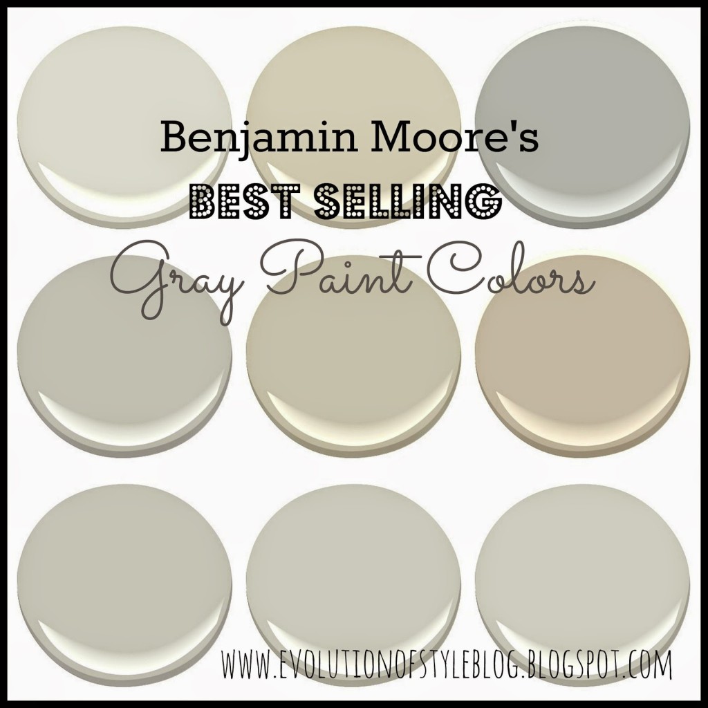
If you’re not in a beachy mood, you can always play it safe with some of Benjamin Moore’s best selling gorgeous gray neutrals that are a great backdrop for any season.
Jenny

4 Comments
Lauren@SimplyLKJ
August 9, 2017 at 10:22 amI think it is so much fun to pull colors from nature. Our library color palette is based off of the shells in the mirror that I made.
Jenny
August 9, 2017 at 9:57 pmNature has the best color palettes!
Cathy B.
August 9, 2017 at 1:36 pmEnjoyed your post. I hear nice things about Corolla. We usually stay in Hatteras.
Jenny
August 9, 2017 at 9:57 pmWe love Corolla – it’s a little further out, but I like that! Thank goodness we weren’t impacted by the power outage – I feel terrible for those who were!