
Here we are, already on day four of the Homearama 2017 tour. I hope you’ve enjoyed the homes thus far, and if you’re late to the party, no worries, you can catch up on the previous homes here:
Homearama 2017: Day One – Chatham Cottage – Weiland Builders
Homearama 2017: Day Two – The Camden – Drees Homes
Homearama 2017: Day Three – Eagle Ridge – Hensley Custom Building Group
Let’s get things going with the next tour, shall we?
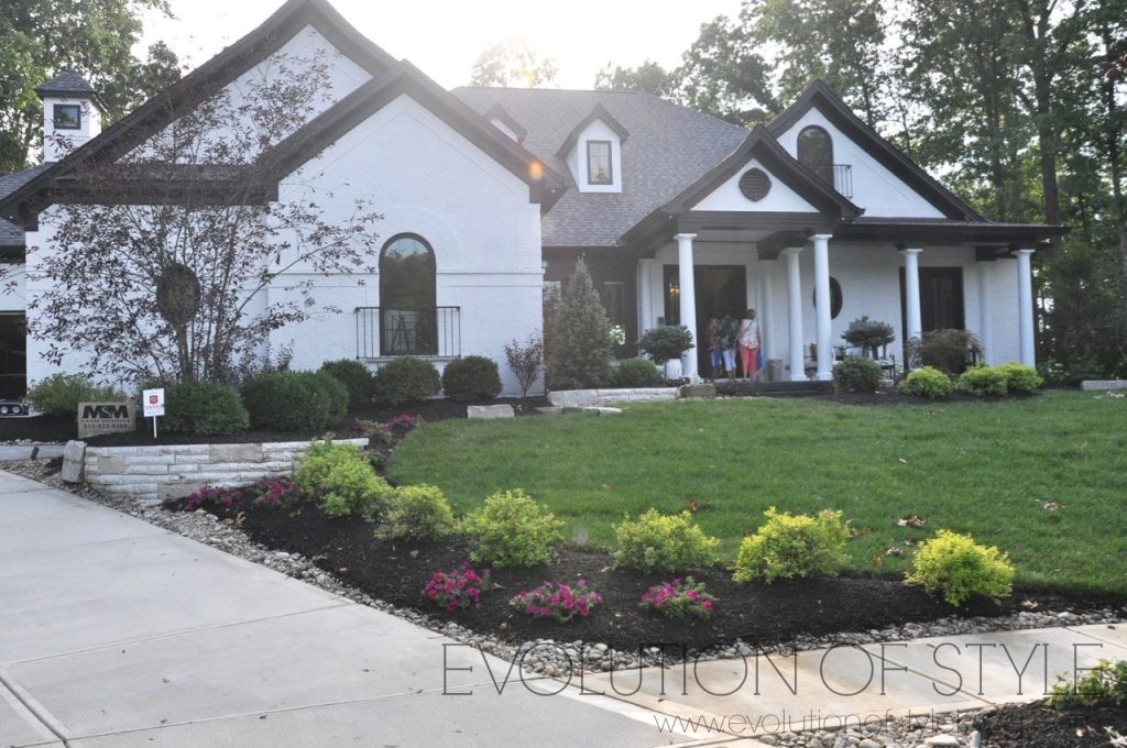
Royal Birkdale – Justin Doyle Homes
Price: $1.1M
Square footage: 5675 sq. ft.
Website: www.justindoylehomes.com
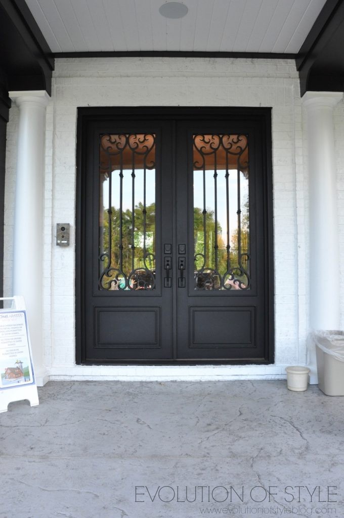
Another pretty black and white traditional exterior. Pretty architectural details abound.
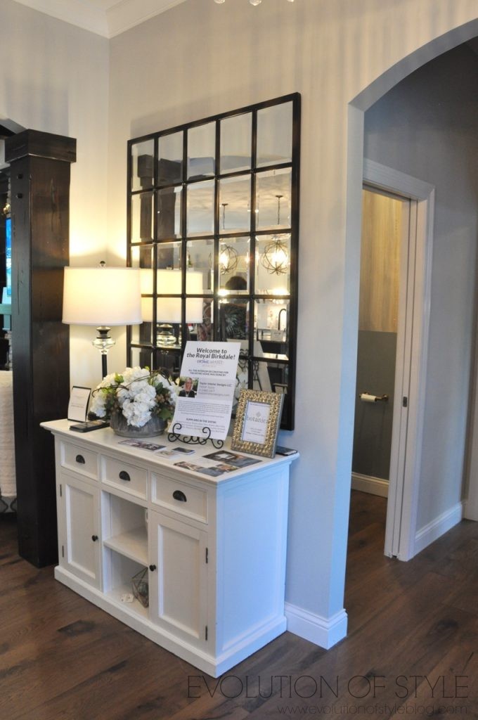
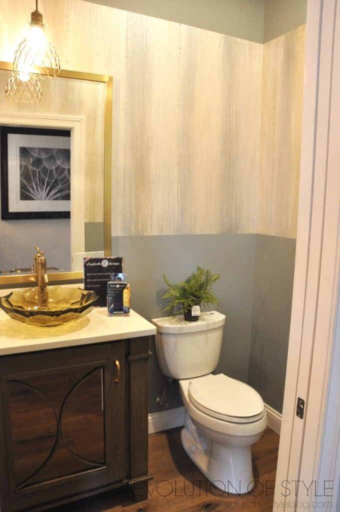
A look inside to the foyer, and to the right is a bathroom and an office.
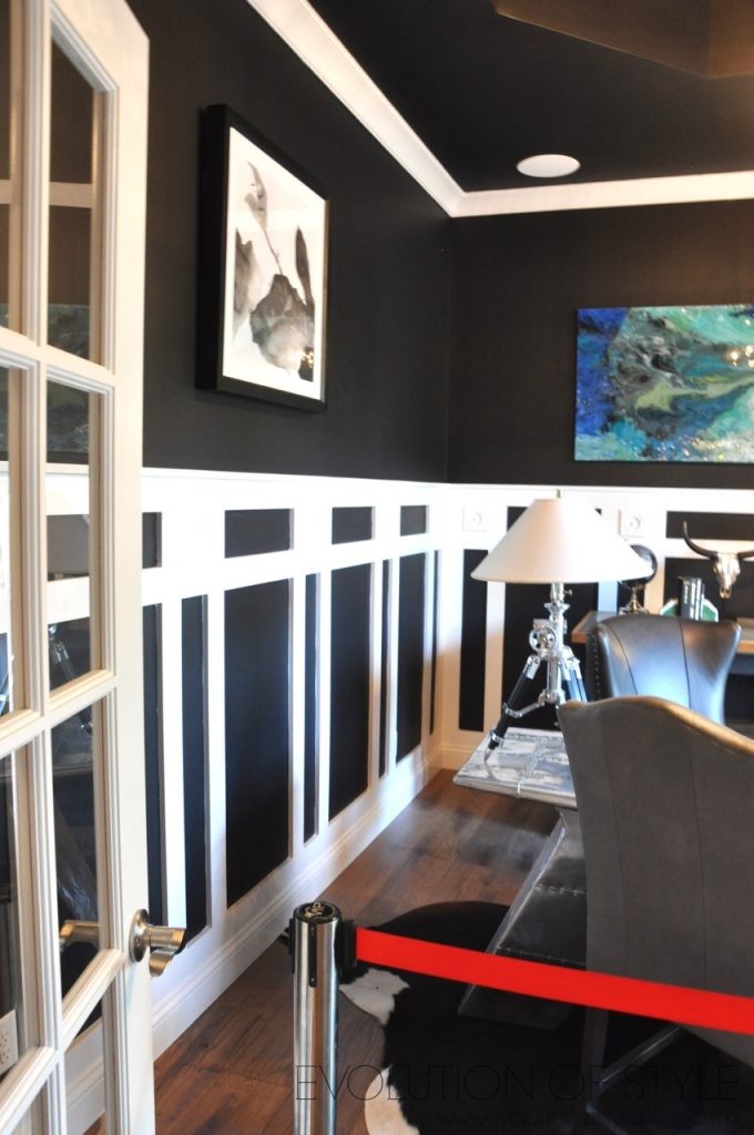
You all know that I’m a fan of high contrast, and this office is close to hitting the mark for me. The walls are a rich and awesome navy, but the trim detail on the bottom makes me a little dizzy. I would have preferred to have it all white.
And then there is the ceiling detail. Call me boring, but I’d rather have a white ceiling in here – maybe coffered? The desk isn’t my style, but with a few changes, I could make myself at home in here.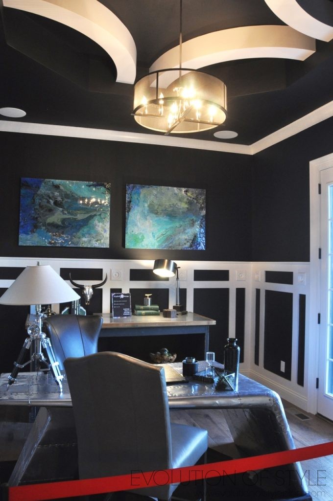
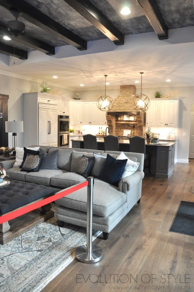
Straight ahead is the family room. Did you notice that a few of these homes have very similar layouts with the main living space? But hey, it works, right?
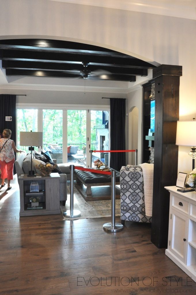
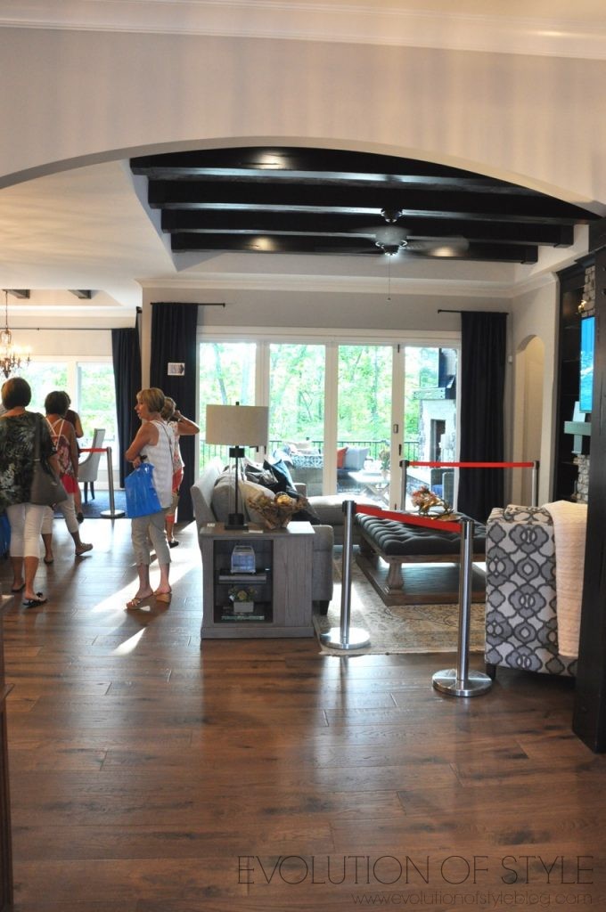
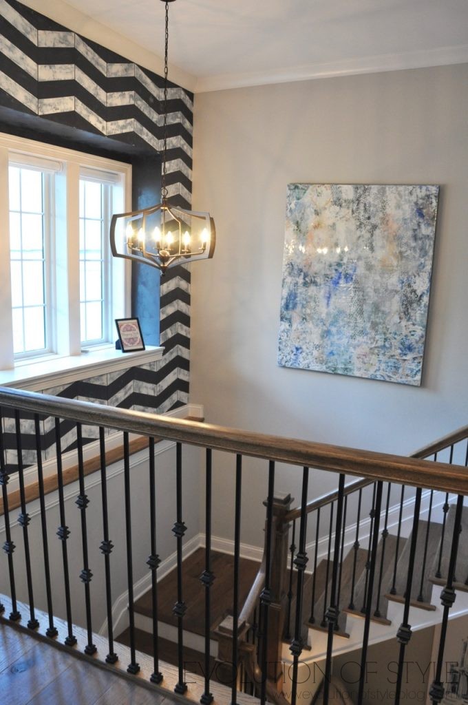
To the left is the staircase to the finished basement.
Off of the great room is the large open kitchen. I love exposed brick elements in a home, and appreciate the detail. I’m just not sure I like the shape of the brick around the stove. I’m thinking a more streamlined straight “box” shape would have been more aesthetically pleasing, if that makes sense. But I know working around cabinets sometimes requires design accommodations. Perhaps it’s because I have a similar shaped space in my own kitchen (that I don’t like), and I’m bringing my own prejudices to the table here.
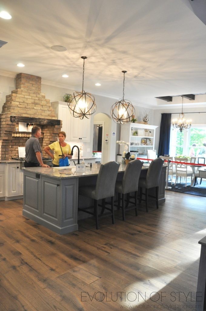
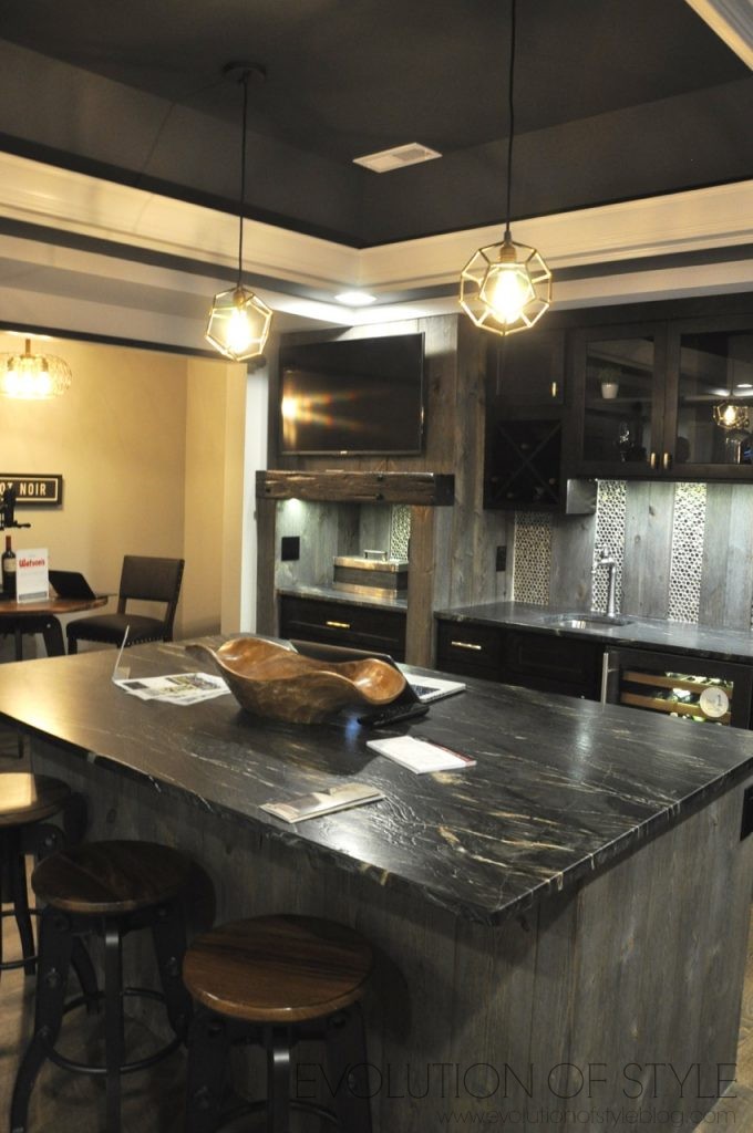
A nice roomy island with plenty of seating – great entertaining space, and again, I love that there’s only one dining area.
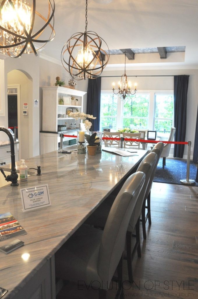
I’m not sure of the ceiling detail. I don’t mind the beams, but the dark ceiling treatment brings things down too much for my own taste.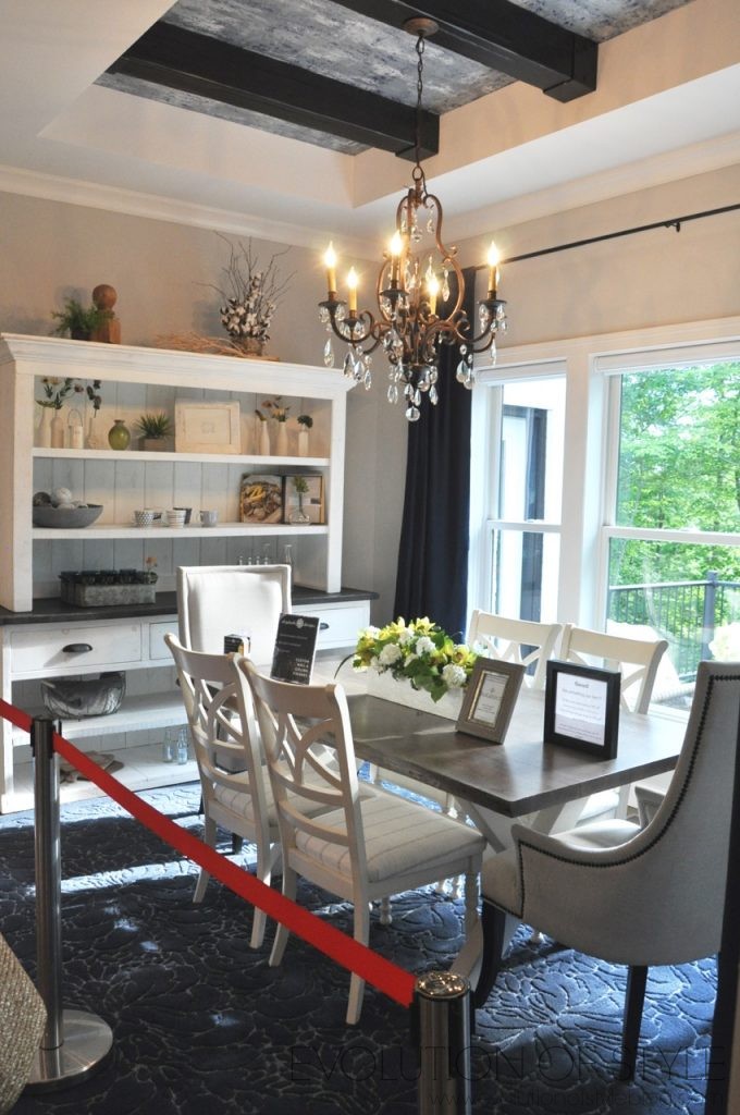
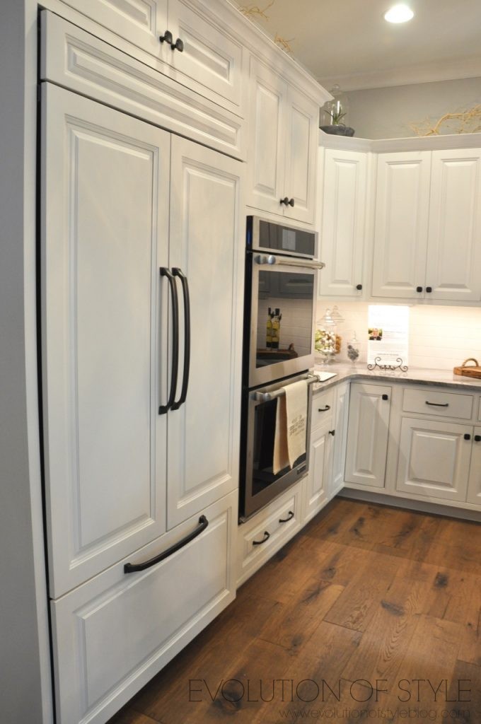
Another view of the kitchen. The countertops are different than what we’ve seen in other homes, but they work in here.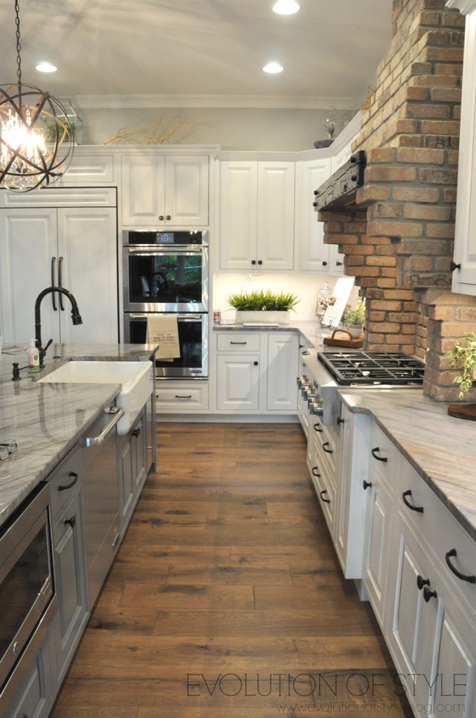
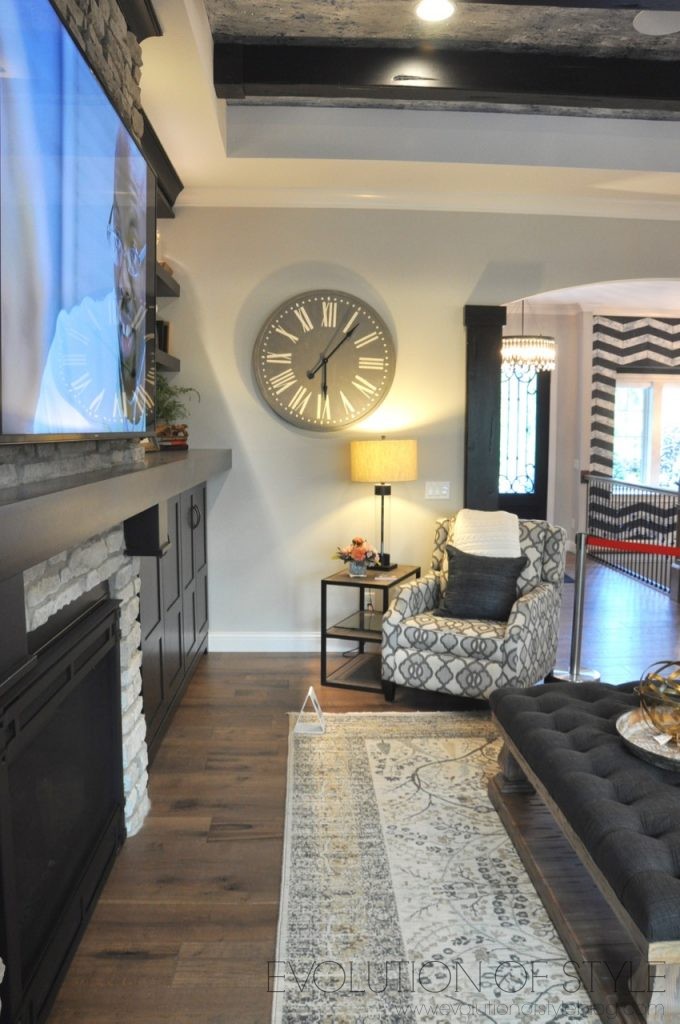
I didn’t get as many shots of the family room as I thought I did. You can see that the ceiling treatment in here is the same as what’s in the dining room. Just a little too much for me.
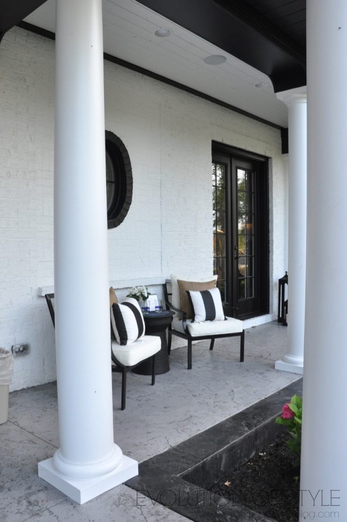
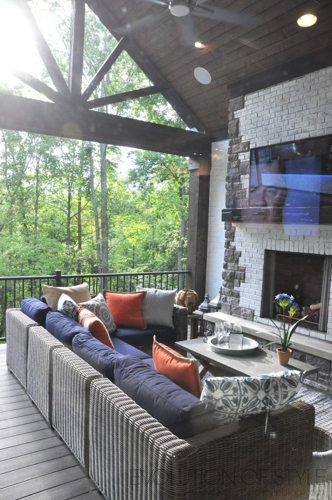
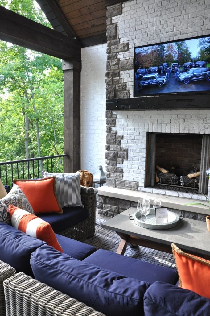
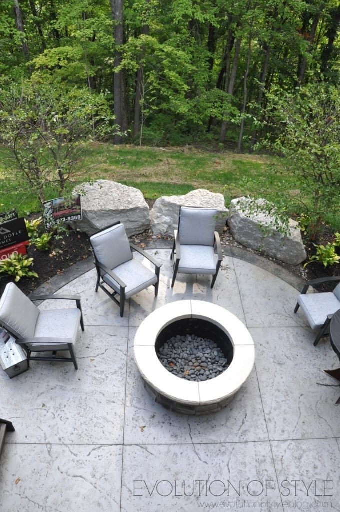
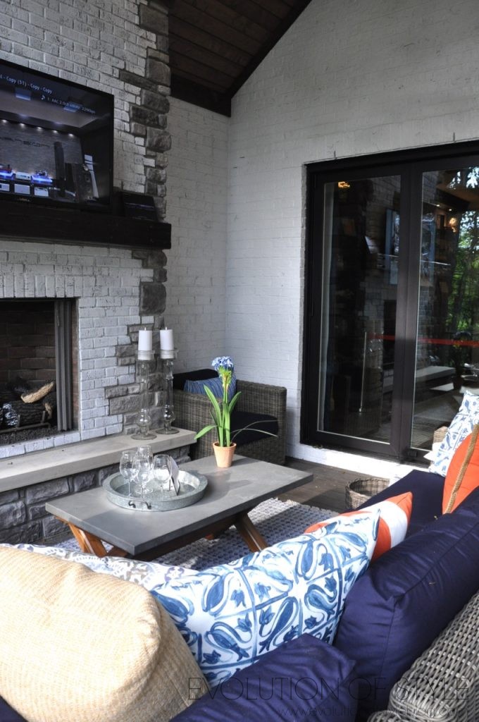
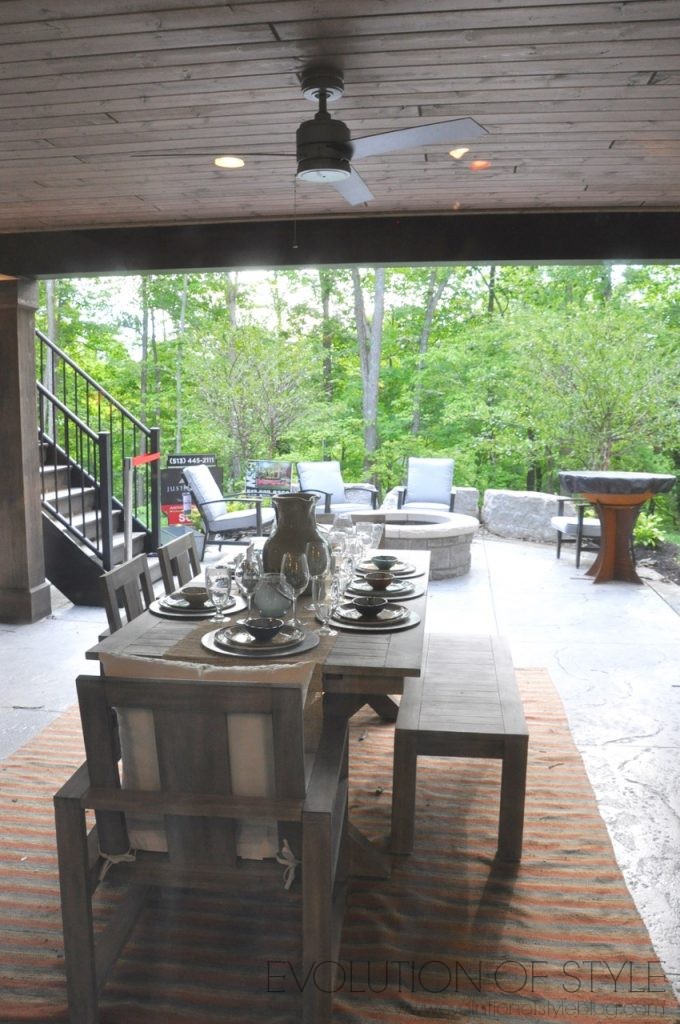
There is a stunning outdoor porch on this home – it almost has a ski lodge vibe to it with the way they did the detail on the ceiling and roofline, along with the cozy fireplace. Can you imagine the view out here in the fall?
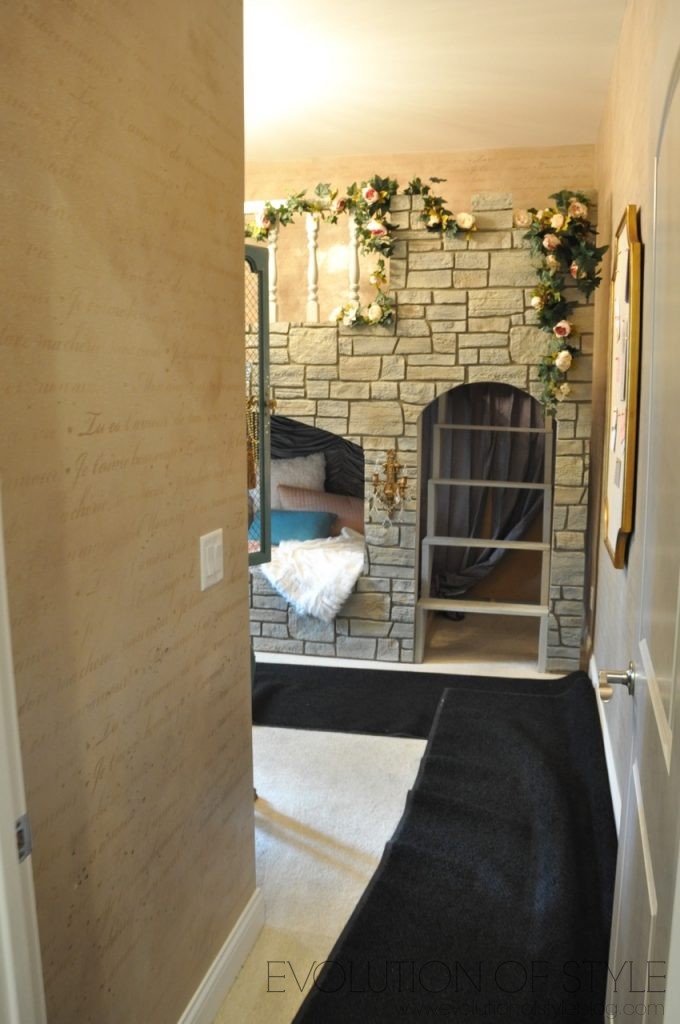
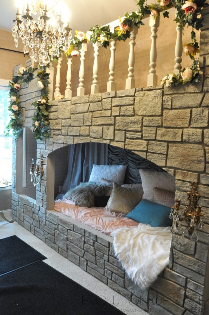
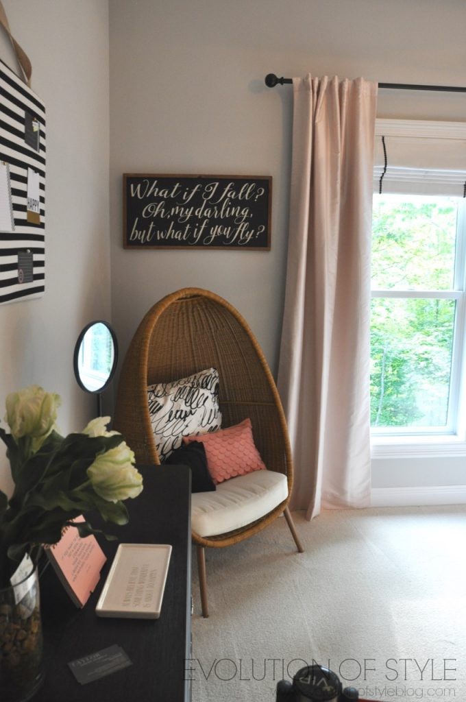
This home did have some pretty off the hook kid’s rooms though. Check out this one – made for a princess. Literally.
There is a Jack and Jill bathroom that connects this room with another extra bedroom. Loved the floor tile in here.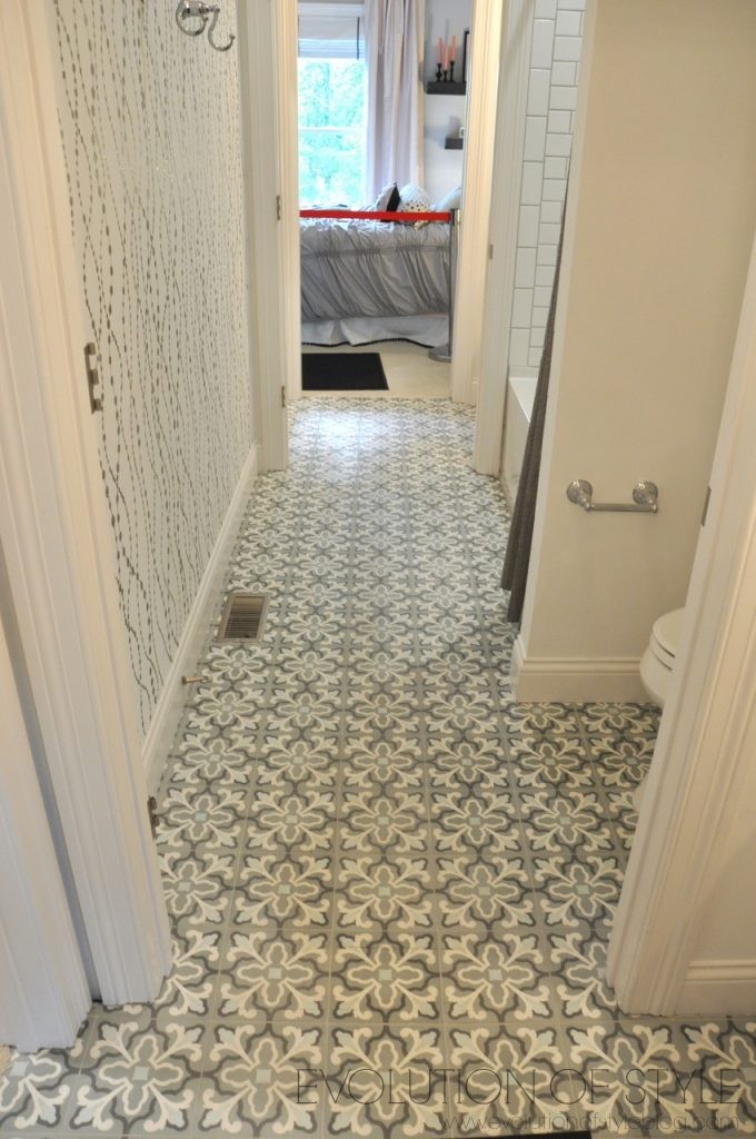
But the wall detail made things a little too busy for my taste. I think if this wall had been painted in a solid accent color, it would have showcased the floor a bit more, rather than compete with it.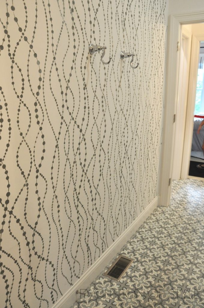
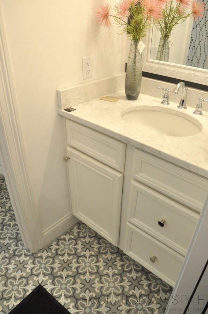
Although I did like the stripe detail on the wall of this vanity.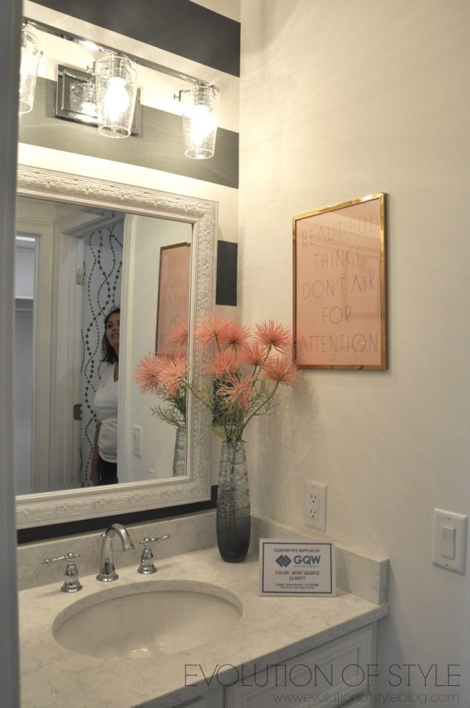
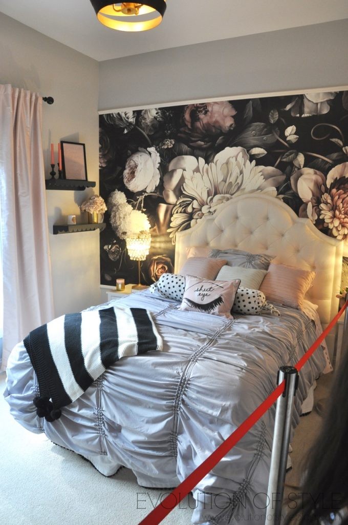
This is more of a teen/tween bedroom, and we all gave it two thumbs up. Cool mural detail, and such a soft and sophisticated color palette.
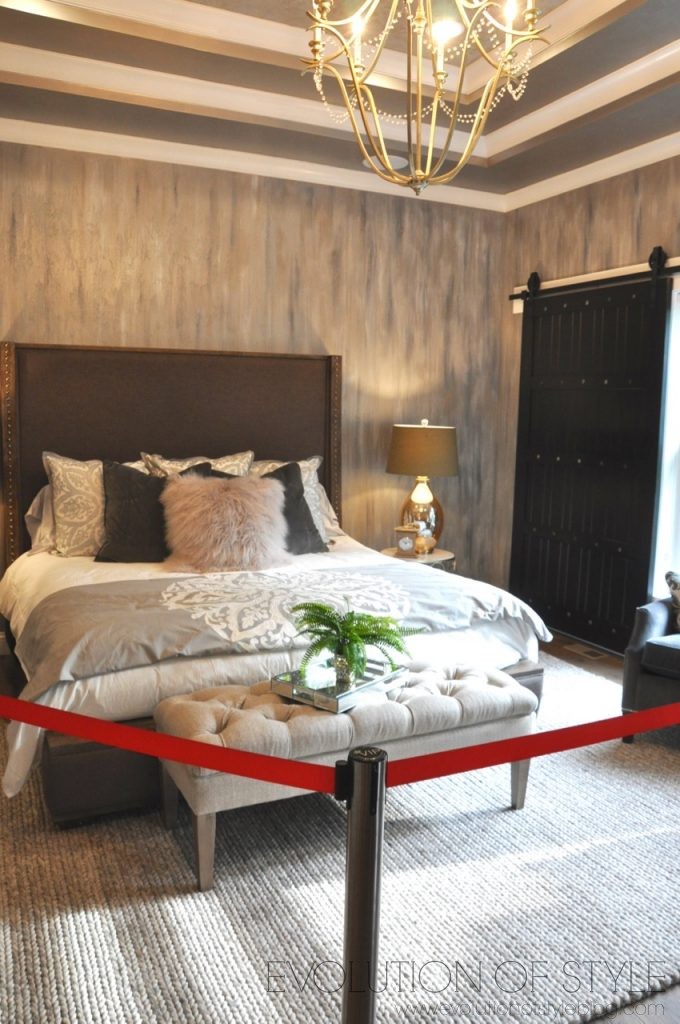
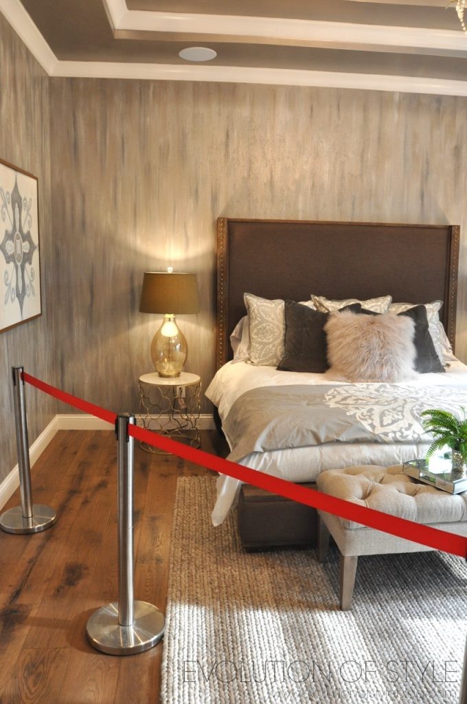
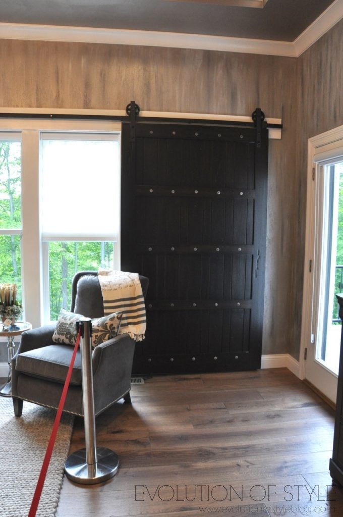
We made our way to the master bedroom on the other side of the house, complete with sliding barn doors.
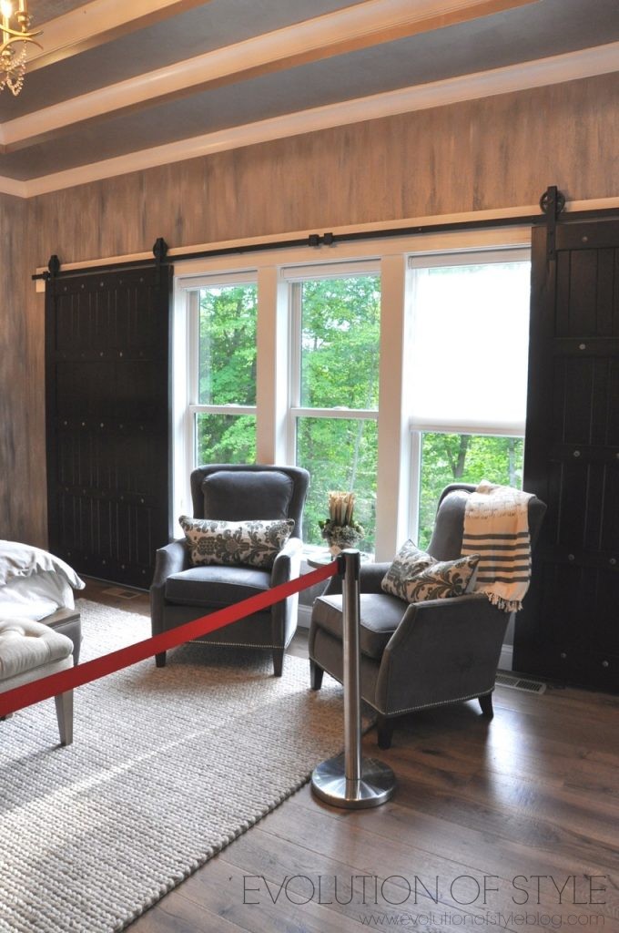
While I don’t know if I would want barn doors in my master bedroom, the appeal of total darkness for sleeping is definitely appealing to me. My husband thinks I’m part vampire with the way I like it as dark as possible. Maybe I have thin eyelids, but I swear, I can see lights when they’re on at night.
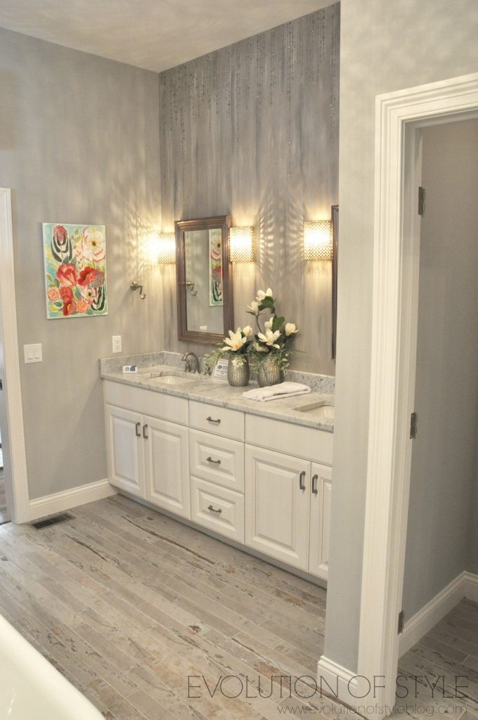
Then we entered the master bathroom. The flooring is tile. It looks like worn wood, but it’s tile.
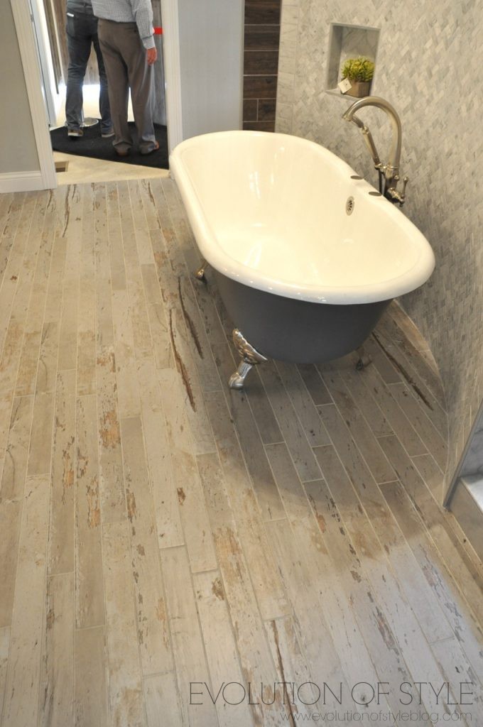
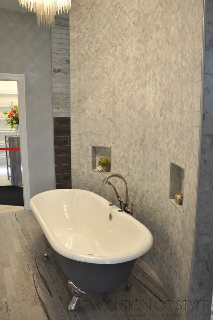
There is too much tile going on in here for me, and it just doesn’t play well together. Pebble stone tile on the floor, two different wood look tiles on the walls and then a herringbone tile on another wall. Just too much. I think the worn wood tile has a time and a place, I just don’t know if this bathroom is it.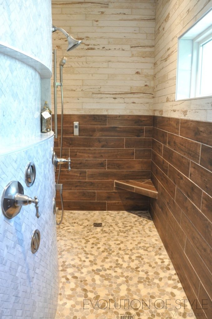
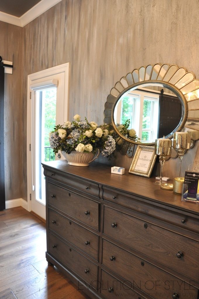
Awesome master closet, and I’m digging the chandelier in here.
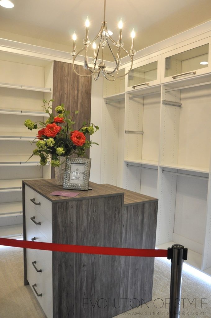
And the laundry room is off of the master closet, which I like – very convenient.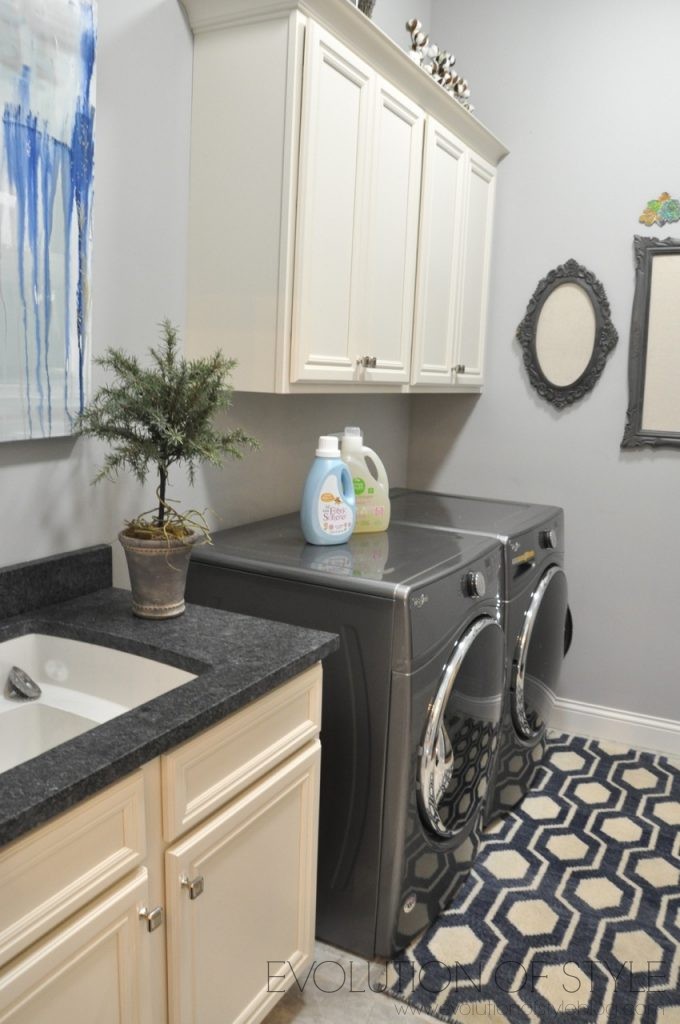
From here, we made our way to the finished basement.
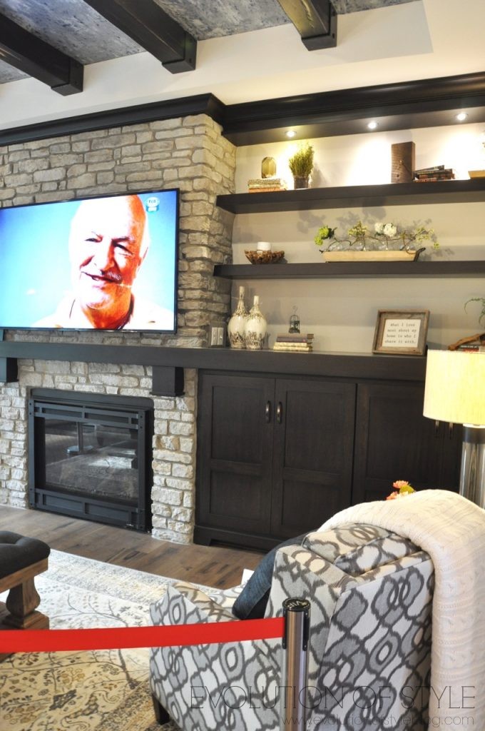
This detail around the fireplace is something I’ve never seen before – it lights up – so you can see how it would all blend together if the fireplace was on down here.
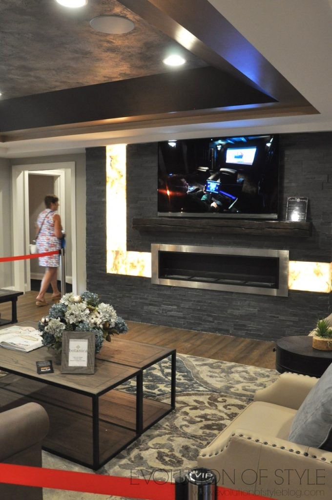
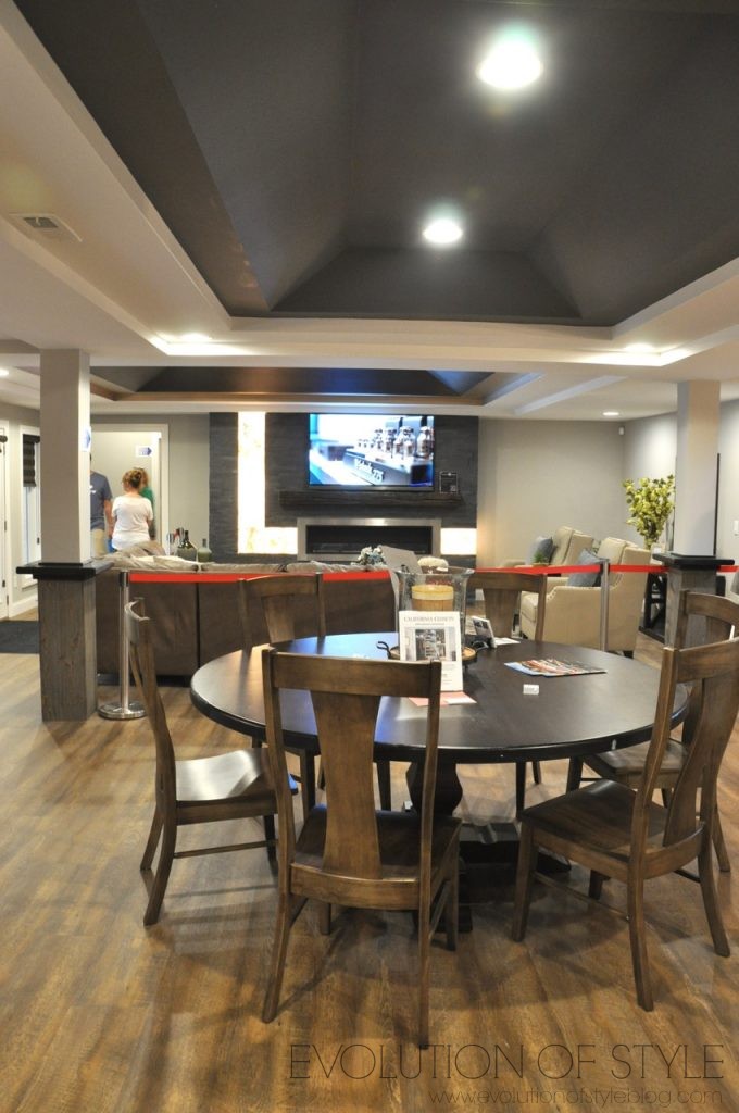
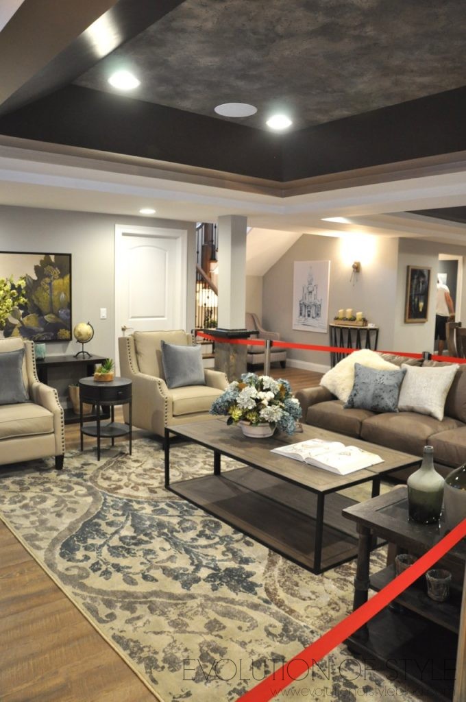
Pretty and comfy furnishings down here too.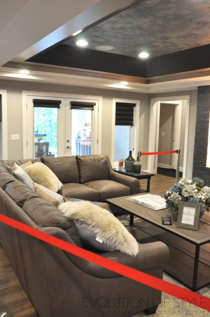
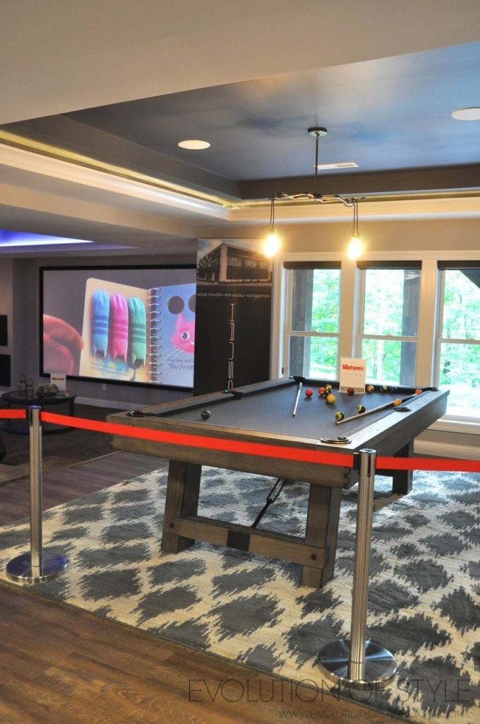
No one can say that there isn’t anything to do down here. Pool anyone?
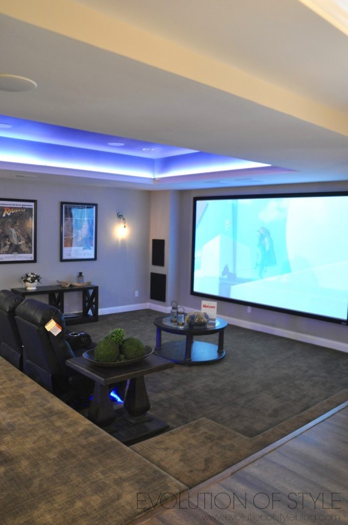
I love these sunken media rooms. They really just lend themselves to cozying up and watching movies (vs. having a movie on and doing a million other things around the house like I usually do).
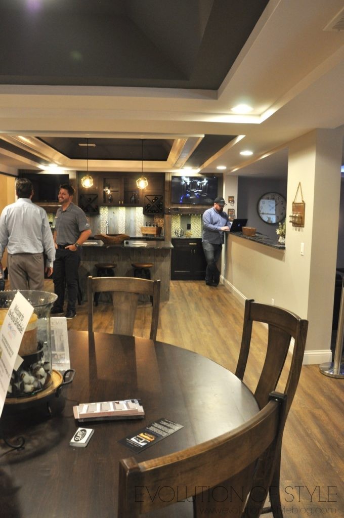
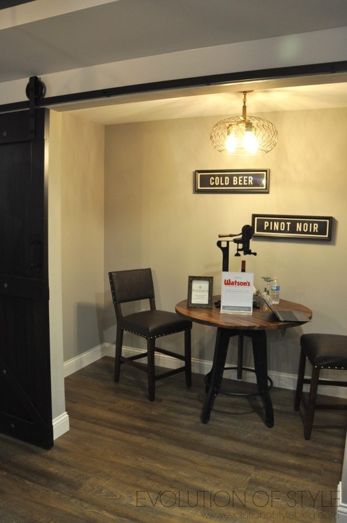
Bar area too – very industrial, and you can see more of the wood beam detail that they incorporated upstairs as well.
Another barn door that reveals a little wine room.
This basement also walks out to a great outdoor entertaining spot.
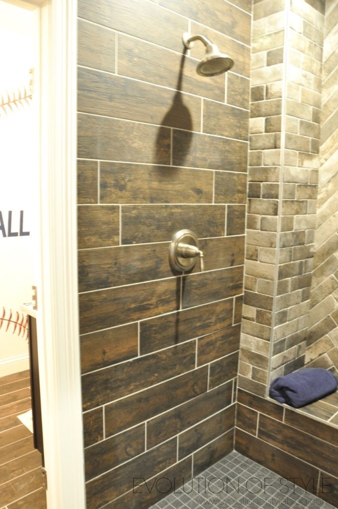
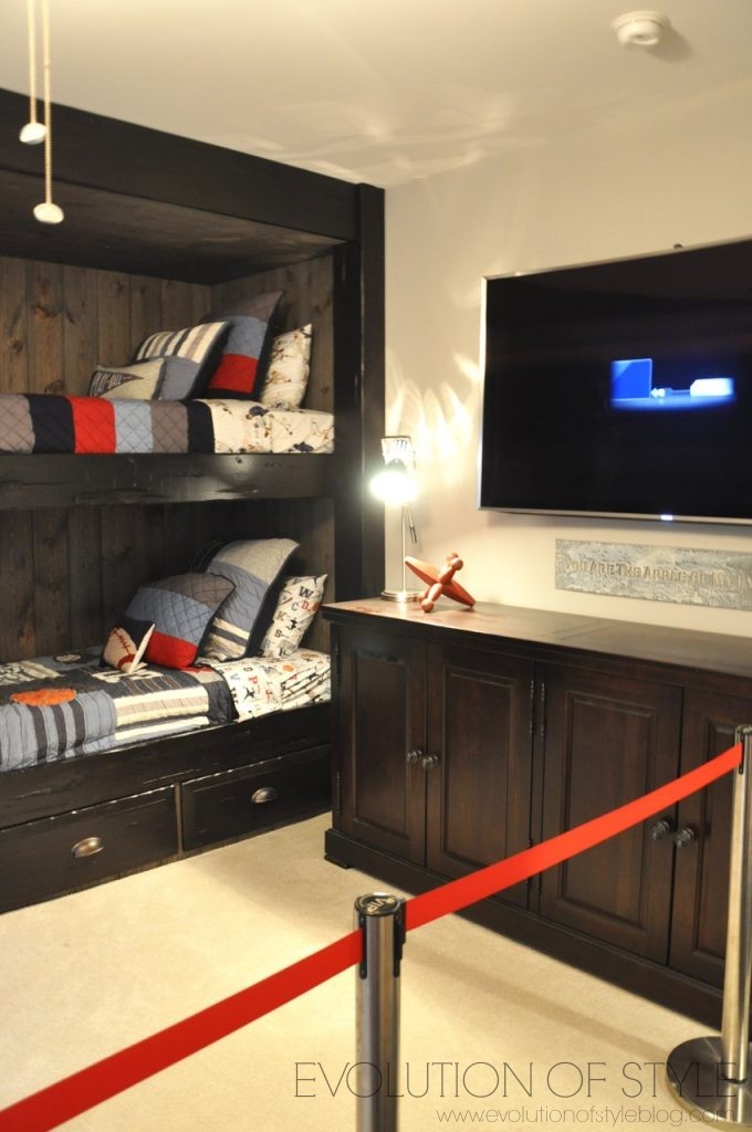
There are two more bedrooms down here also. Fun baseball detail on the wall of the shared bathroom.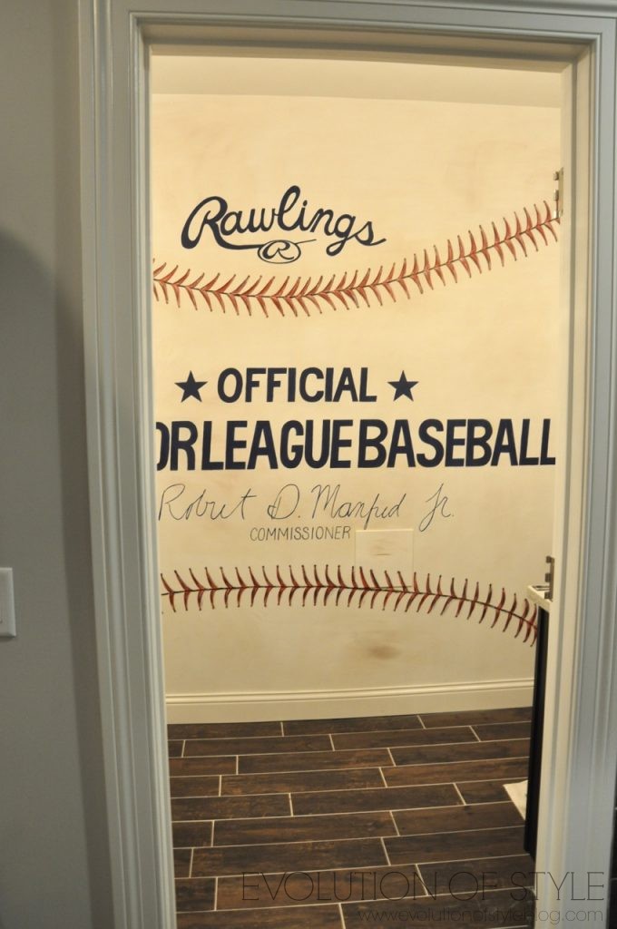
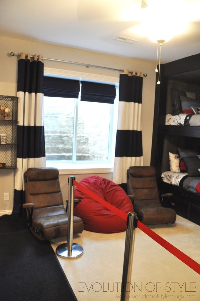
This bedroom is probably my all-time favorite kid’s room. I have always admired bunk rooms like these, and this one was just any boy’s dream room.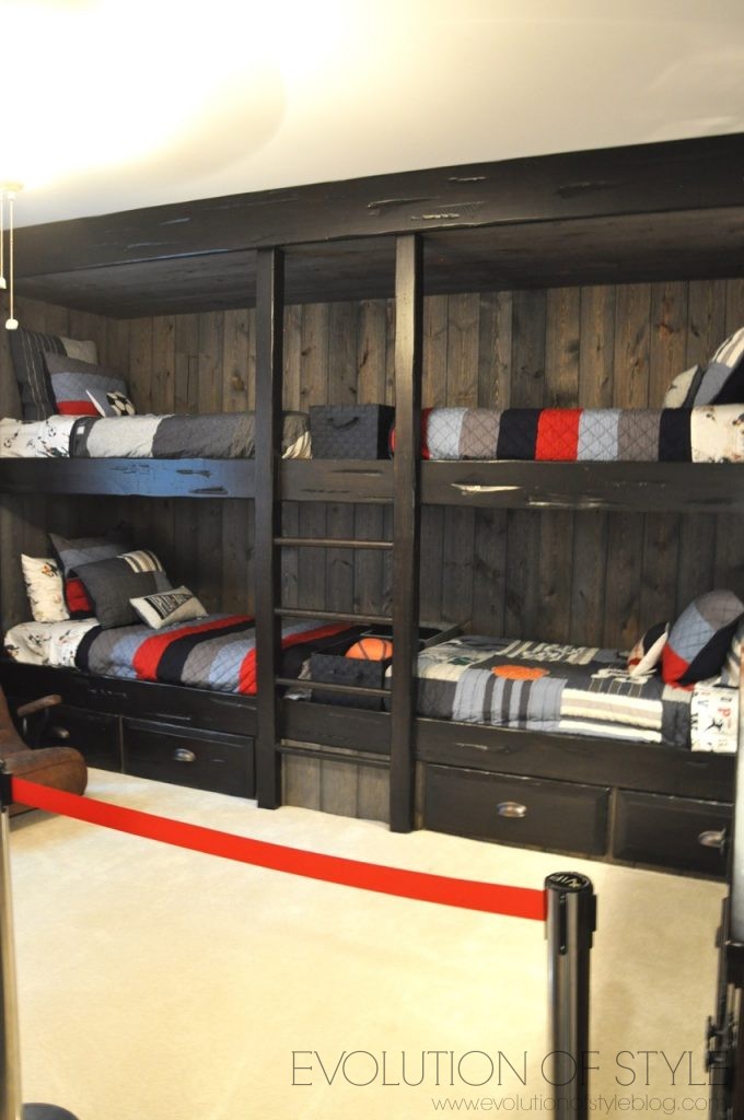
Gaming chairs, what more do you need?
It connects to this bathroom, carrying on the baseball theme with a “crowd” on the wall. Very cute.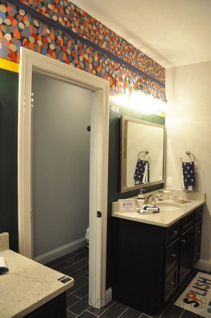
And then there’s the Batman room. With a Batmobile.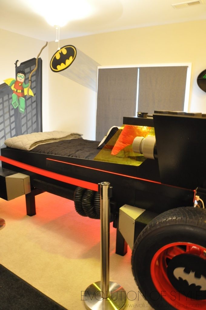
That lights up. Practical? Perhaps not. But I know there are plenty of little boys that would be willing to take it for a test drive.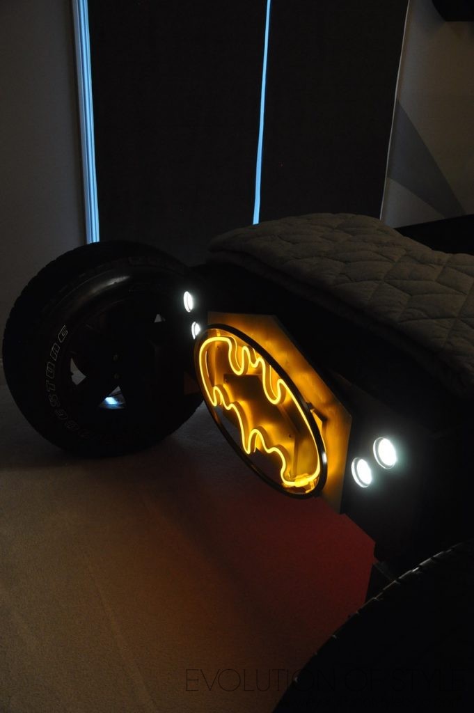
Another view of one of the basement living areas. So pretty and comfortable, don’t you think? And again – notice the hardwood floors down here. Love it.
There were no paint color palettes available for this home, sorry. But I did get one uploaded for this home on Day Two of the tour. 🙂
What do you think of this tour? Likes or dislikes?
One more house remains for tomorrow – it’s in a league all its own! Stay tuned…
Jenny

4 Comments
Kellie
July 19, 2017 at 3:29 pmI feel like there is too much going on in this house. I’m with you on the brick in the kitchen. Also that herringbone tile with that wood tile?? Yikes.
Lori
July 19, 2017 at 4:13 pmThis house is pretty awful.
I loved Day 1.
Pam Bolton
July 19, 2017 at 6:11 pmSo far this year’s Homearama houses aren’t doing it for me. Too much in some areas and not enough in others. Today I liked the teen girl bedroom, the outdoor patio and terrace and the most of the white kitchen except the brick stove surround and eating area.
Leah
July 20, 2017 at 8:30 amLeast favorite so far! Way to busy in so many of the rooms