Hello!
I hope you’ve enjoyed the homes from the 2016 Homearama tour so far, and there is still much more to come! If you’re just joining in, you can catch up with the previous days here:
Pine Valley
Price: $929,000
Square Footage: 4,600 sq. ft.
Builder: Justin Doyle Homes
Website: www.justindoylehomes.com
In the Homearama guide book that we received for the tour describes this home as casual, comfortable, rustic and classic with an urban farmhouse style. I think that’s a fair description, and as we go through the tour, you’ll see those elements in the design, layout and finishes. Let’s get started, shall we?
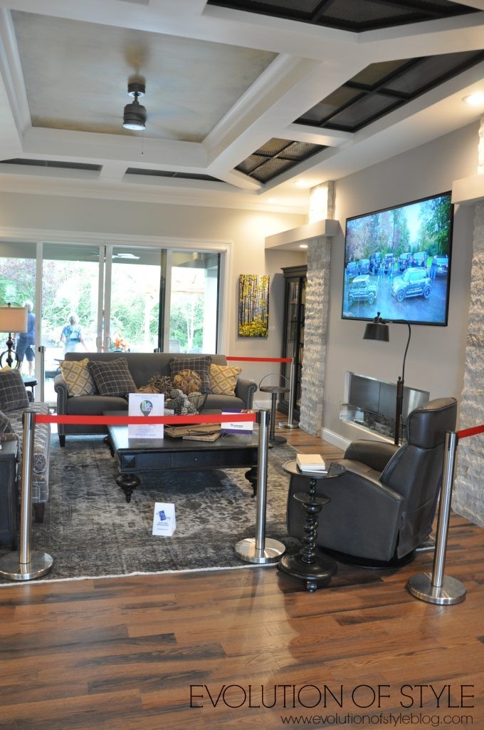
When you walk in the door, you’re greeted with a family room and doors that lead to the backyard. Take a look up at the ceiling – the black insets are kind of like metal grates, for lack of a better description. While they look interesting in the photo, they reminded me of a fire escape, quite honestly. Not a big fan.
But I love the open floor plan, and how the kitchen flows seamlessly into the family room and dining room area. Again, no formal dining room, but the dining room space they have in this home is huge – plenty of room for entertaining, and really, it makes so much more sense having a setup like this, doesn’t it?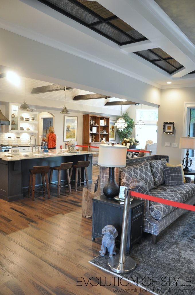
To the right of the entry, is the home office. I guess this is where the “rustic” description of this home comes into play, with the wood beams and the iron work on the walls. 
Continuing on through the right side of the home, there is a handsome looking bedroom.
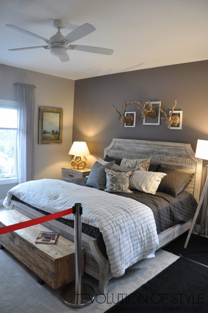
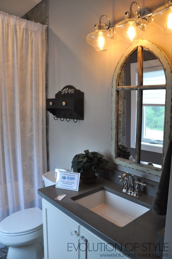
It has its own private bathroom.
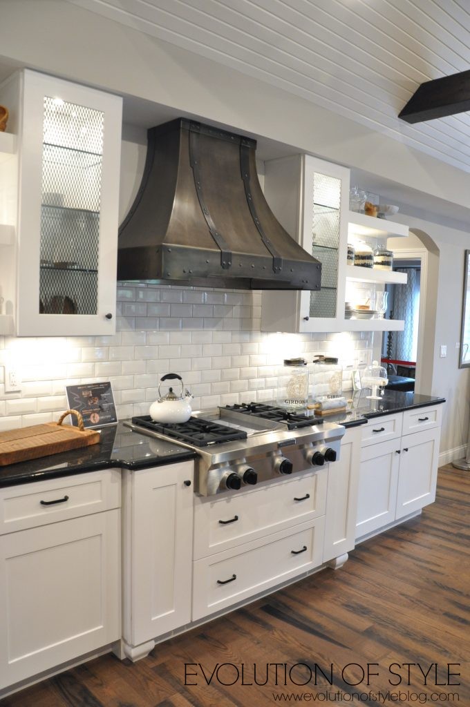
Back out to the main living area, we’re in the heart of the home – the kitchen. It’s a great space, light and bright, but I have to admit, I’m still smitten with the floors from the first home tour. But it’s still gorgeous, don’t get me wrong.
They carried the metal detail that was in the ceiling in the family room, to the cabinet door fronts here, along with open shelving and a metal hood.
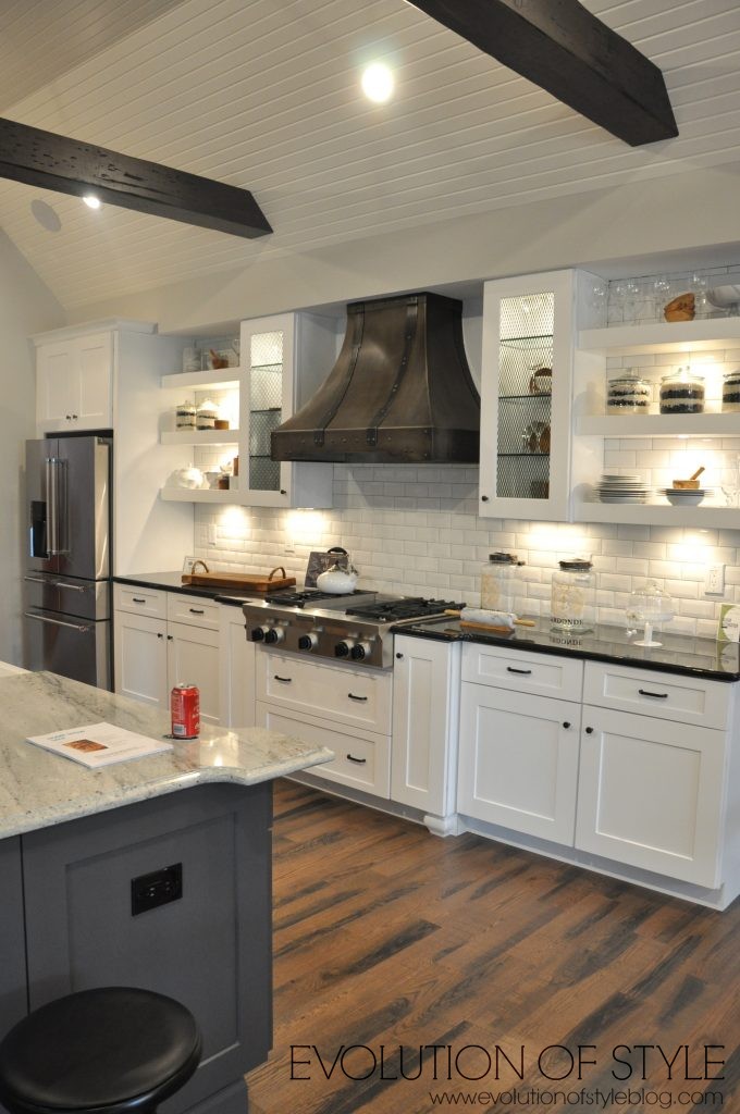
I love the high ceilings with the wood beams, and the sliding barn door that they incorporated. And of course, who doesn’t love a huge island?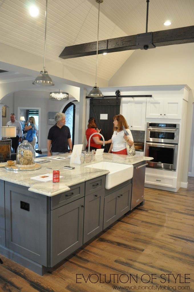
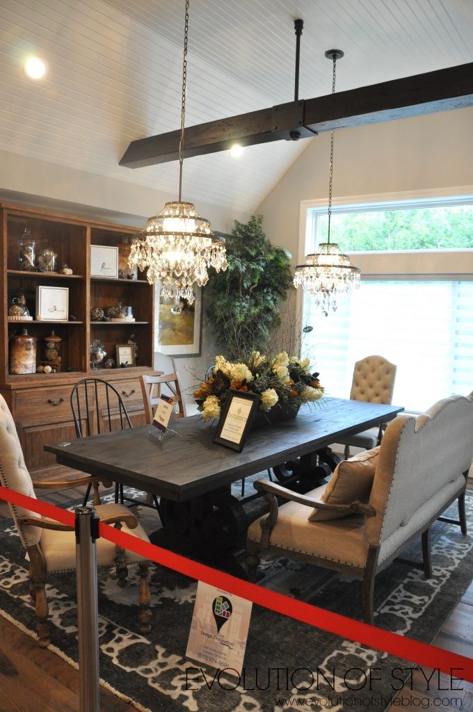
Here you can see how the kitchen flows right into the dining area. LOVE this space.
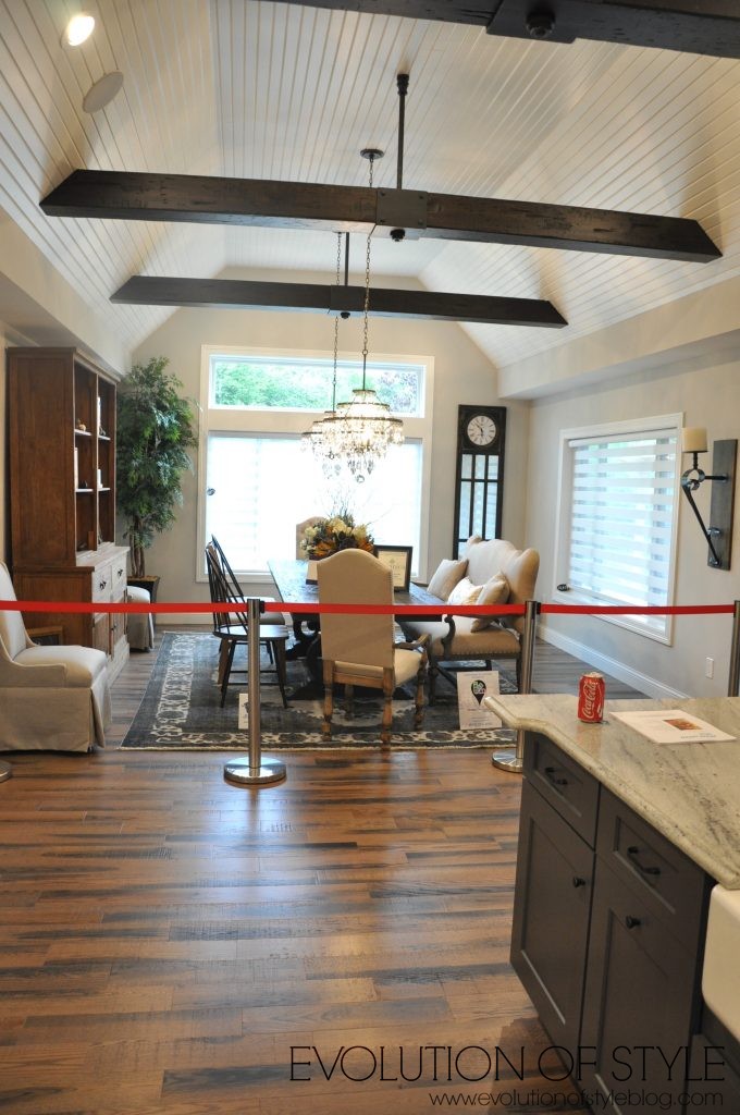
Here’s a closer shot. Isn’t it lovely?
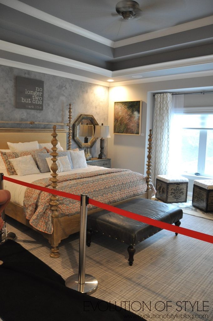
From here, we went through the master suite. The carpet pattern caught our eye – kind of a new take on an old style.
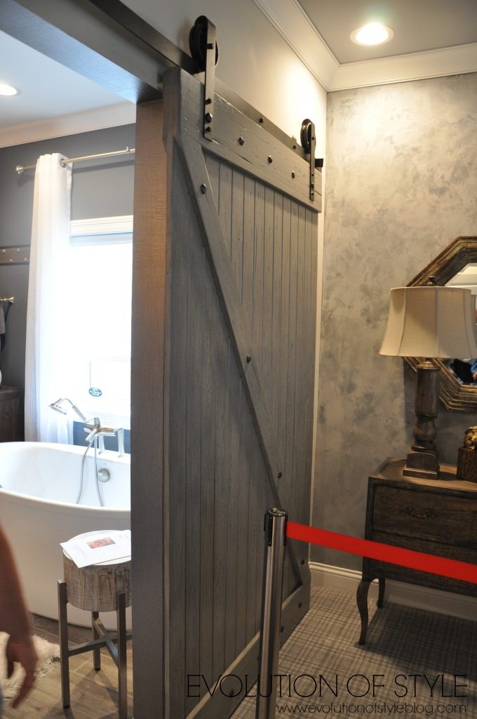
Another sliding barn door to the master bathroom.
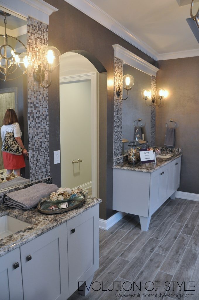
And then the master bathroom. Call me crazy, but I think the mirrors would have looked better if they were just completely trimmed out with molding and not the addition of the tile. It just seems a little too busy for me, especially with the granite. Lots of lighting fixtures with the Edison lightbulbs in them – that was a big trend throughout a lot of the homes.
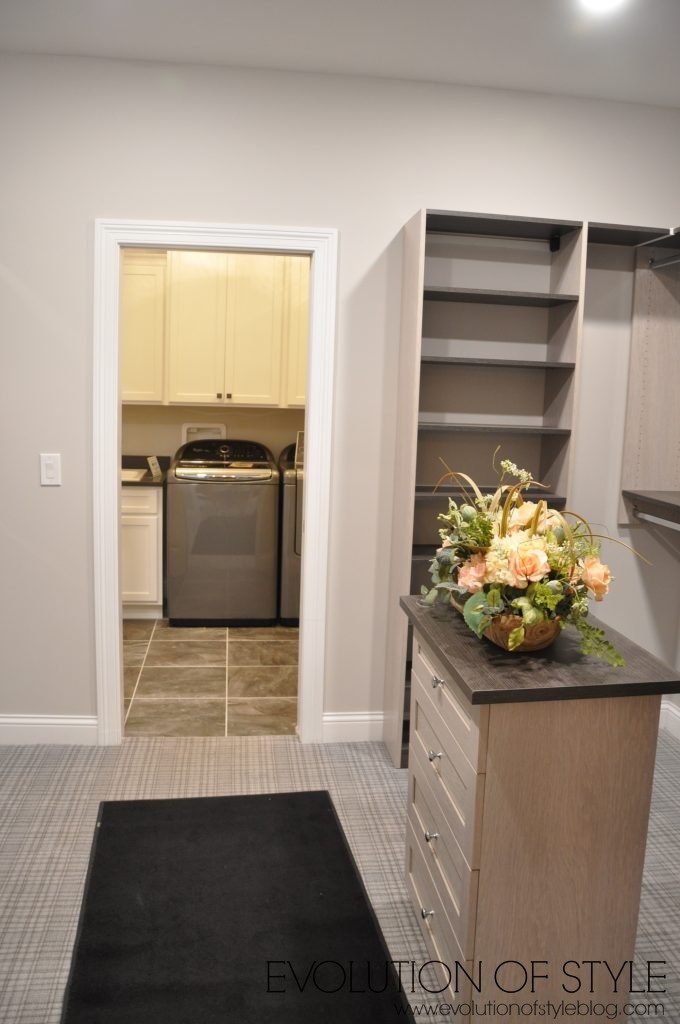
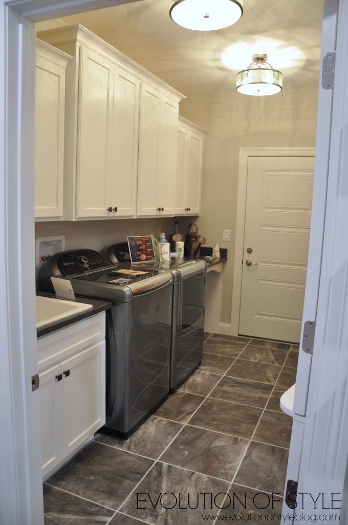
Through the master closet, you have access to the laundry room, which I thought was a nice touch.
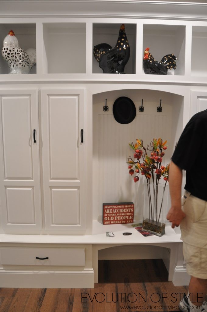
A landing spot for all of your stuff when you come in the door.
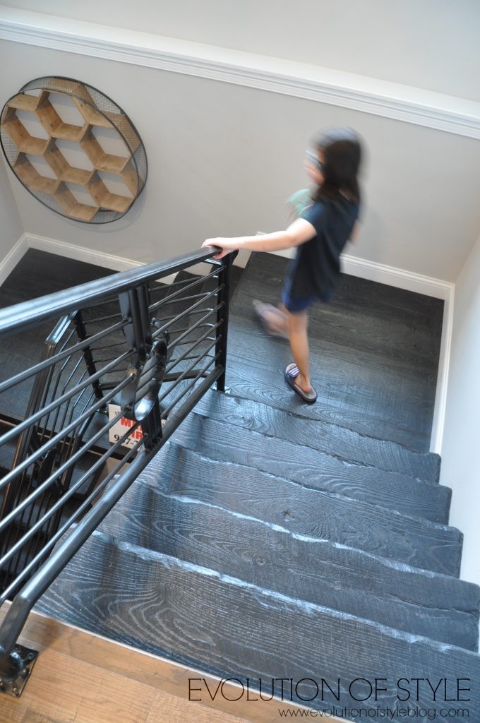
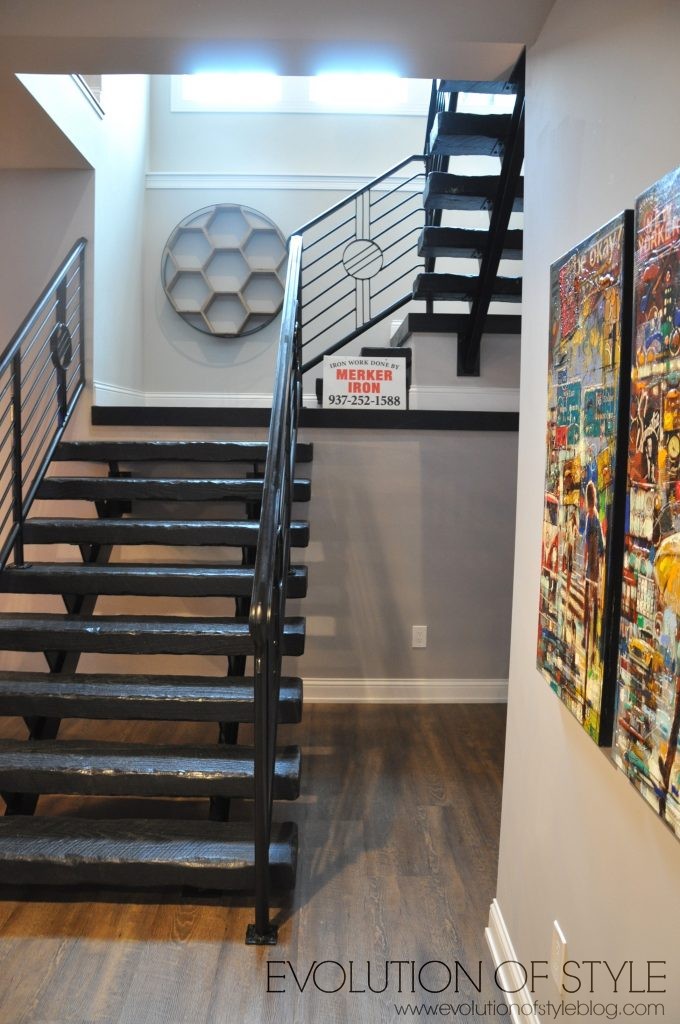
And then we made our way downstairs. I’m not a big fan of these stairs, I’ll admit it. The rustic log vibe just didn’t make sense to me.
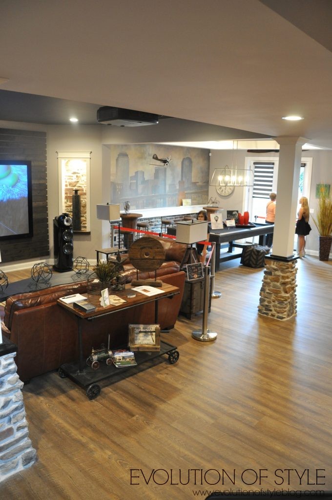
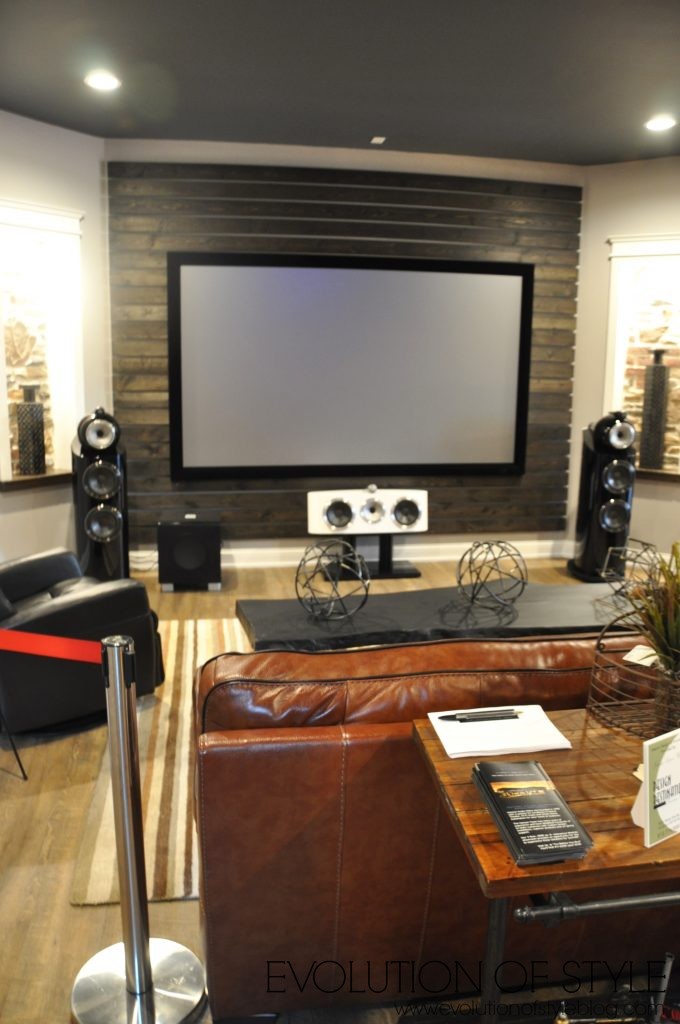
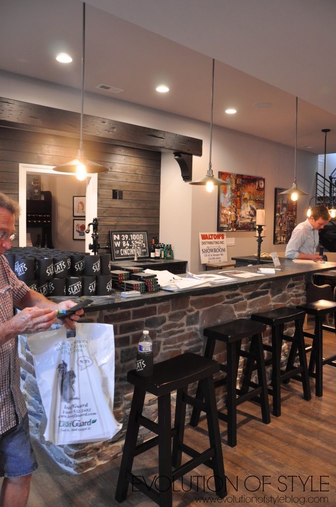
A great entertaining space, that’s for sure.
I’ve seen these lights in dining rooms, but I really like it as a pool table light. And how cute is the wall mural?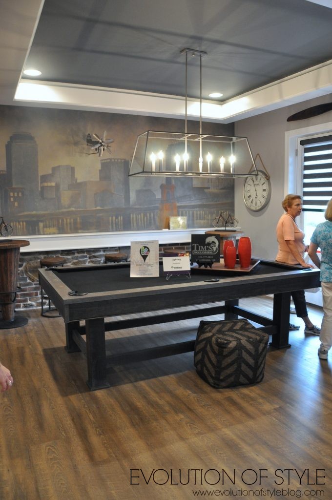
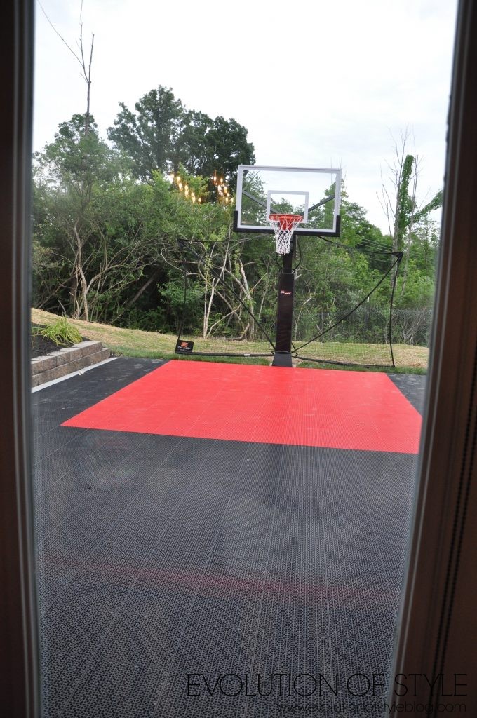
Off the pool table area, you have this awesome basketball court. My kids would LOVE this. My only concern would be basketballs going through the glass.
A couple more shots of the basement areas – poker table…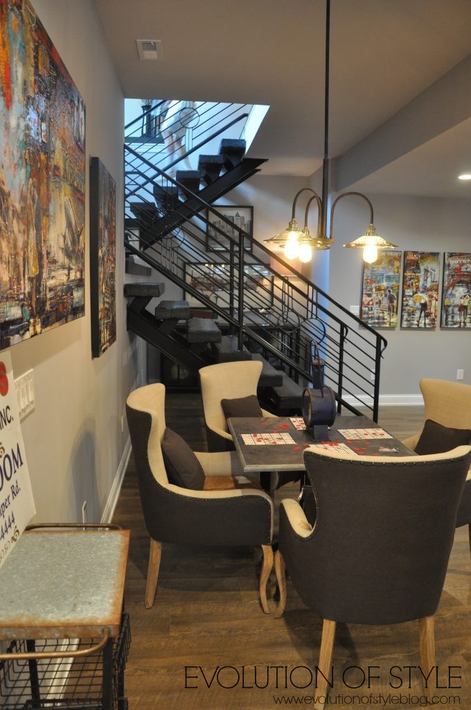
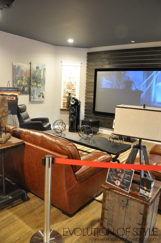
A better shot of the staircase –
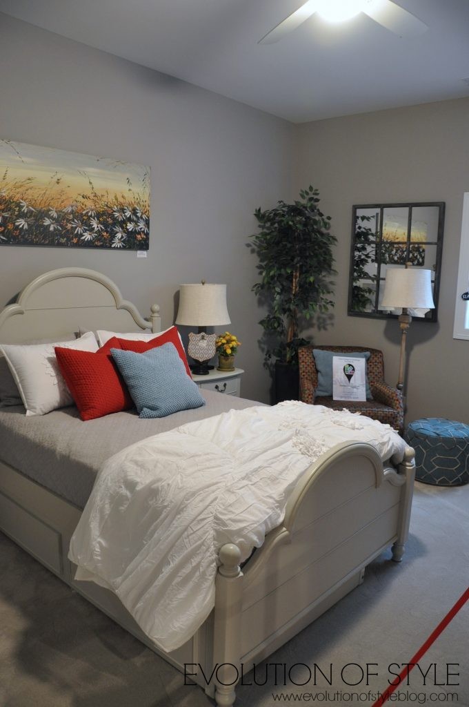
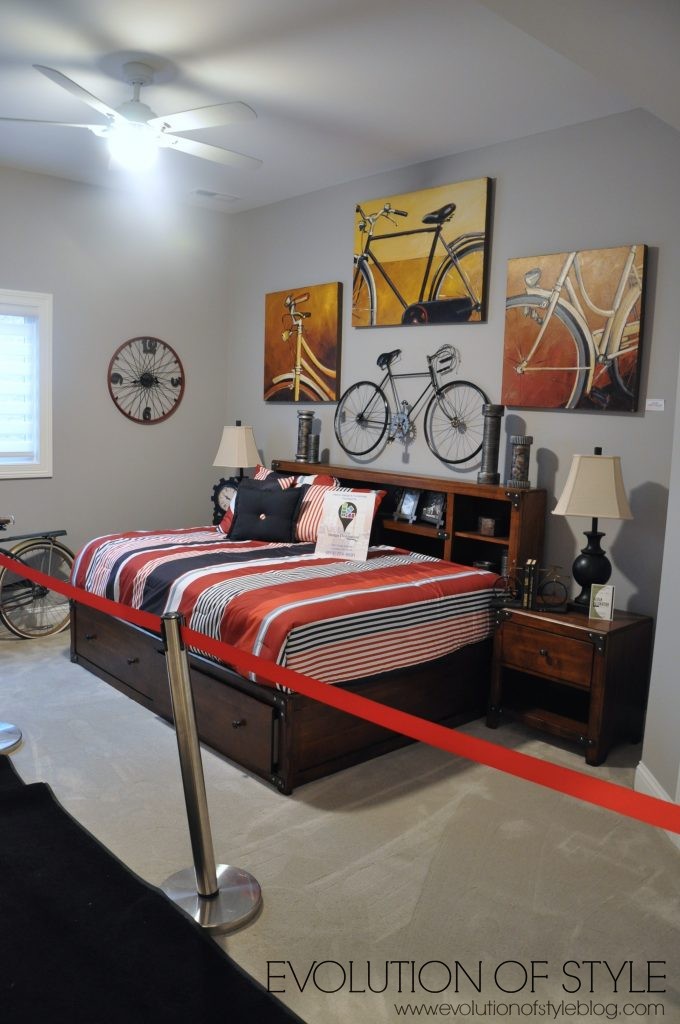
There are two bedrooms down here as well, and they share a bathroom.
Really cool sink, the only downside is that there isn’t a whole lot of counter space. But I still like it.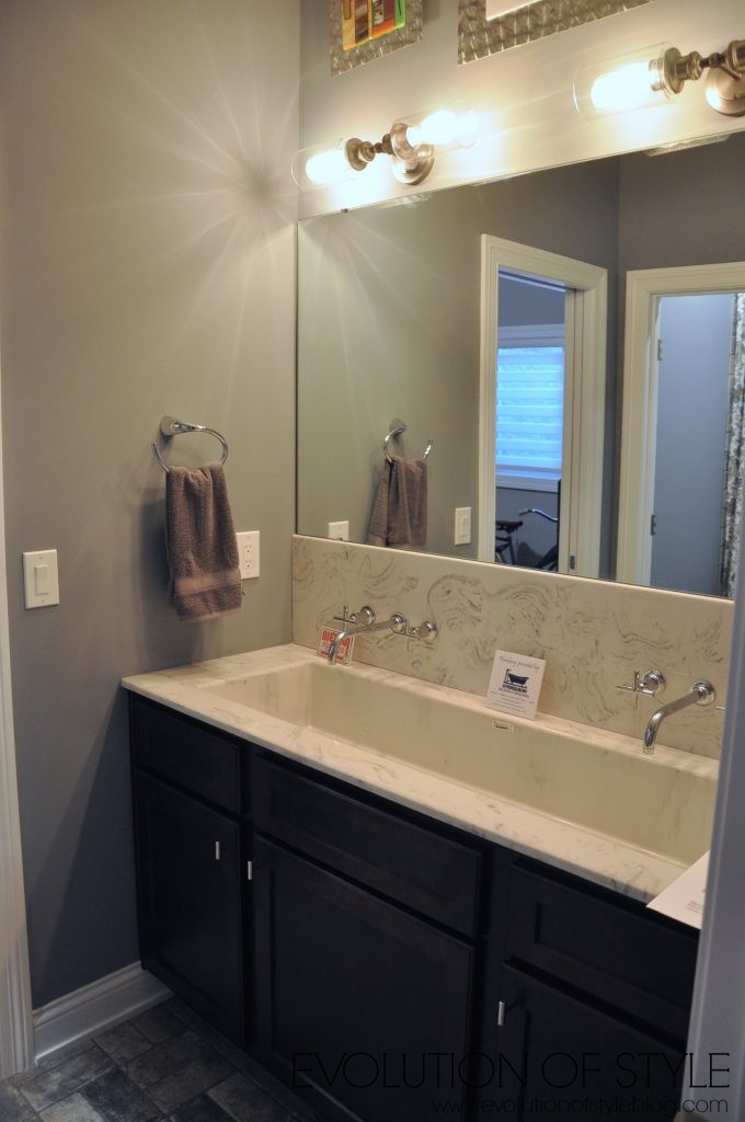
In going through these photos, it dawned on me that we didn’t go outside! I’m not sure how that happened – looks like we had access through the family room, but we must have missed it. So, I found these photos from the Homearama Facebook page.
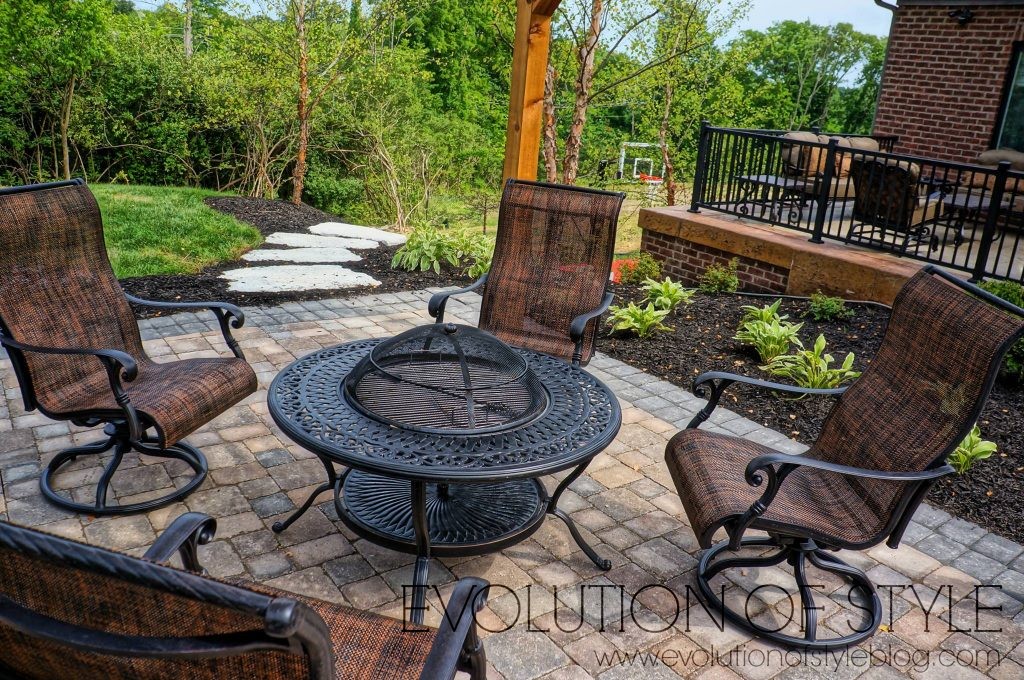
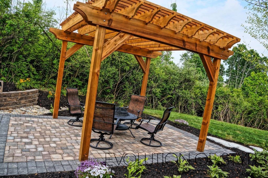
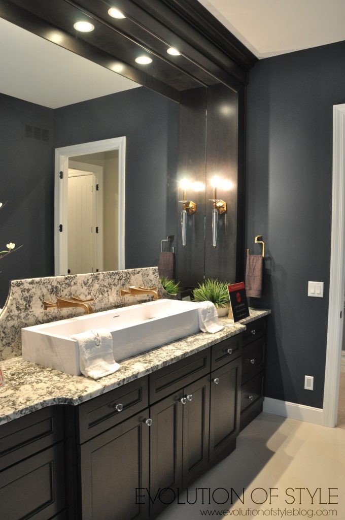
So that wraps it up for this tour – any favorite things? I love the kitchen/dining room area and how it’s so conducive to entertaining. More to come – a peek from an upcoming tour…
Jenny


5 Comments
Kelly
June 22, 2016 at 12:43 pmNot enough color. Most of these houses are boring. What is up with all the gray and black!
Mary
June 22, 2016 at 2:13 pmI was not a fan of this house at all. So many finishes seemed gimmicky or played-out (barn doors and steampunk range hoods.) I could not live with that busy tile around the mirrors in the master bath that clash with the granite. So much money that could have been better spent.
Jenny
June 22, 2016 at 9:51 pmI think you hit the nail on the head with the steampunk reference, as it summed up what I was thinking but didn’t quite articulate. It was like they went overboard with some of the themes they were trying to incorporate. I think it could have been a lot more effective if they had incorporated some of those elements in much smaller doses.
Tara
June 22, 2016 at 4:31 pmAgain, a few things I love, more than a few I do not, and not my favorite house so far. Love the kitchen/dining/seating area. As in LOVED. Don’t love the laundry room off the master closet. So you’ve taught your son (or daughter) how to do laundry and he’s going to go through your bedroom and closet to do it? No thanks. Really dislike those grates in the ceiling in the front of the house. I can imagine the next designer coming in and stating, “These must go! Immediately!” Don’t love the flooring or the plaid carpet. I’m seeing the return of things I didn’t like when it was popular years ago and I’m not usually a fan this time either. One of the (many) disadvantages of getting old I suppose.
Jenny
June 22, 2016 at 9:53 pmThe kitchen dining area was fantastic, I agree. I should mention that the laundry room is accessible through another door, not just the master suite. And yes, the grates need to go – some of the elements they added took things a little too far and would have been much more effective in small doses.