Hello!
Thanks for following along with the tours friends. Even if you don’t like the home as a whole, I hope you can find a couple of things that you like, since no home is perfect, right? We’re on to the fourth home of the tour today, so let’s get to it.
If you’re just joining in, catch the other tours here:
Homearama Week 2016 – Day Three
The Gables of Woodland
Price: $930,000
Square Footage: 4,700 sq. ft.
Builder: Homes by Gerbus
Website: www.homesbygerbus.com
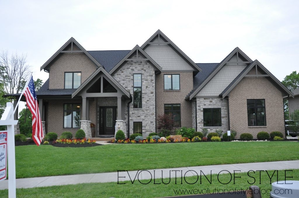
This home is described as “vintage warmth meets modern design in this transitional-style home.” Let’s go inside.
I need to get better at taking photos of what things look like when you walk in the front door, but to the left, is the home office.
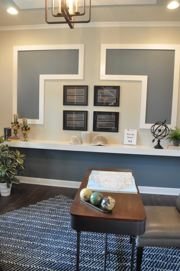
This shot gives you a look at the ceiling.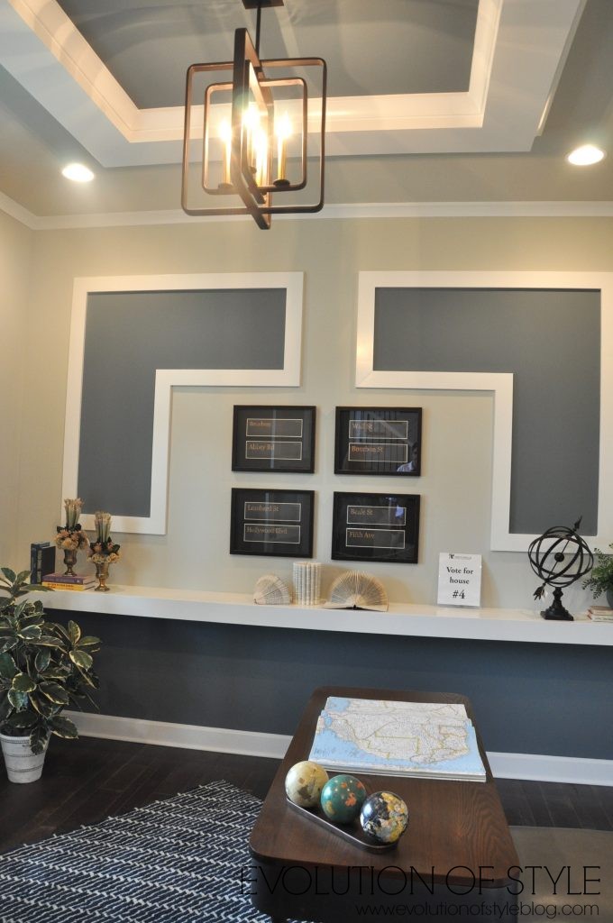
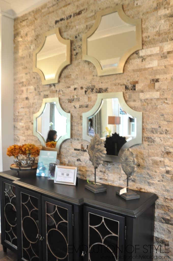
This is on the right as you make your way towards the family room. I like the collection of mirrors as a focal point here.
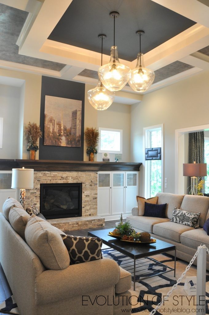
Lots of interesting ceilings in these homes, and I’m kind of digging this one, even though it’s a bit outside of my comfort zone in terms of the style and color used. I like the lighting trio here, and it just seems to work in this space. It’s a really high ceiling, and the color and lighting seems to ground the room. And I love the rug.
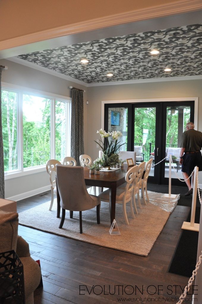
The dining room is off the family room, towards the back of the house (again, no formal dining room – yay!). While I love the layout here, because it feels like you’re in a treehouse, I’m not a fan of the ceiling treatment in here.
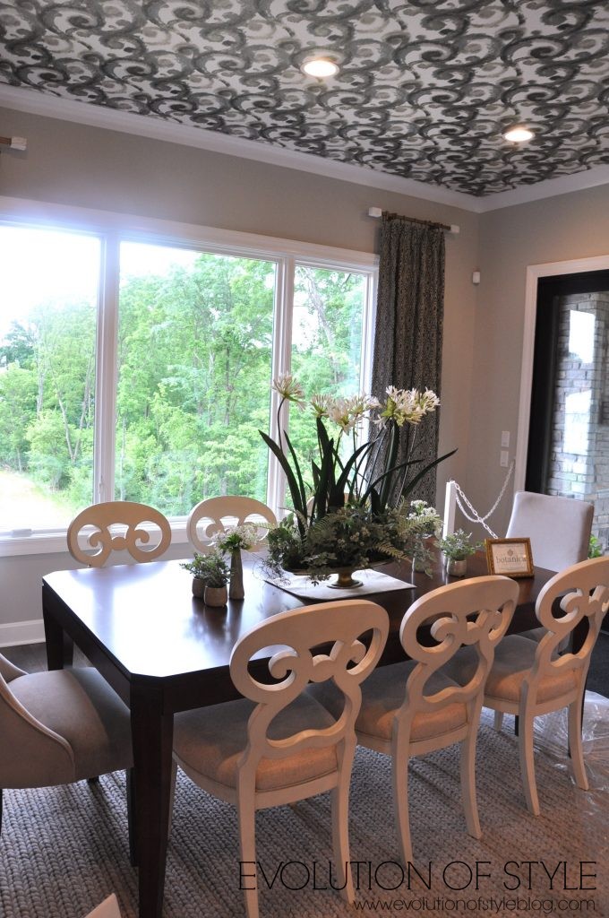
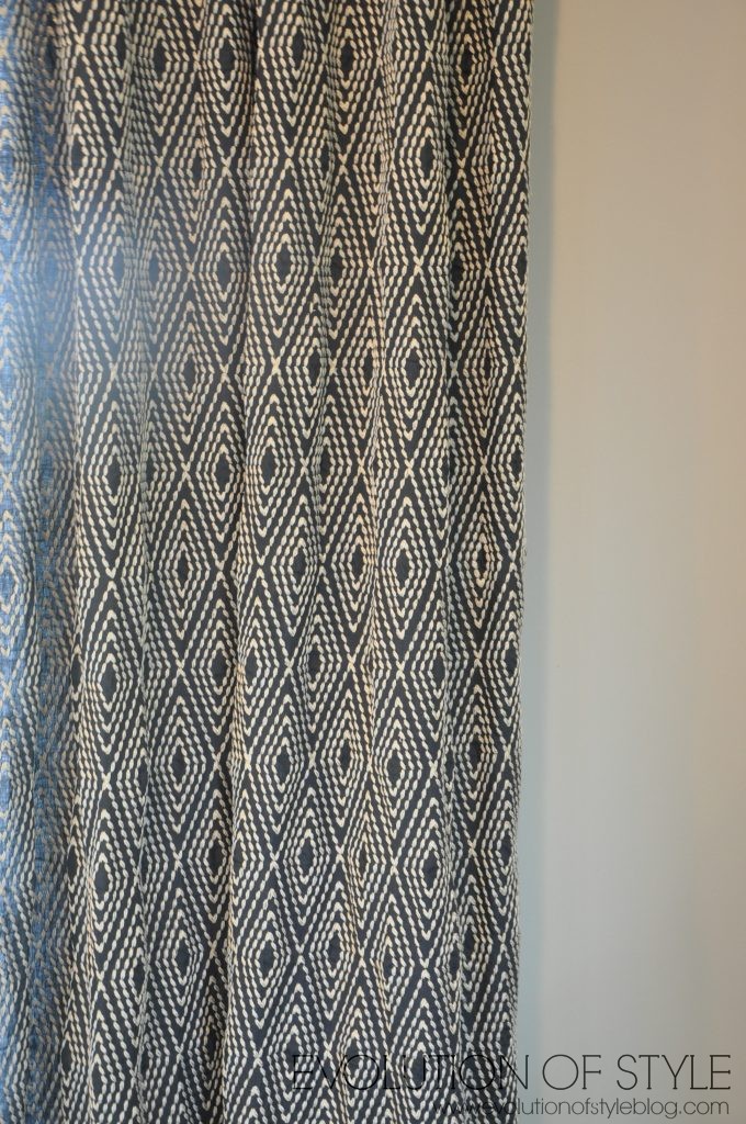
The fabric on the drapes was snazzy – I’m a huge fan of navy blue, and love this graphic pattern.
A look back into the family room from the dining room area. You also get a better look at the pretty floors (since they’re mostly covered up throughout the house).
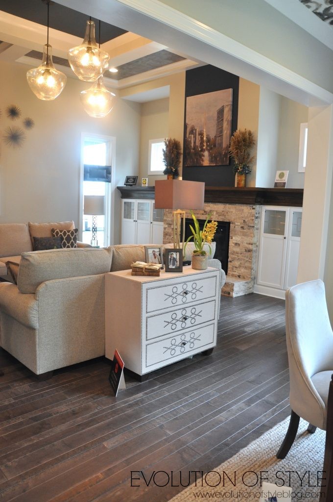
The dining room is off the kitchen, which is also at the back of the house.
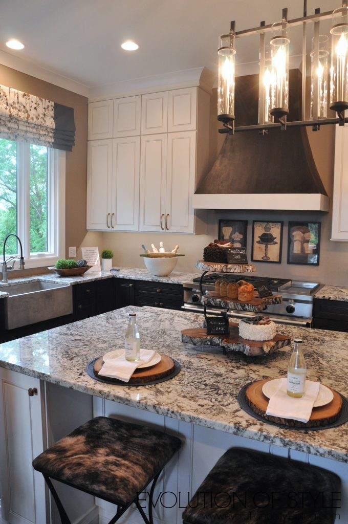
Another beautiful hood, and stacked cabinets to the ceiling. But where is the backsplash? I don’t understand why that was left out in this kitchen. Actually, if I remember correctly, the walls had a texture to them – not sure if it was wallpaper, but it wasn’t conducive to a kitchen environment. And pictures behind the stovetop? Maybe these cooks aren’t as messy as I am. 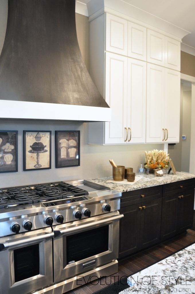
More Edison-style lighting.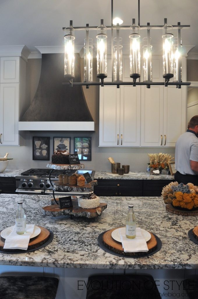
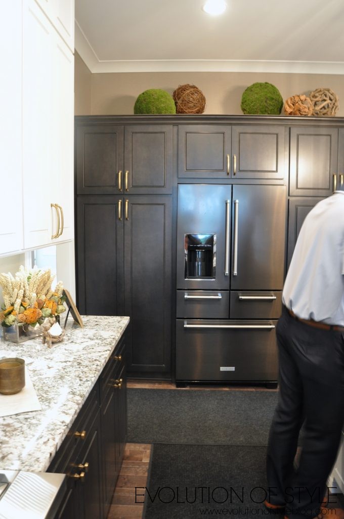
I like the drawers and shelf space carved out here at the end of the island. And my apologies for all of the people in the photos. The house greeter didn’t manage the traffic flow very well, and it was more crowded than our other tours as a result.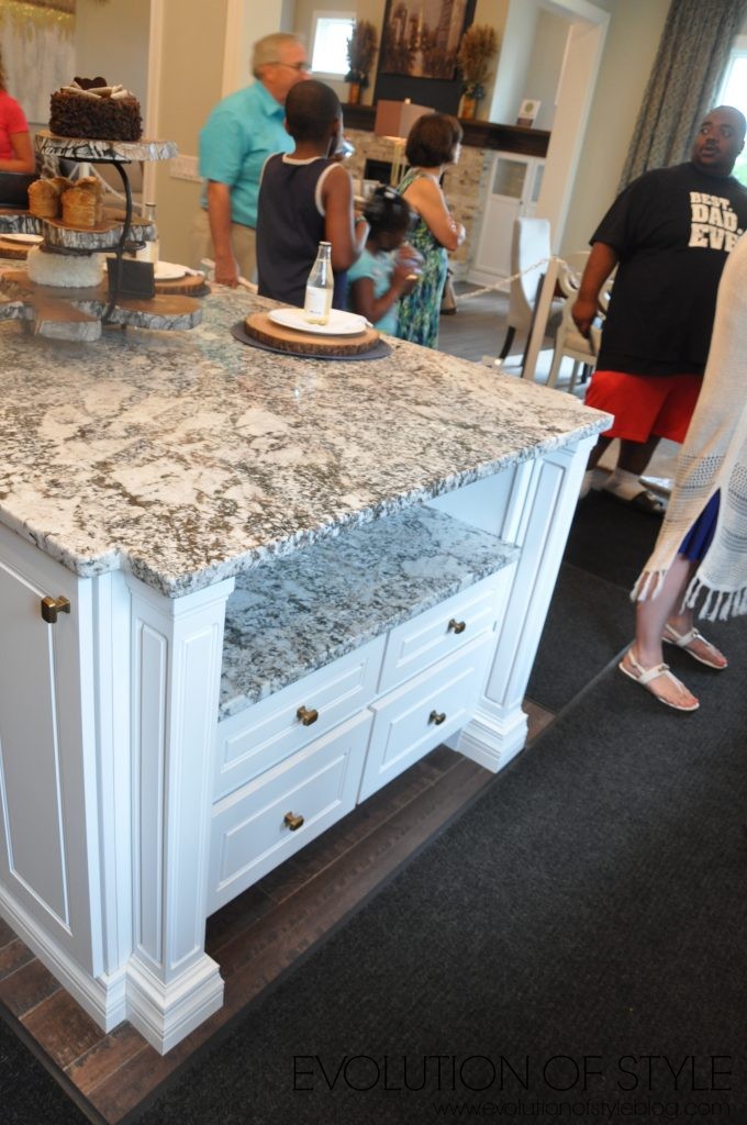
Again with the cute stools.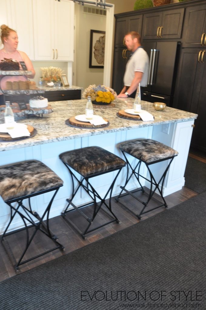
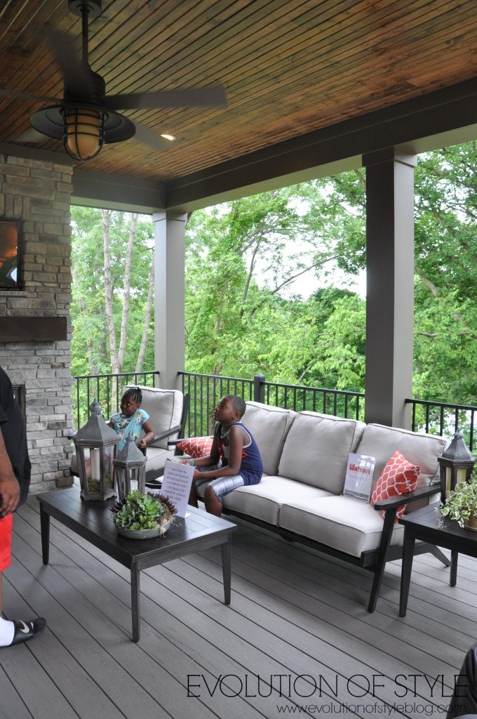
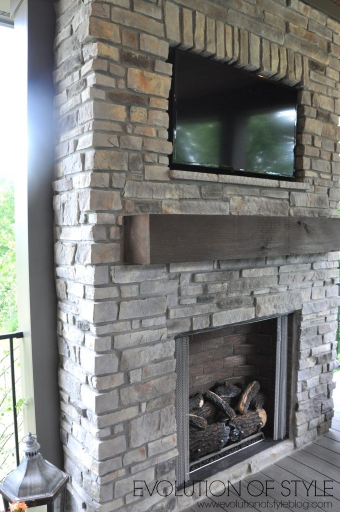
There is a pretty covered deck off of the dining room, which makes for great entertaining.
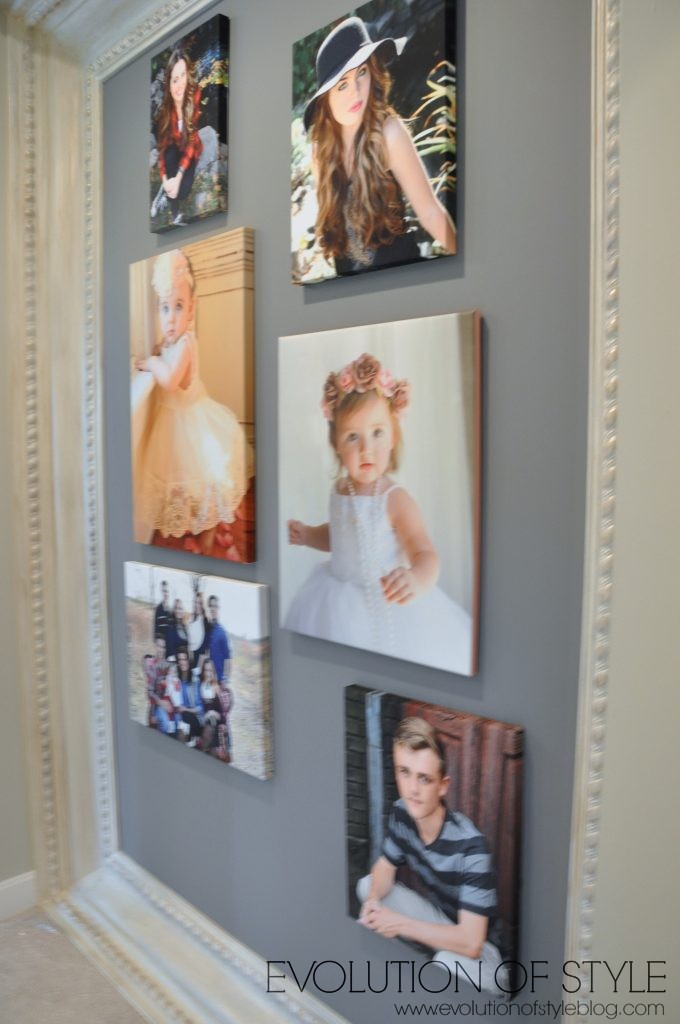
We went back inside and then to the master bedroom which was on the main floor back from the kitchen. As we walked in, we passed this super cool framed out wall that was staged with photos. It would also be really neat with a huge mirror inset as well. But I thought this was a neat idea.
The bathroom vanity area was a big eye catcher for me. This huge framed mirror gave it such a high-end look and felt so grand and classic.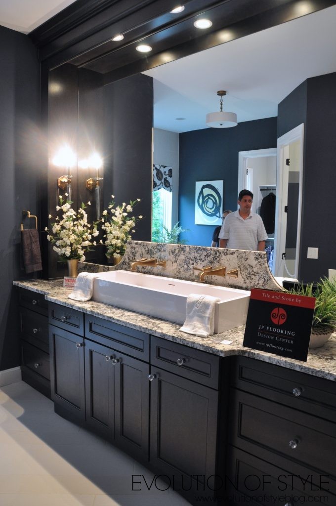
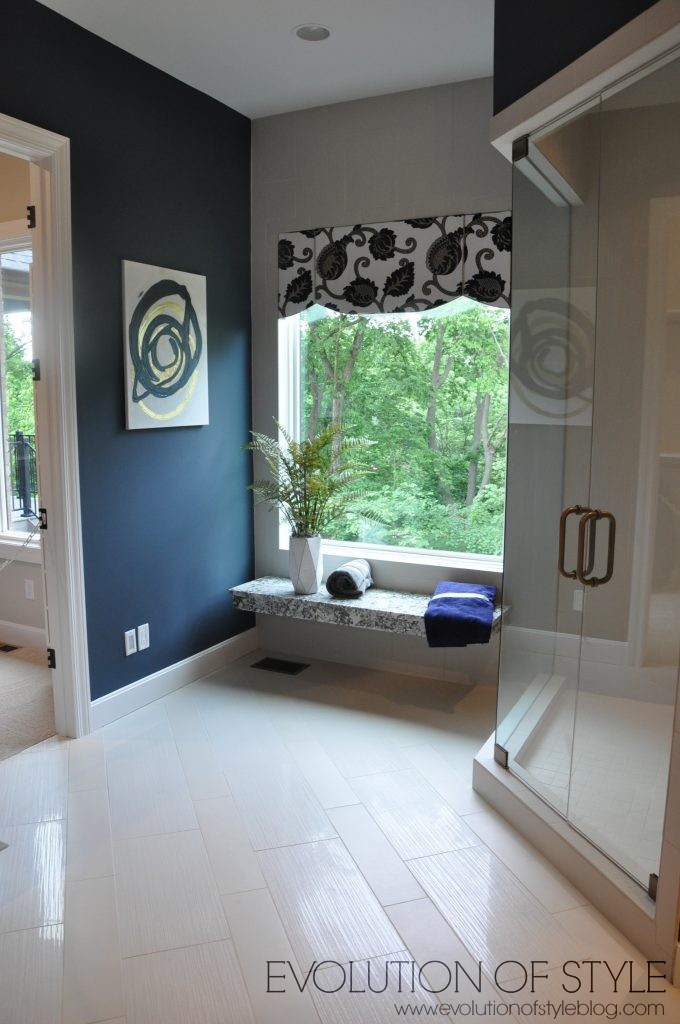
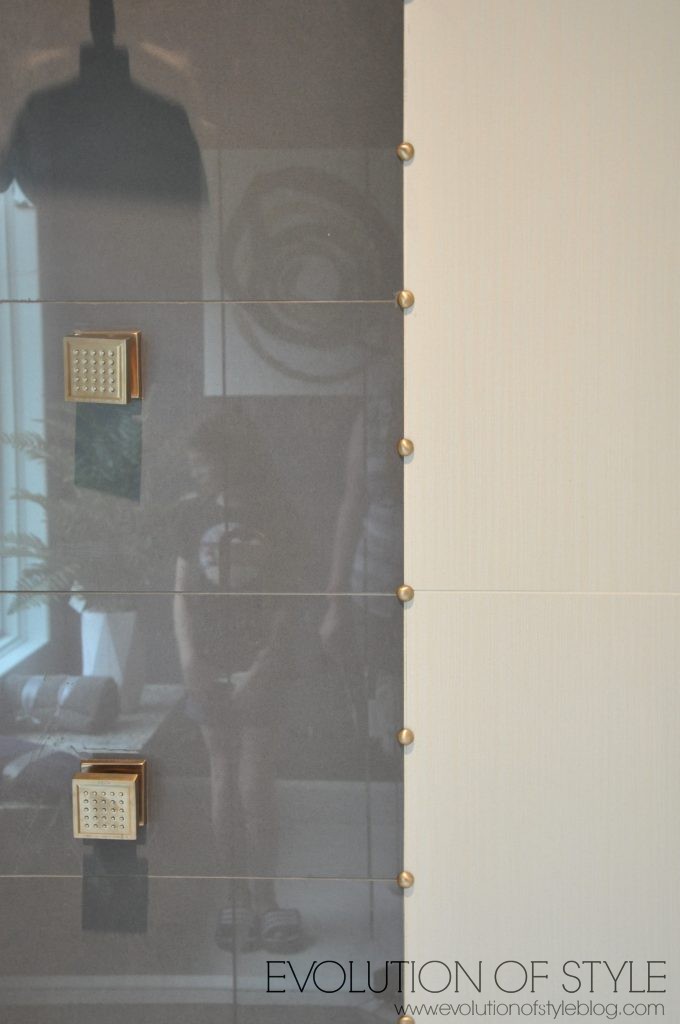
This is a shot of the shower tile – another stripe, with almost a nailhead trim detail. Cool.
And I’m digging the wall color paired with the dark wood – so rich looking.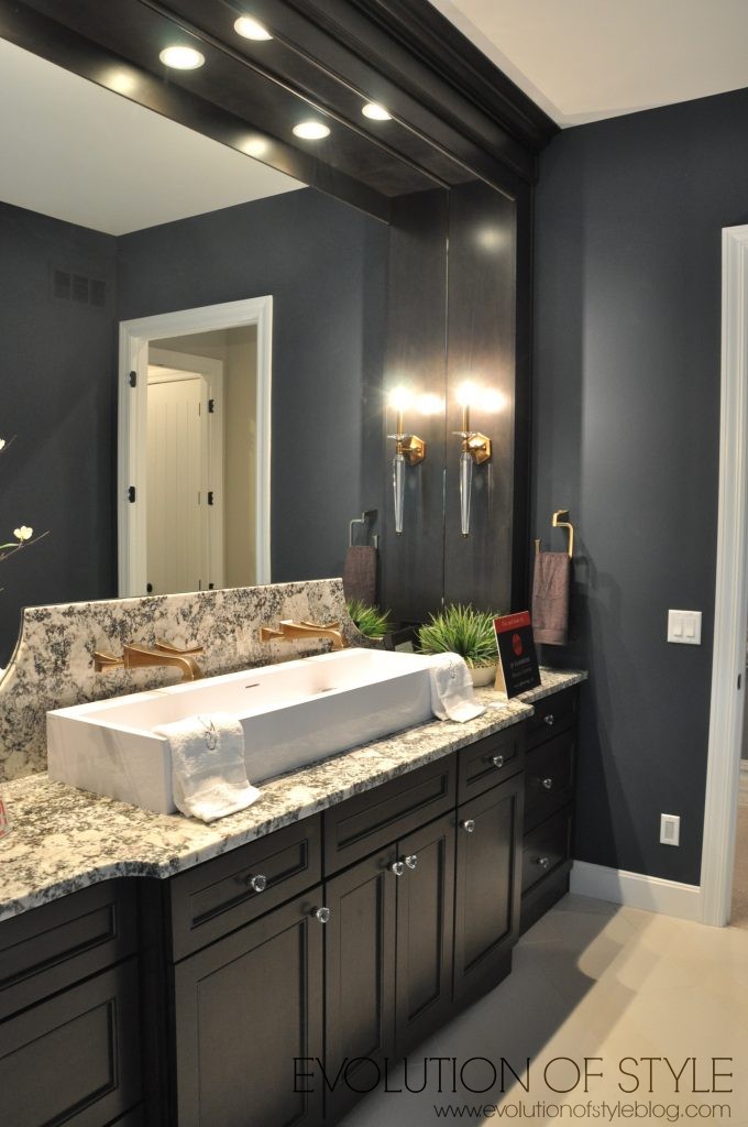
Lots of stripes in this house –
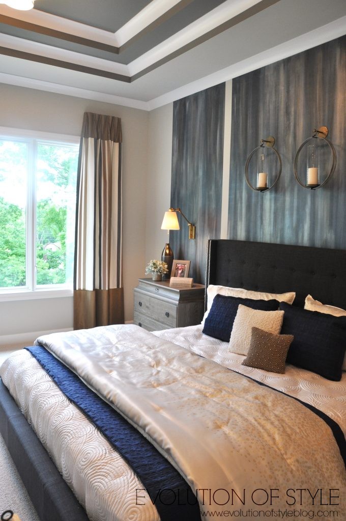
Back to the master bedroom. I don’t know if I’m a fan of the wall treatment – I would have preferred more of a grand bed, but I like the side tables, and I guess with a room of this scale, you need something to balance that out a bit. I’m trying to imagine the room without the stripes, and I think the bed and nightstands would look almost miniature without them.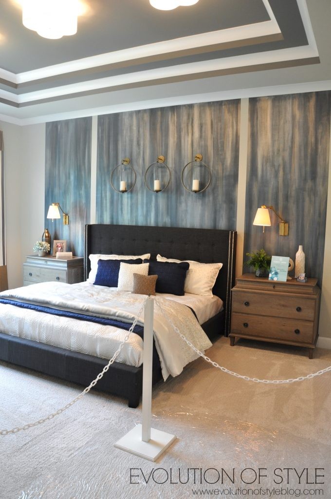
Again – this room has a treehouse vibe to it with the massive window that backs up to the wooded yard.
A triple light fixture feature on the ceiling vs. a single chandelier.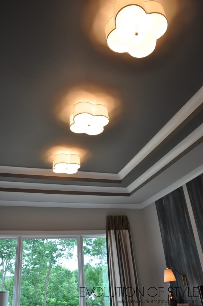
There is a little vestibule area as you head out of the master to access the upstairs and the basement.
Pretty artwork out here too.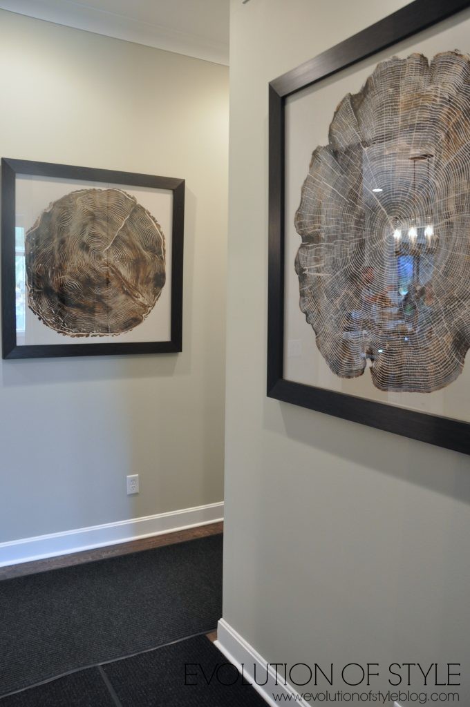
The laundry room is off of this area too.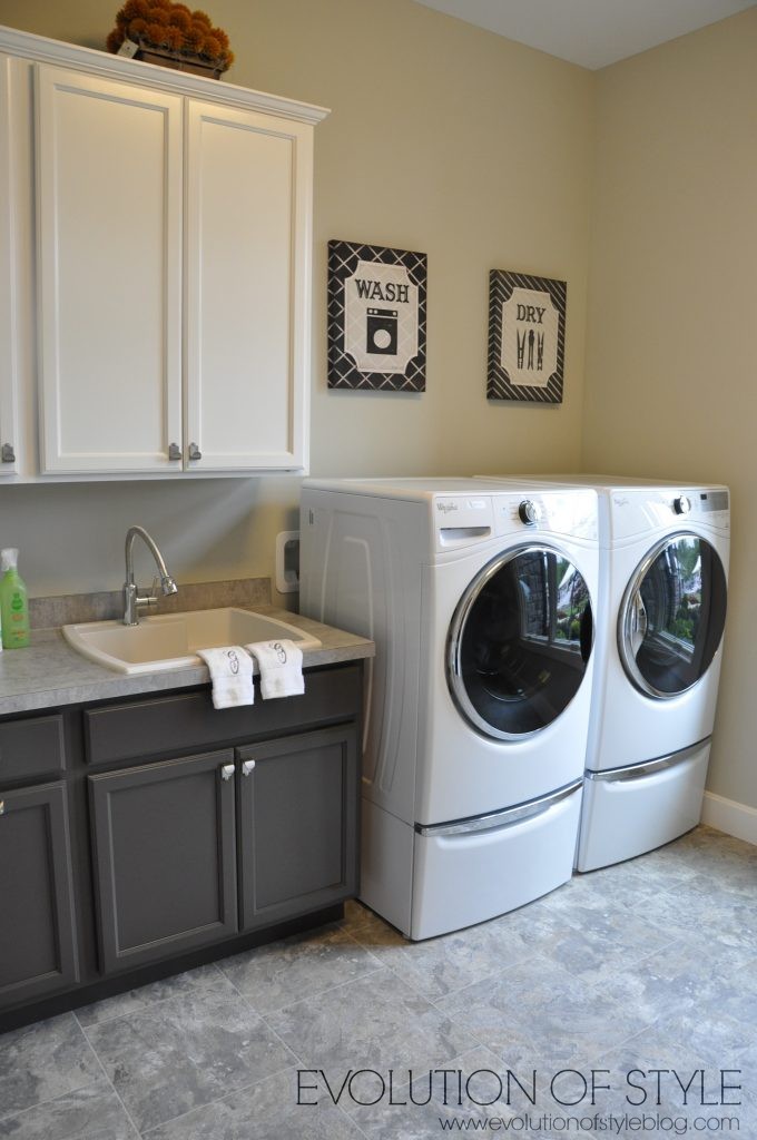
Not sure about this cabinet setup. The top cabinets are awfully high – kind of odd. But I appreciate the folding table.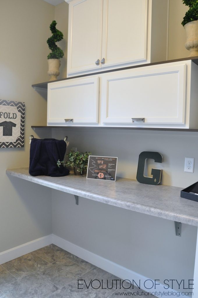
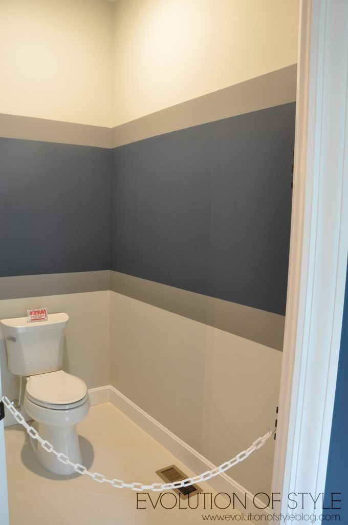
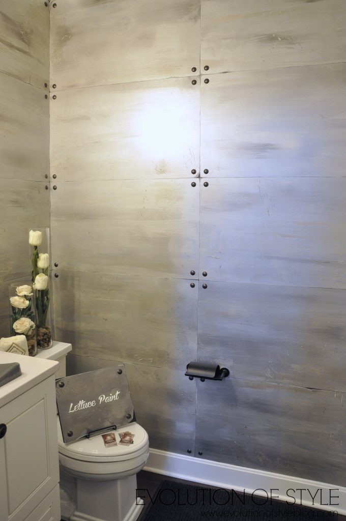
There is a powder room back here as well. And can you believe this is a paint treatment? Way cool – even if it’s not your taste, you have to appreciate the talent.
Let’s head upstairs.
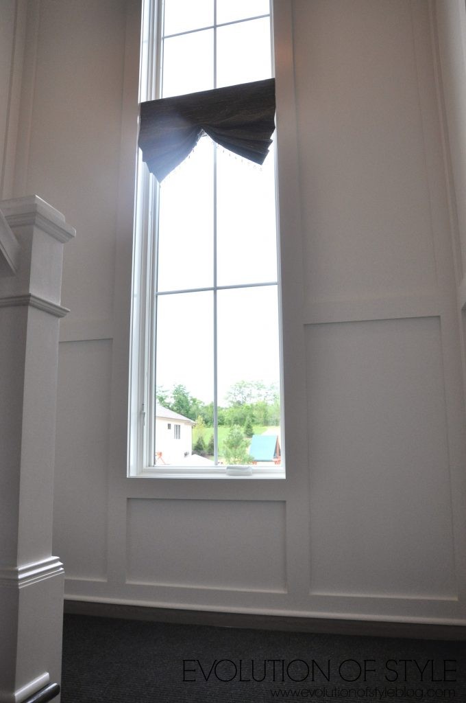
Love the molding and staircase here.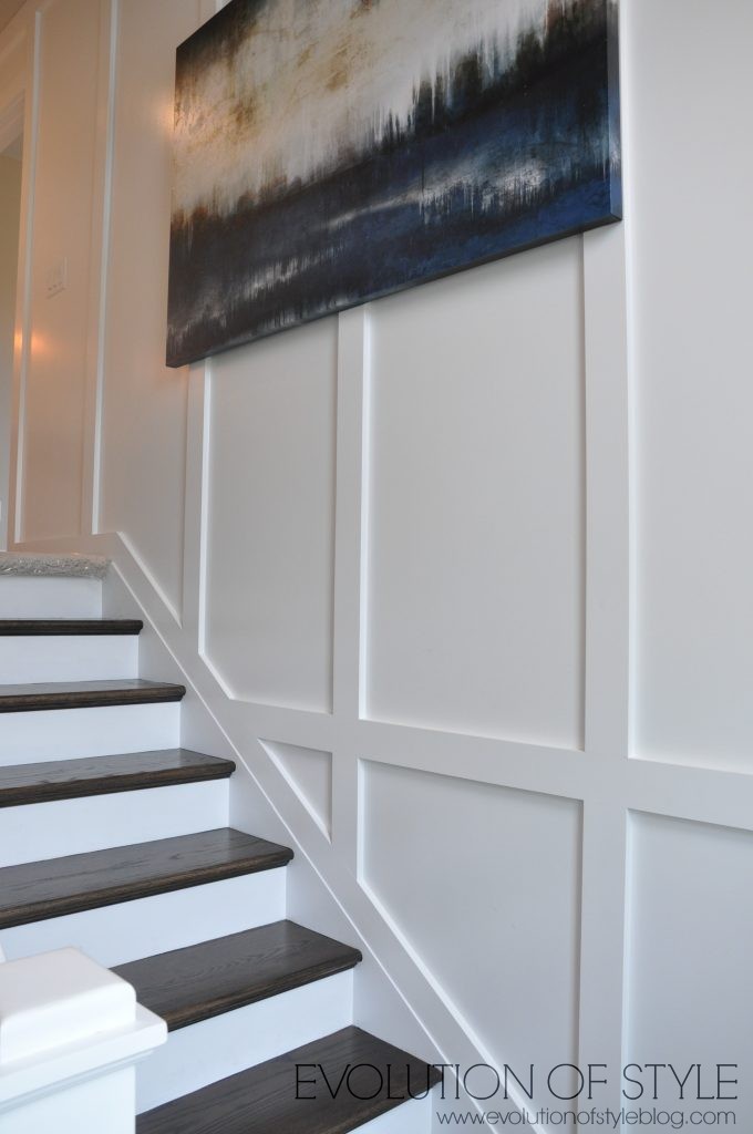
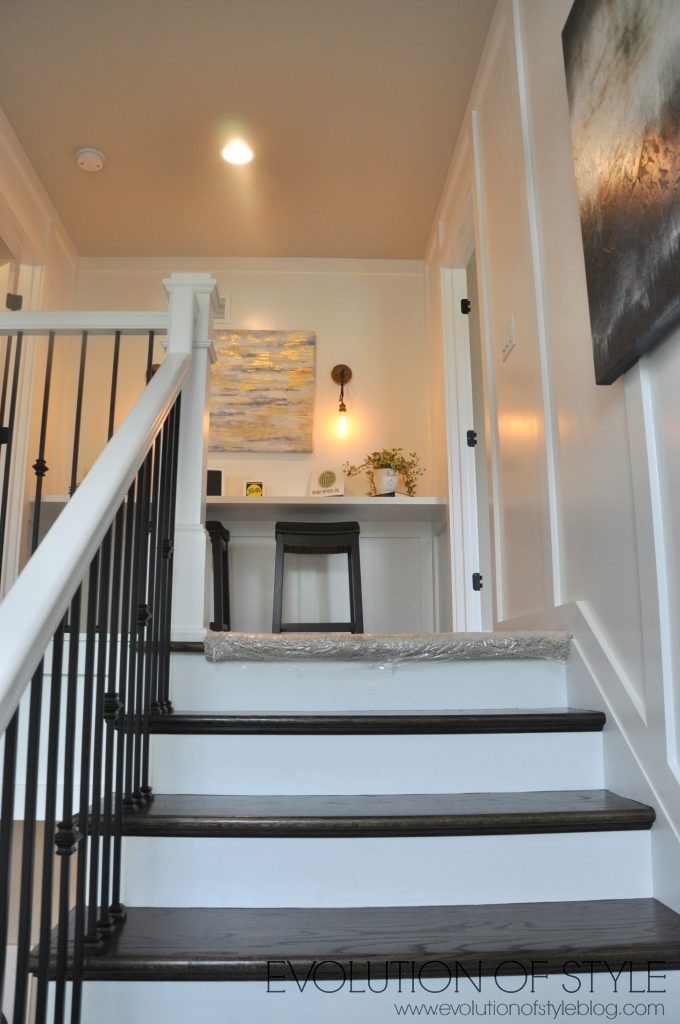
A study area at the top of the stairs.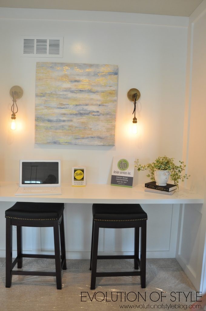
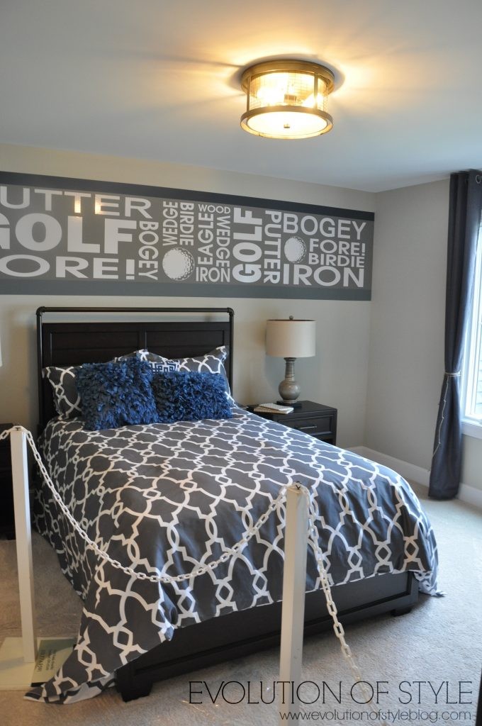
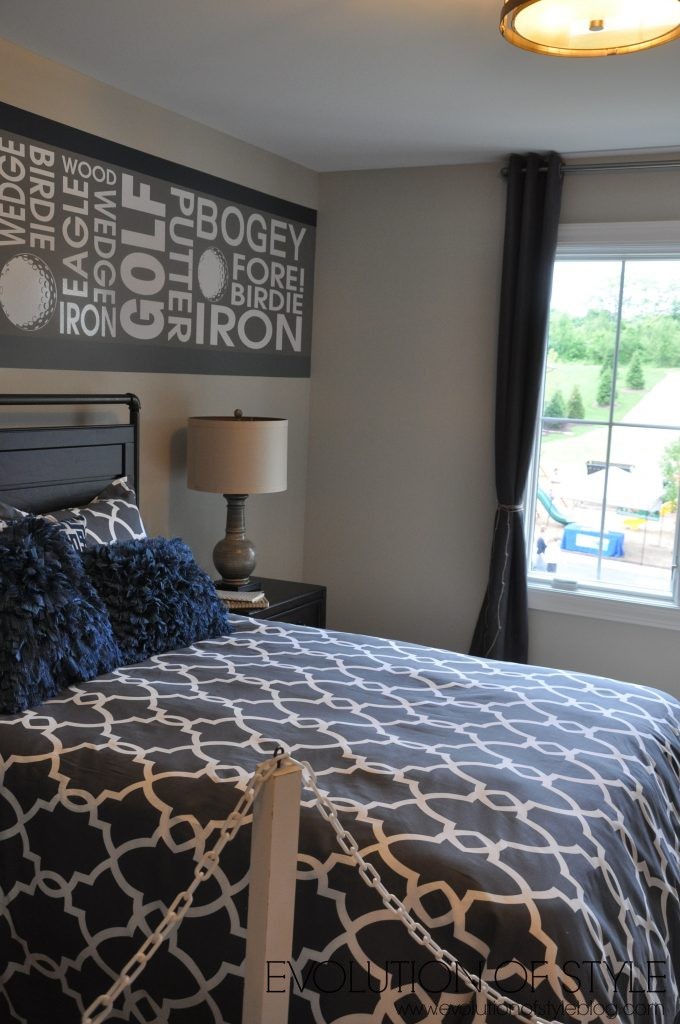
Two bedrooms upstairs – the stripes live on in this bedroom. Very cute with the addition of the golf words.
Jack and Jill bathroom setup with cute linen closet doors.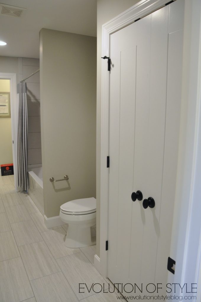
And another stripe to tie it all together.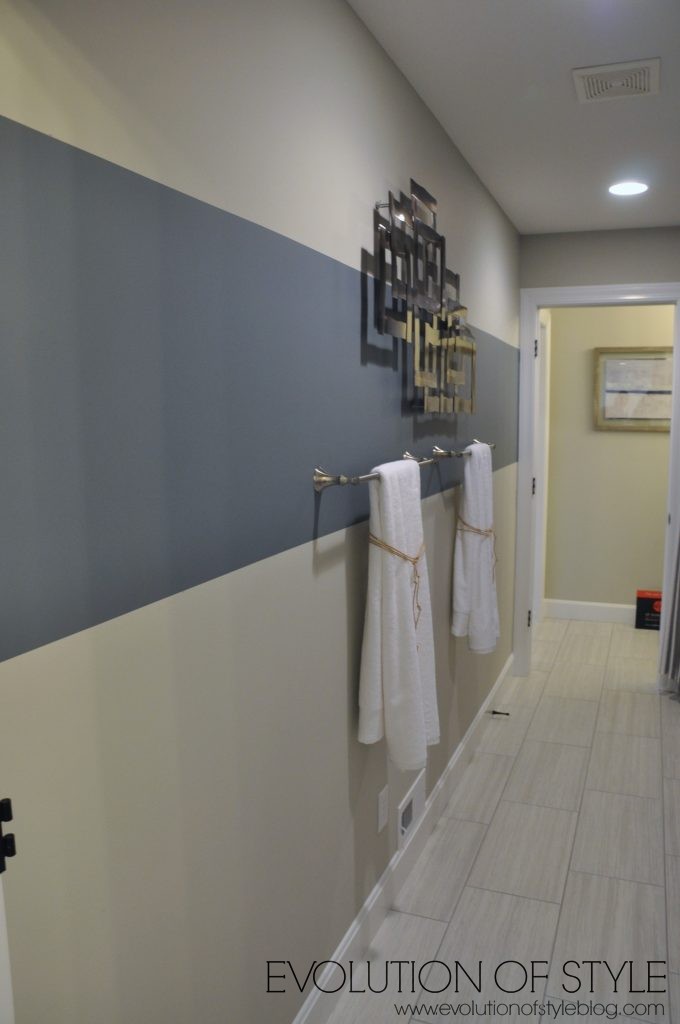
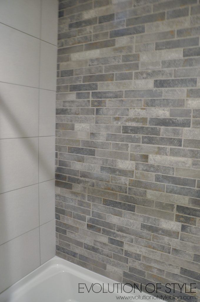
And the second bedroom with more big wall letters.

Cute artwork.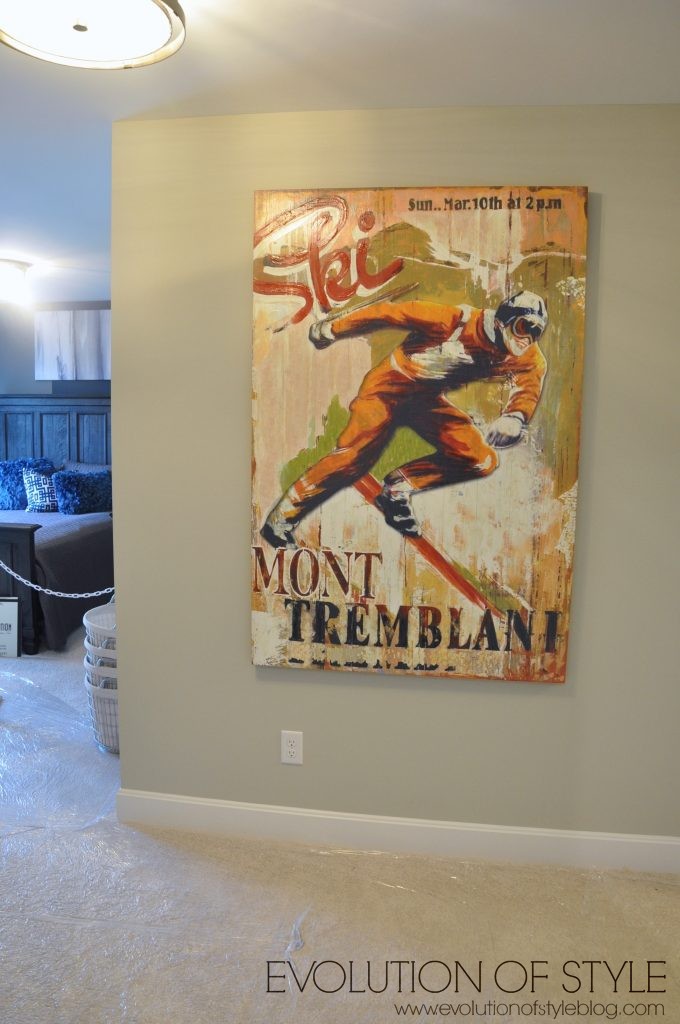
And a vertical striped feature wall. I thought this bedroom is really well done – it was a nice space, and the window was flanked with shutters (but I didn’t get a good photo of them).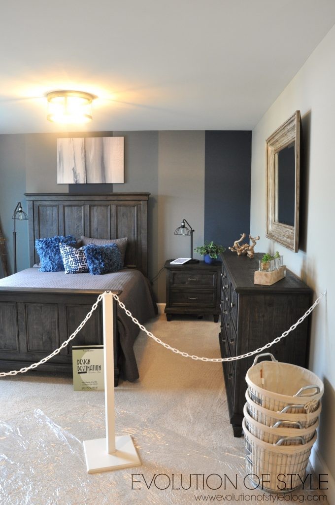
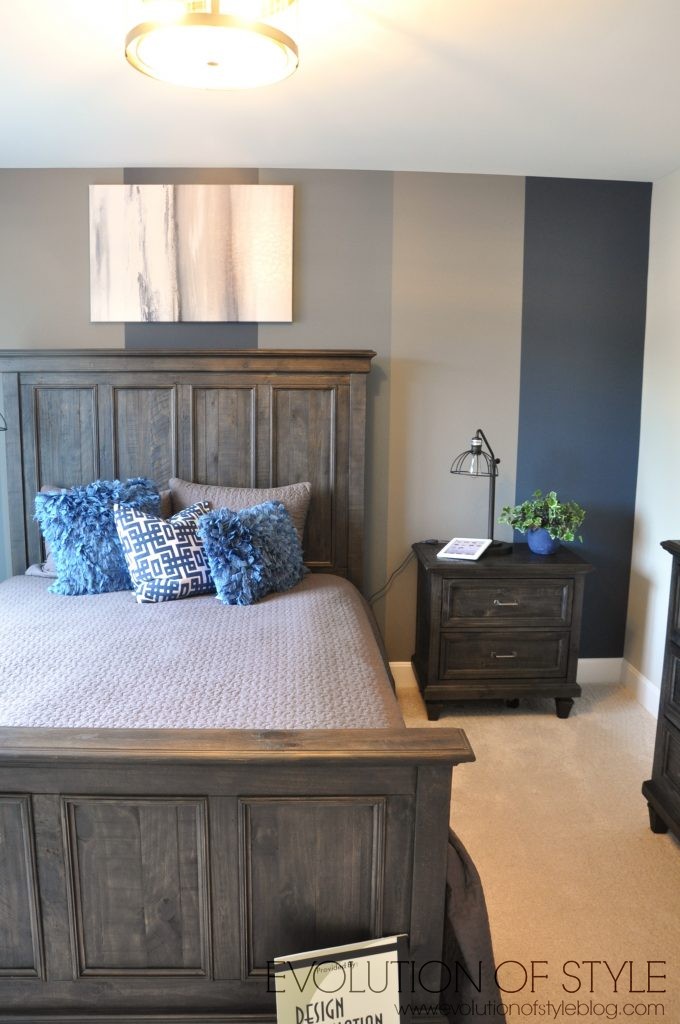
Making our way down to the basement, we’re greeted with a yoga room.
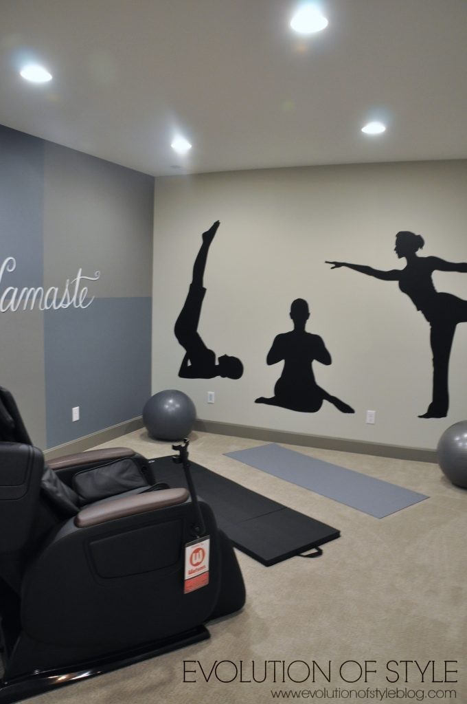
A media space –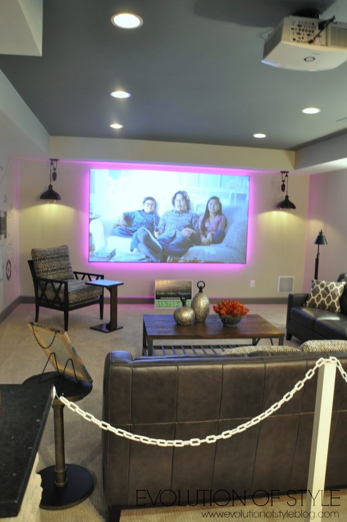
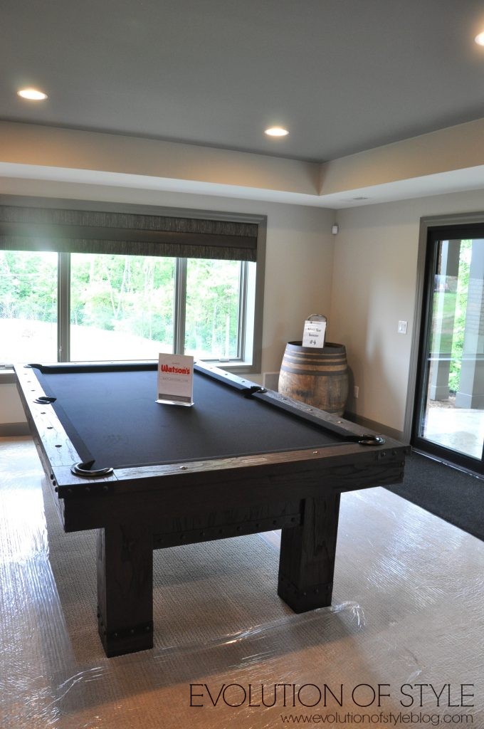
Pool table area –
And a bourbon bar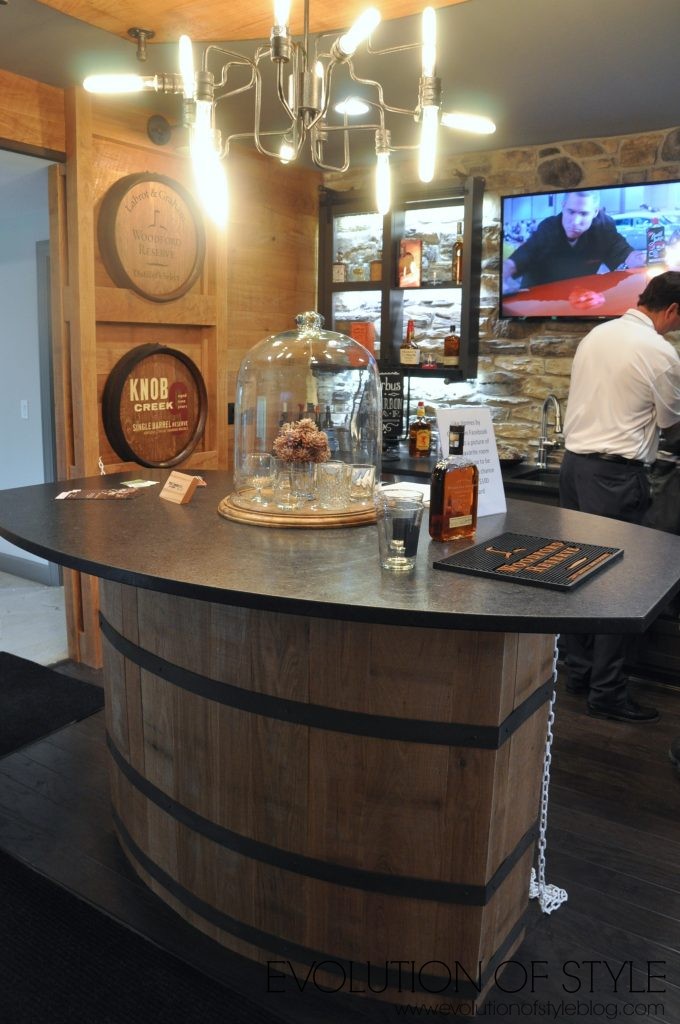
This wall was really clever with the barrel tops on display (even though I don’t drink bourbon).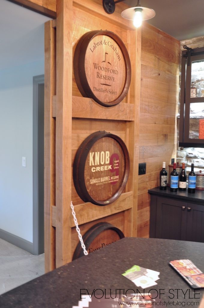
And then a bourbon barrel sink to match.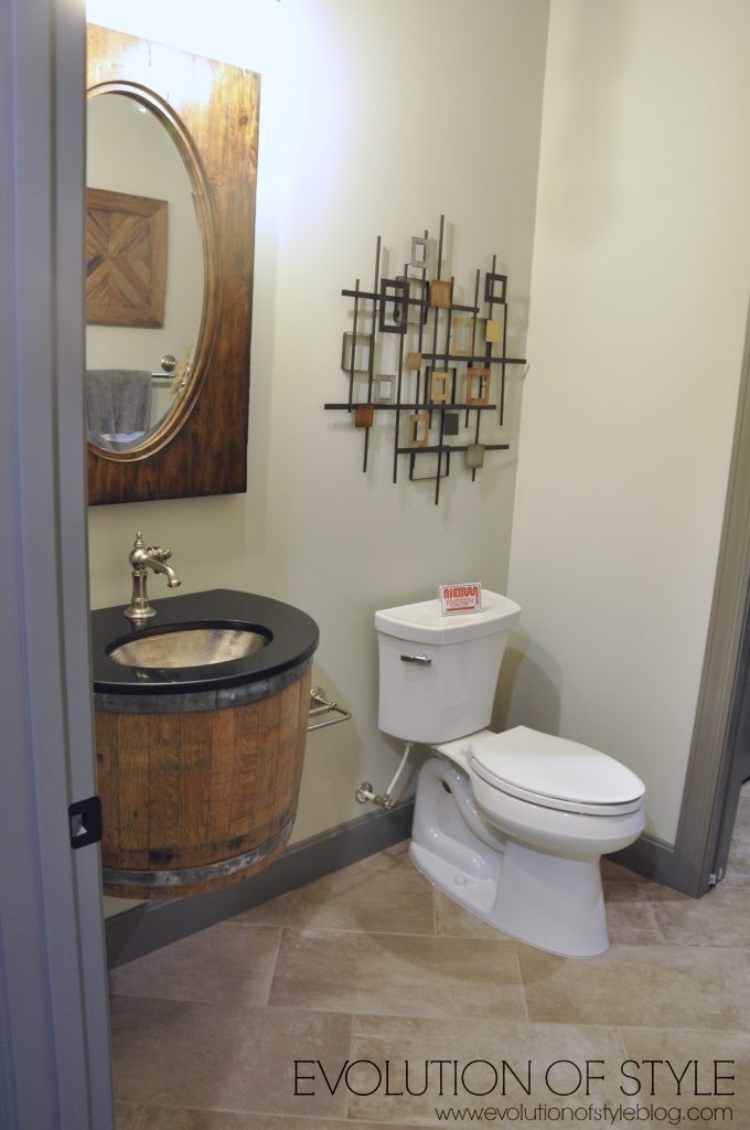
A guest room is down here as well.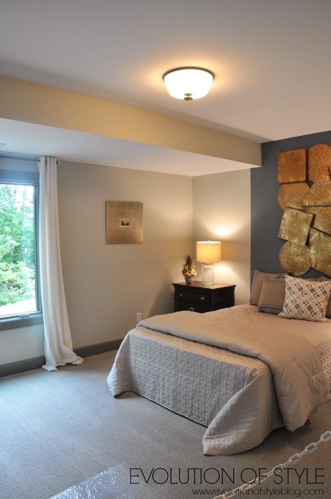
Love these closet doors – and plenty of light from the full size windows, which is a must.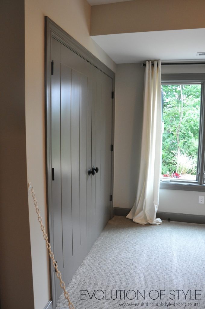
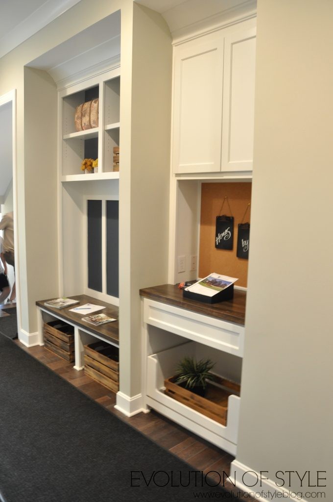
As we head out – one more shot of the drop zone area.
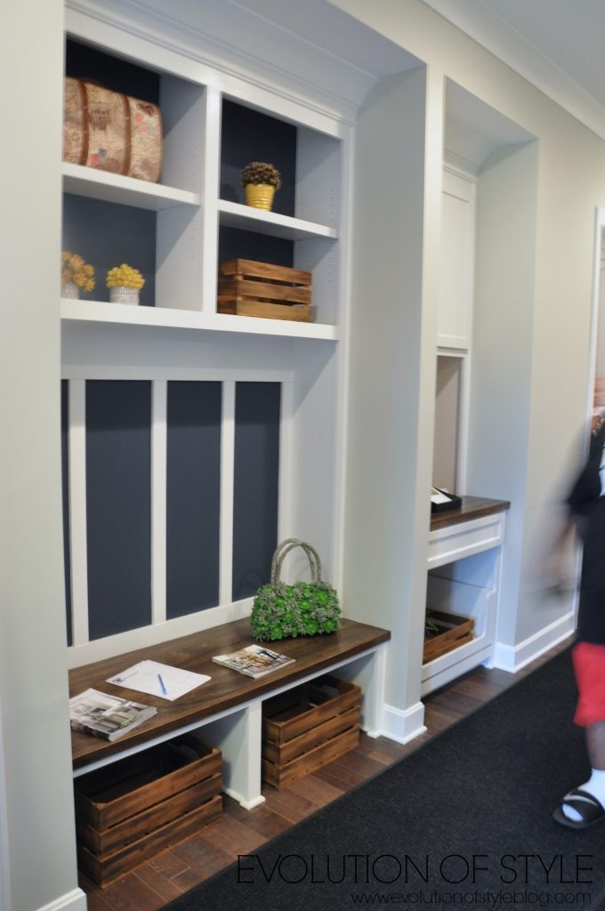
And here is a peek into another tour that is yet to come…
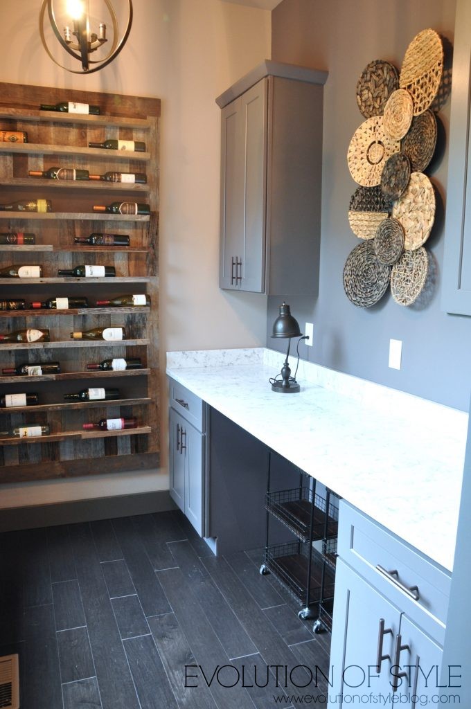
Until tomorrow…
Jenny


4 Comments
June
June 23, 2016 at 1:47 pmThis is by far my favorite! I love everything, but the paint colors were perfect, the back porch is amazing, the spaces were all perfect, I love the light fixtures …. I love it
Sue Weaver
June 23, 2016 at 2:01 pmI love the light in the entrance way. Do you know where that’s from?
This tour is so much fun! Thank you.
Lynn
June 23, 2016 at 5:26 pmI liked the style and furnishings of this house. As soon as I saw your picture of the kitchen I wondered who in the world would put glass framed pictures behind a stove. And yes, no back splash is strange. Decorator is not a cook!
Ivory
June 26, 2016 at 1:43 amI went back three times to view this home because of its great style, quality, designs, and it’s classy welcome home feeling that this house gives. I love it, both in and outside. For sure, this home gets a thumb ups!