
Hello!
I’m wrapping up Homearama Week 2016 with three tours today, so buckle up and settle in. If you’ve missed any of the action this week, you can see the other tours here:
Homearama Week 2016 – Day Three
Homearama Week 2016 – Day Four
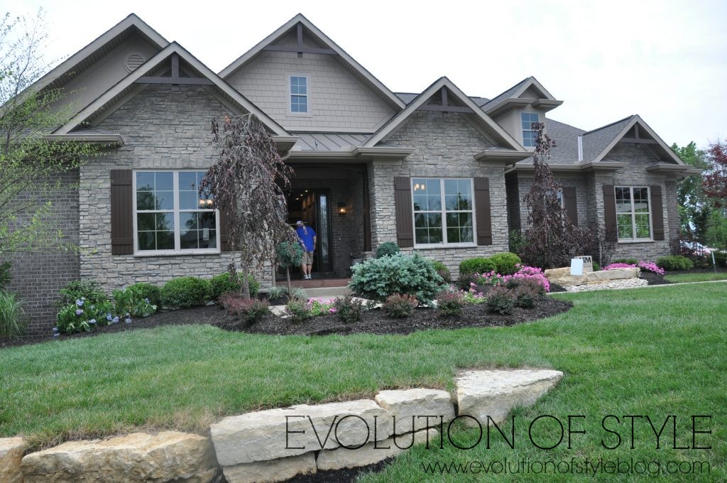
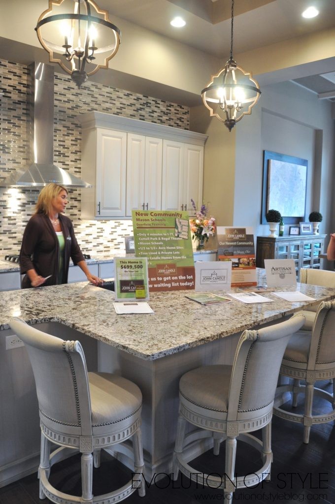
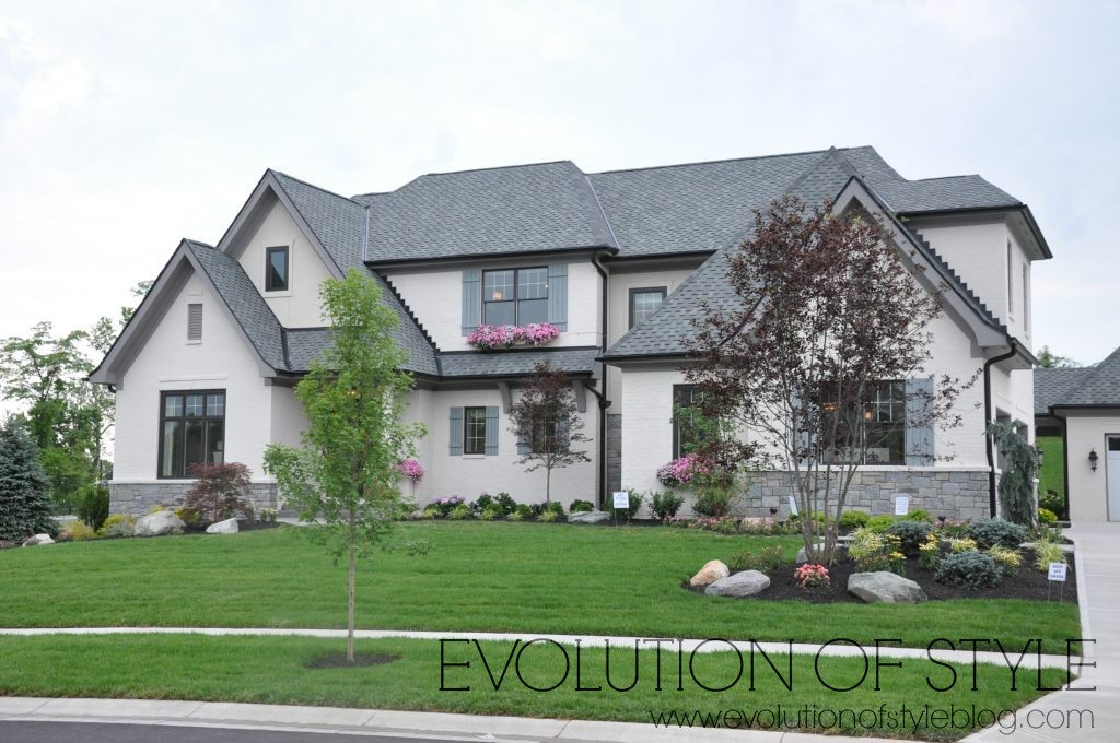
The Rustica
Price: $699,500
Square Footage: 4,360 sq. ft.
Builder: John Candle Homes
Website: www.johncandlehomes.com
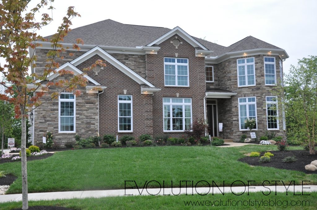
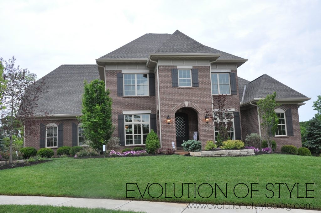
This home is described as having “contemporary design with rustic influences” and gives a nod to the Craftsman style with shake siding, peaked roofline and charming shutters.
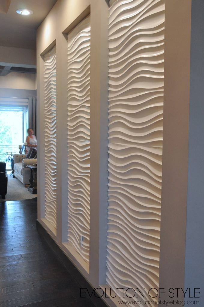
Let’s take a look inside –
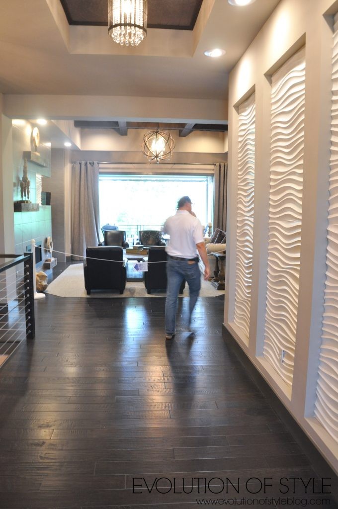
Interesting wall panels on the right as you walk in the door. Not a big fan.
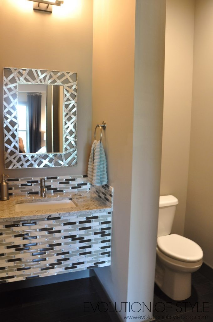
Powder room – why with the busy tile?!? I honestly just don’t get it. I feel like some of these home just aren’t on trend at all when it comes to some of the finishings, tile in particular.
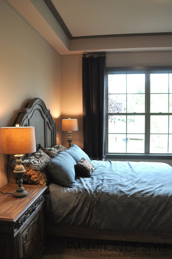
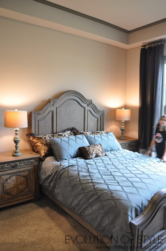
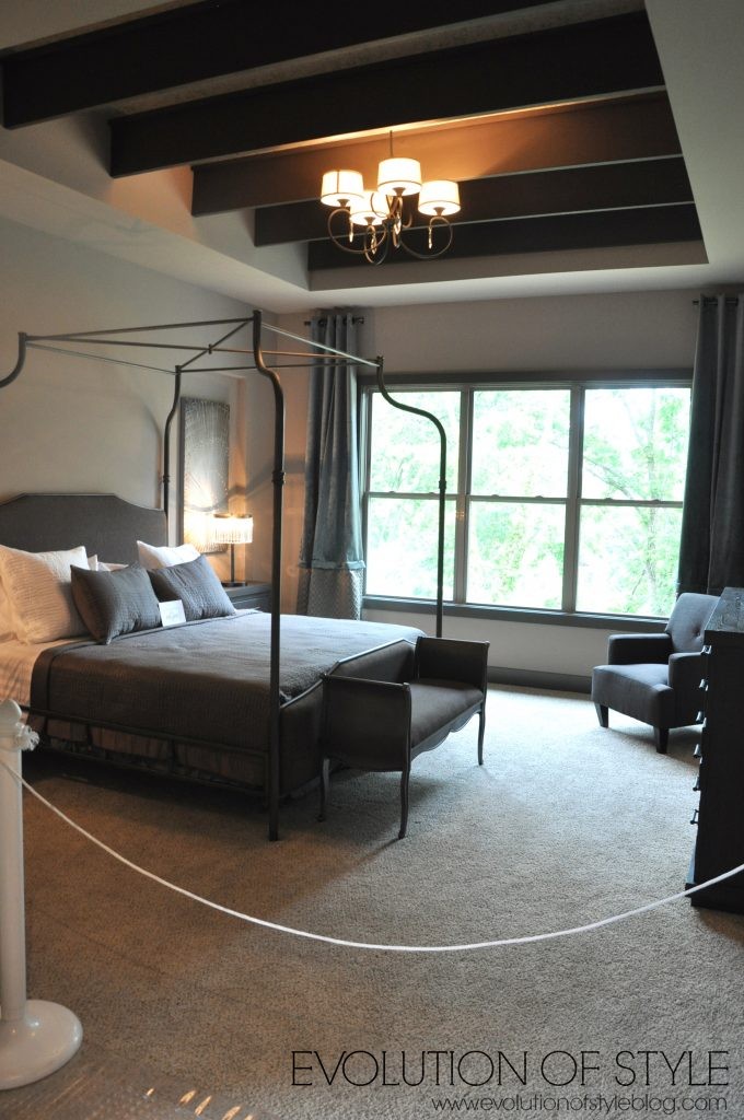
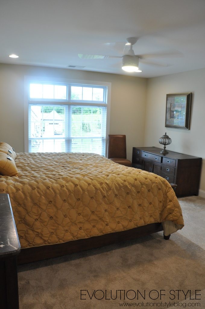
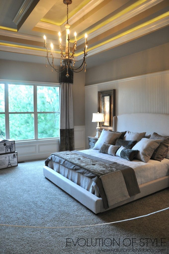
A bedroom – kind of on the dark side. Dark trim, dark drapes – too dark for me.
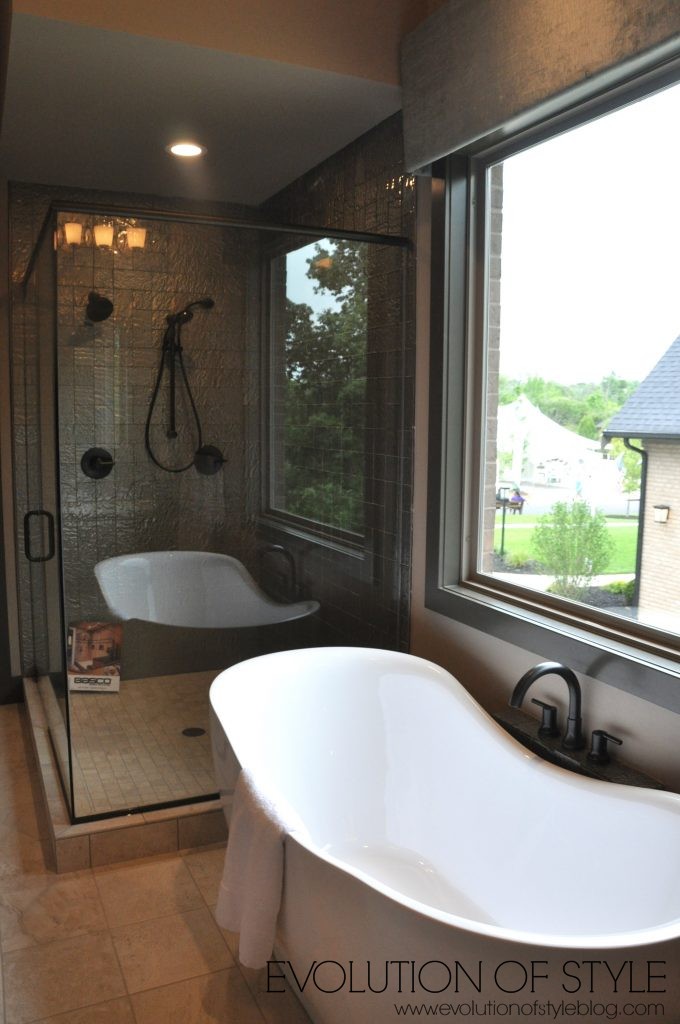
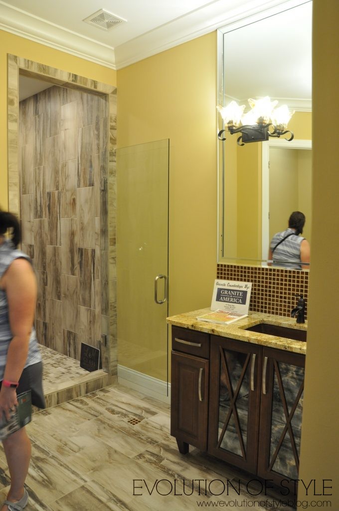
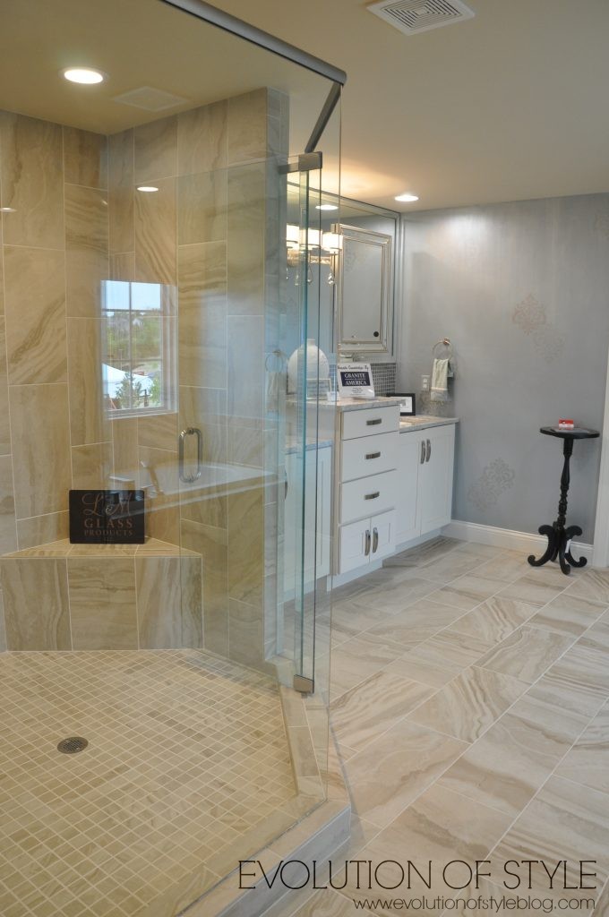
A bathroom off the bedroom.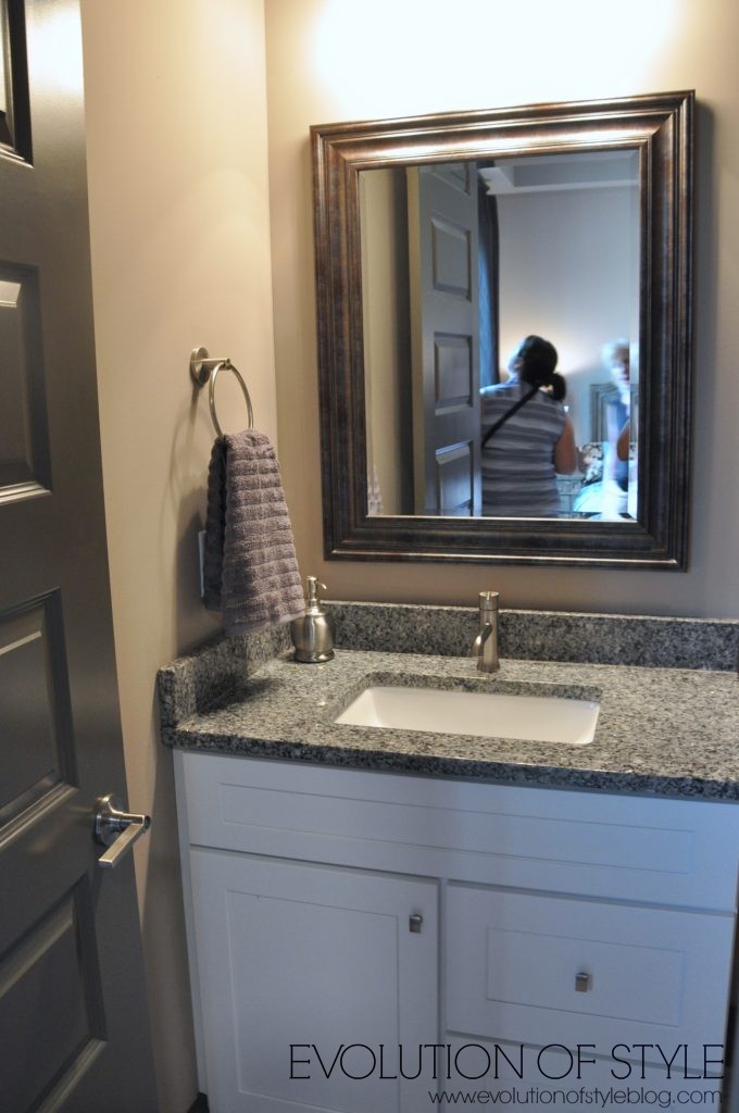
At least the tile is good in here.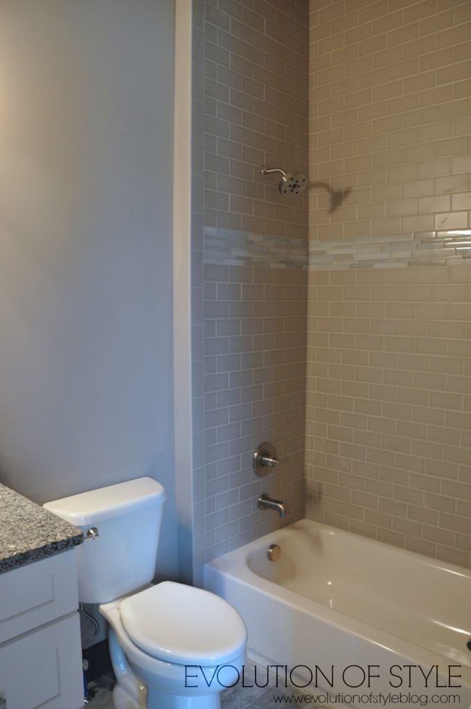
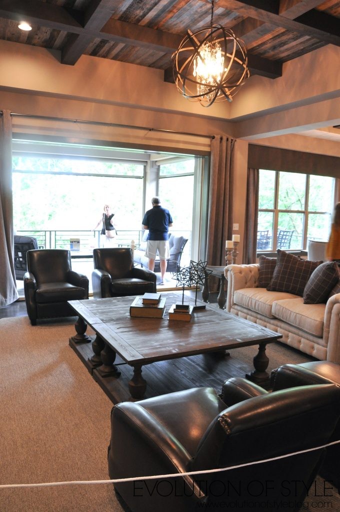
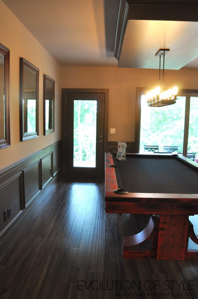
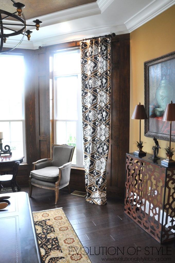
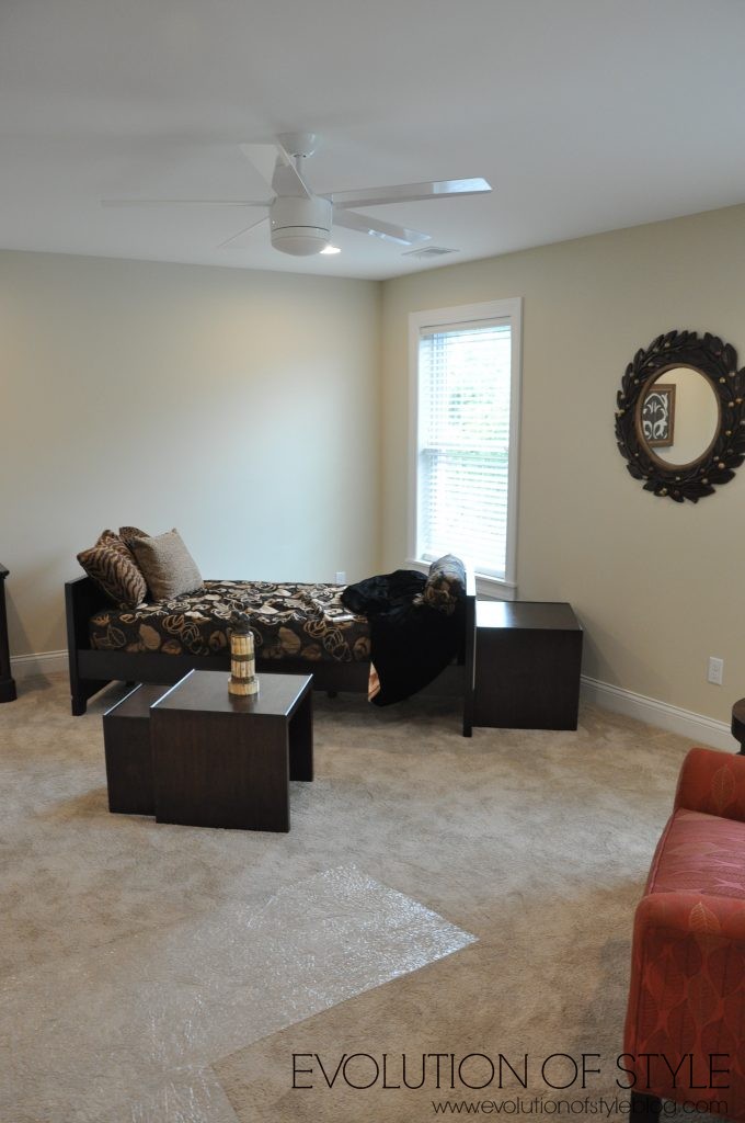
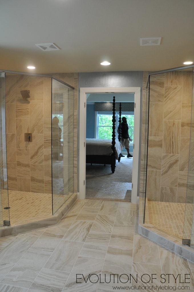
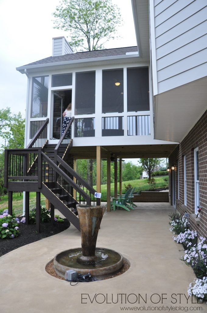
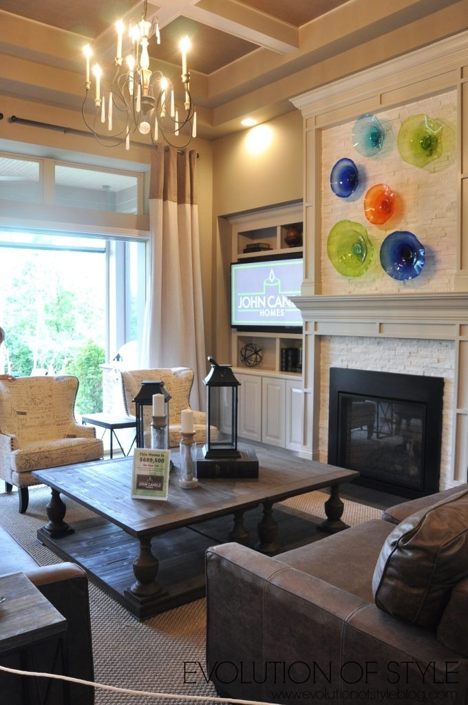
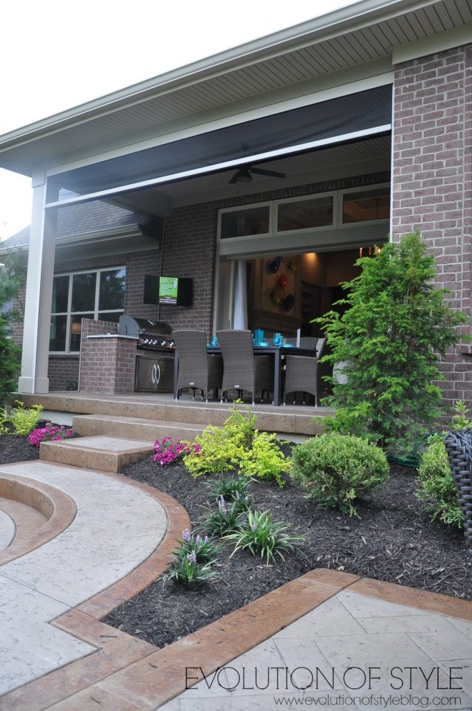
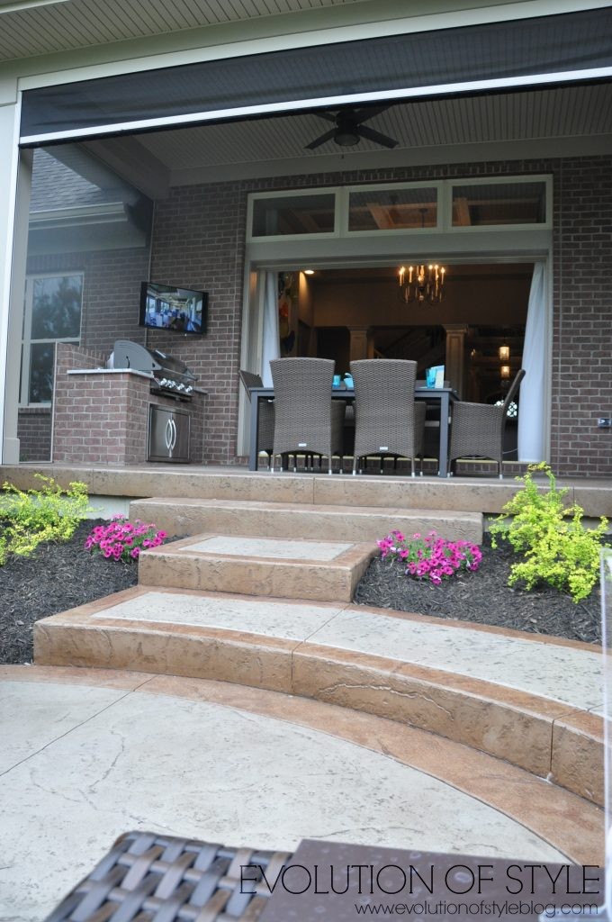
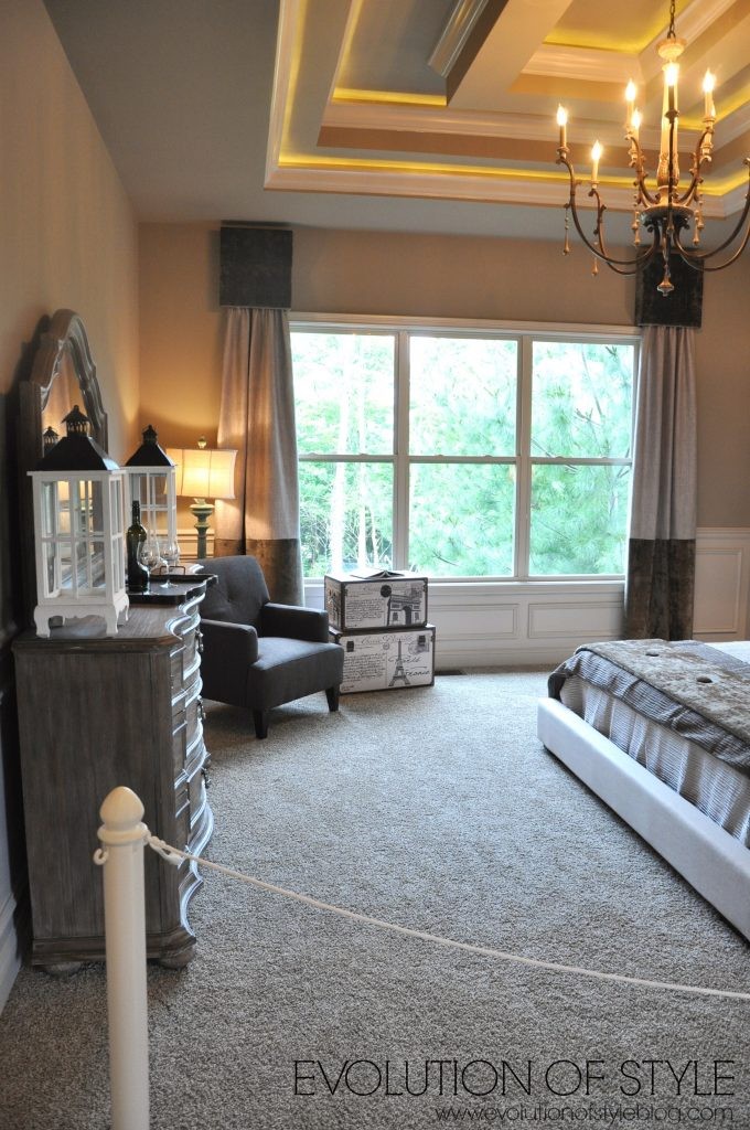
To the back of the house is the family room, dining room (one dining room in the house) and the kitchen. Dark woodwork continues here, including what looks to be a reclaimed wood ceiling. The one thing I do like is how the sliding doors to the back porch open all the way up, making the enclosed porch (with retractable screens – amazing) part of the indoor living area. And with the retractable screens, you don’t have to worry about bugs!
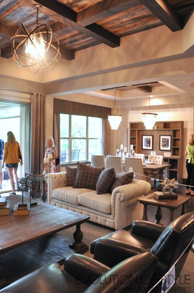
Here you can see the porch area and how the screen to the back just rolls right up and disappears. The windows flanking the TV are already screened.
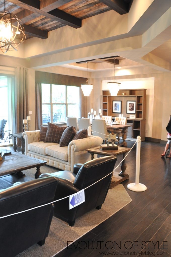
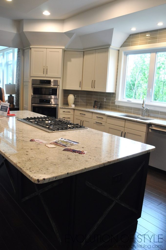
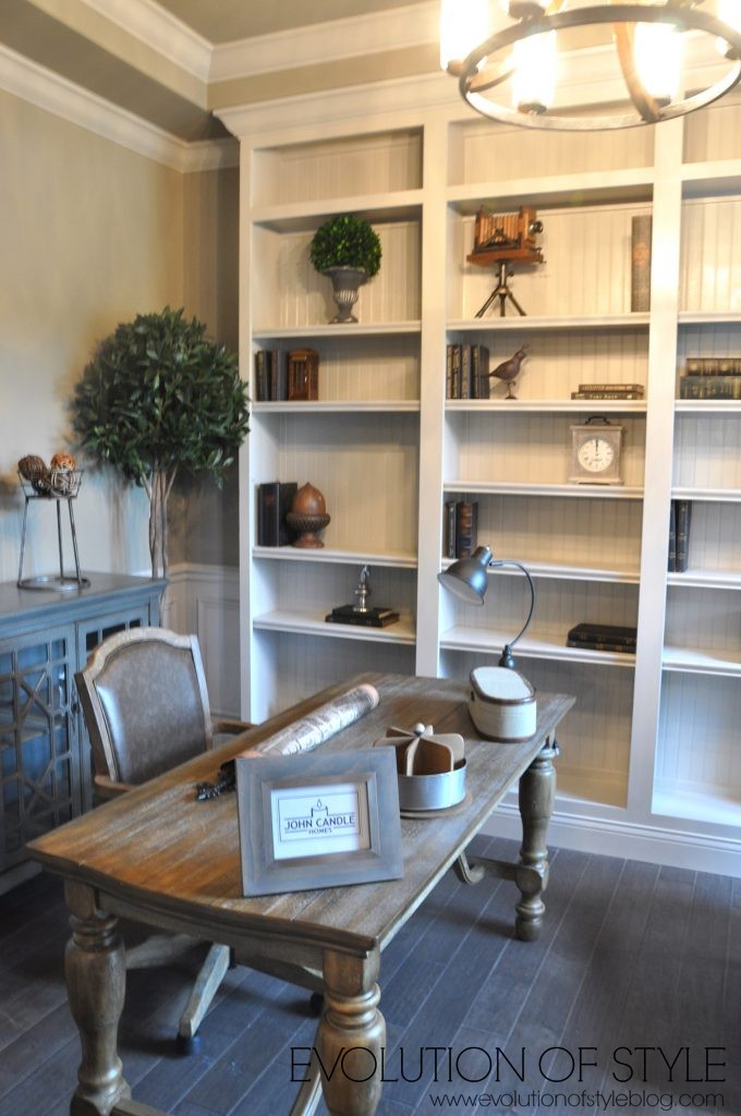
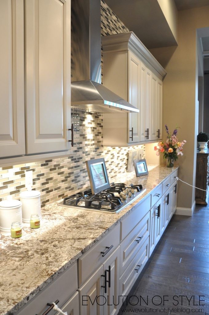
The kitchen is open to the dining area and family room. Again, I can’t make sense of the busy tile in here. I really like the layout of this home, but just don’t care for the dark decor. I think it would have been better served with something a little brighter, with a balance of the darker wood tones. There’s just too much dark going on here – dark ceiling, dark cabinets, dark floors.

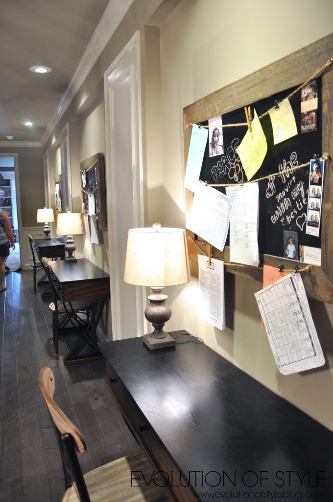
Off the kitchen is this cute little command center –
And an office at the front of the house –

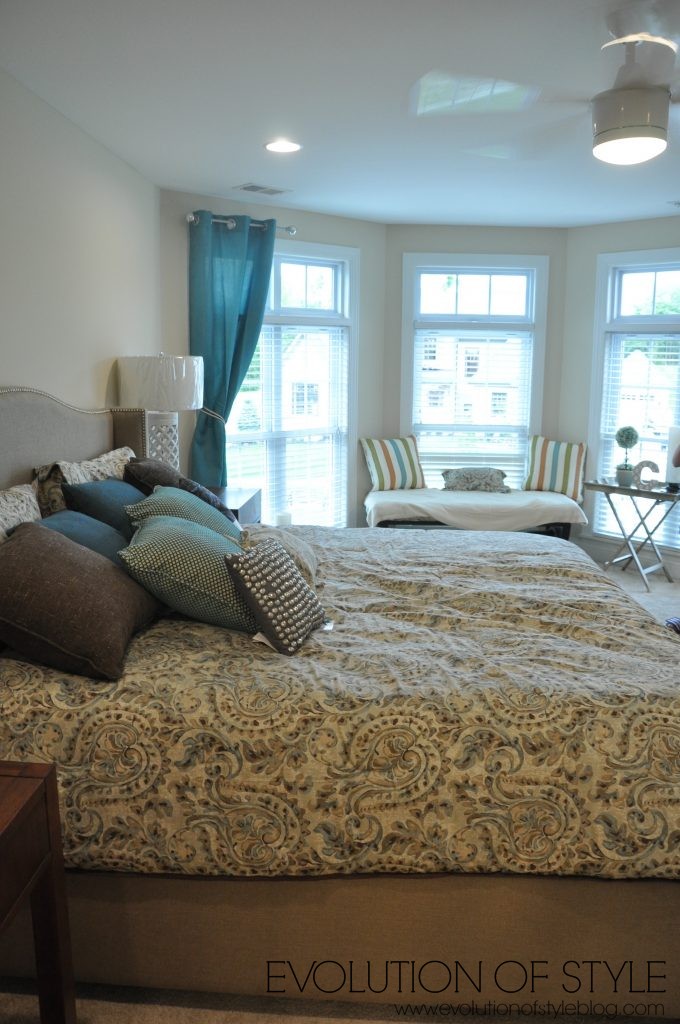
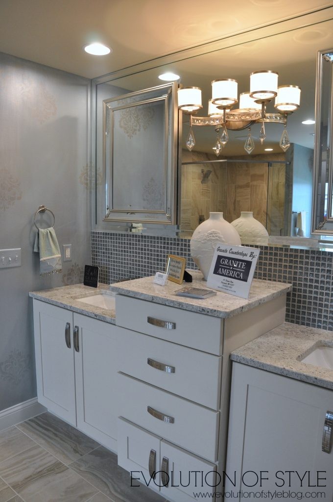
The master bedroom –
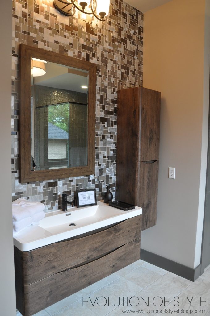
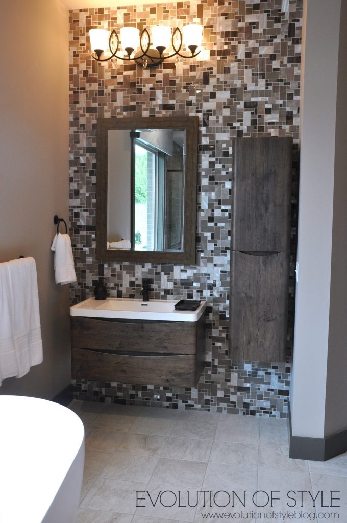
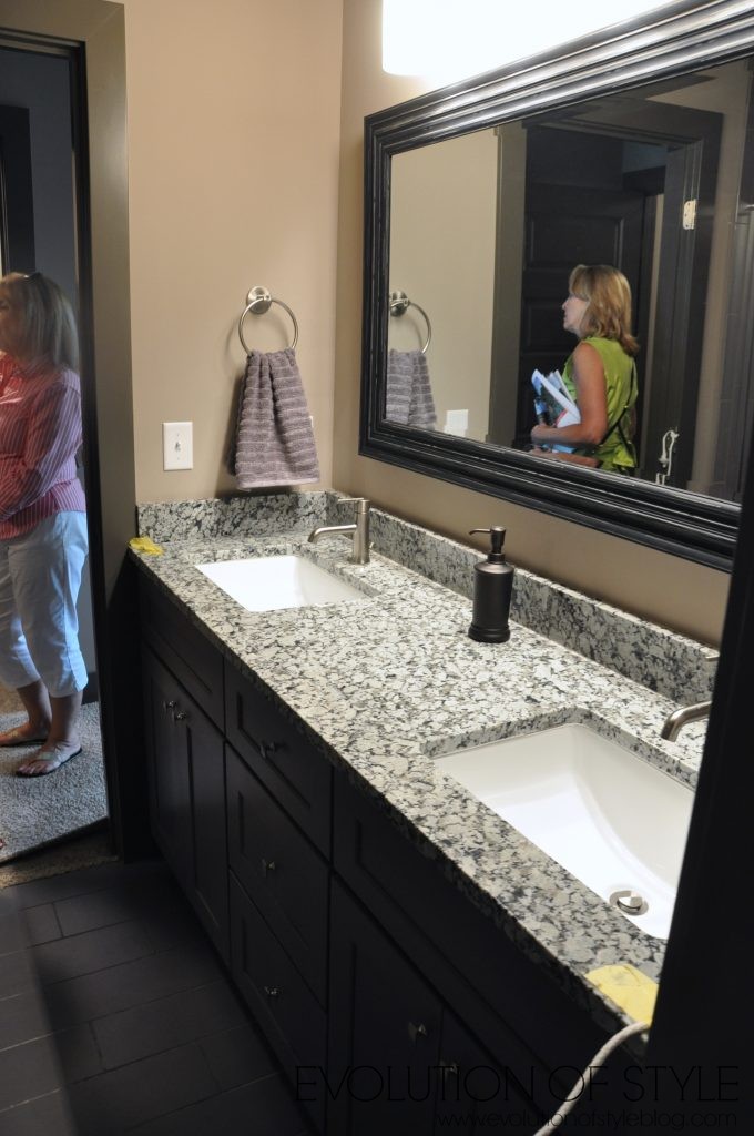
The master bathroom – I can appreciate the wood vanity, but that tile reminds me of something from the 1970’s. Not a fan.
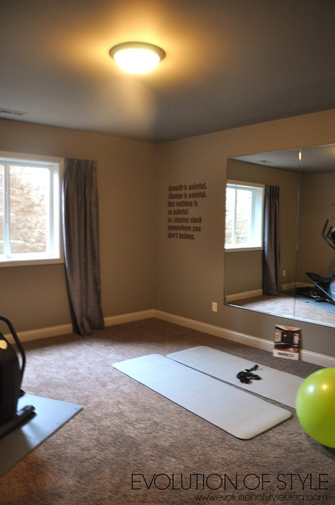
Making our way to the basement –
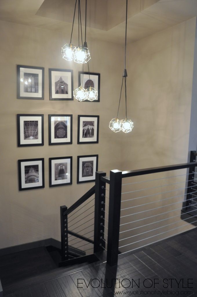
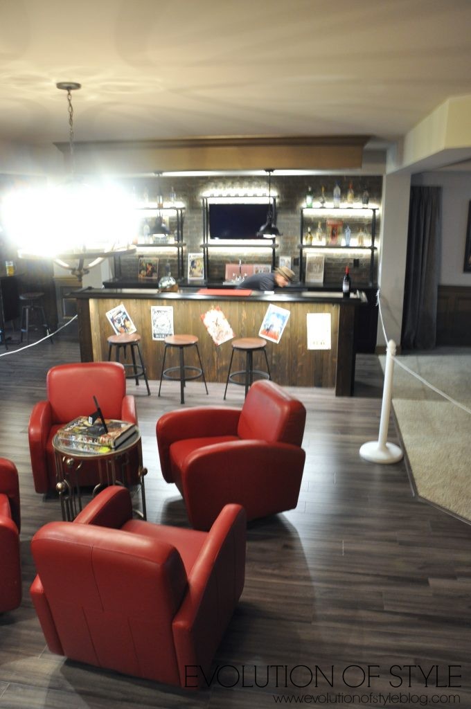
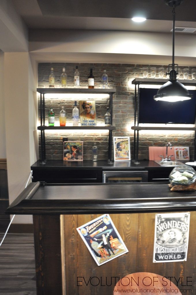
The basement had a magic theme.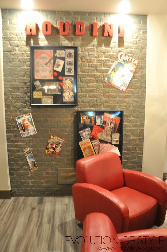
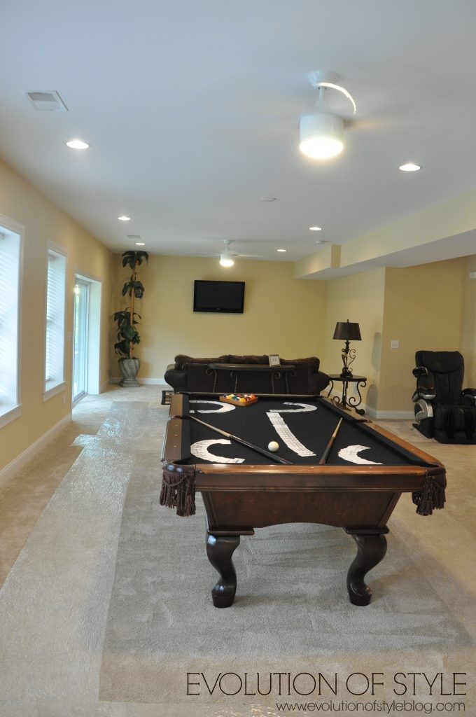
Media space – 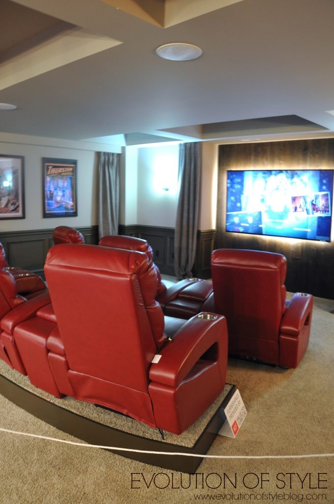
Are you noticing a trend with the large letters?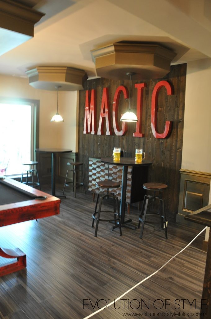
One of two bedrooms downstairs –
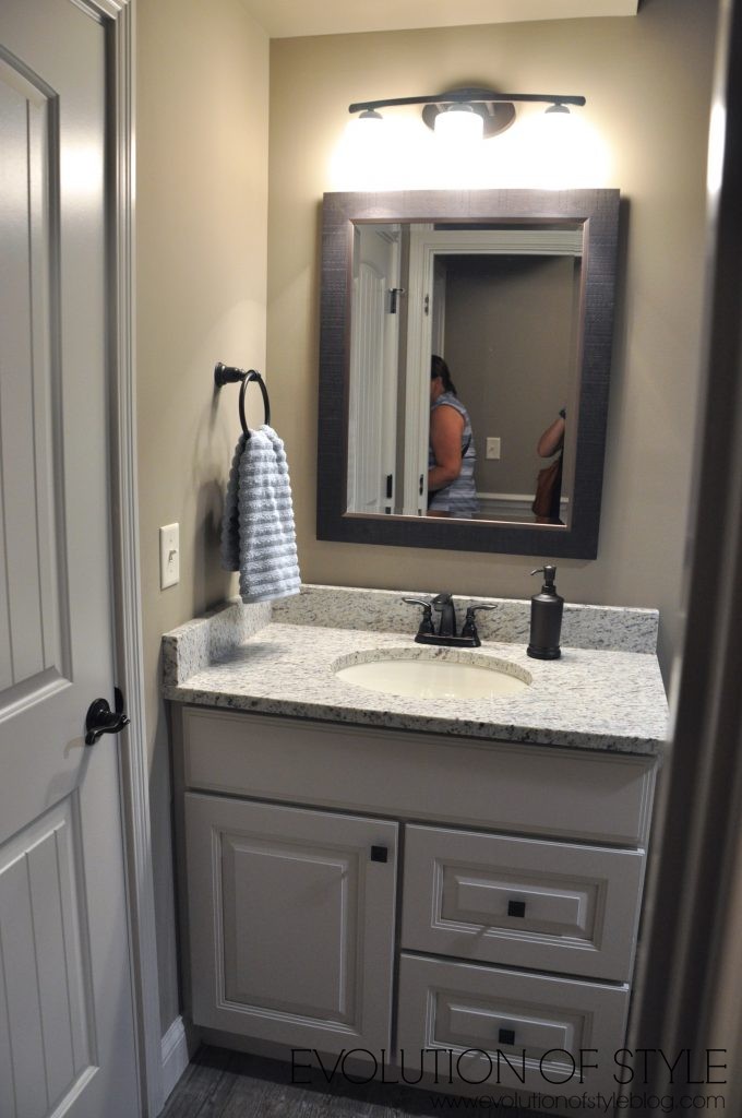
With a shared bath –
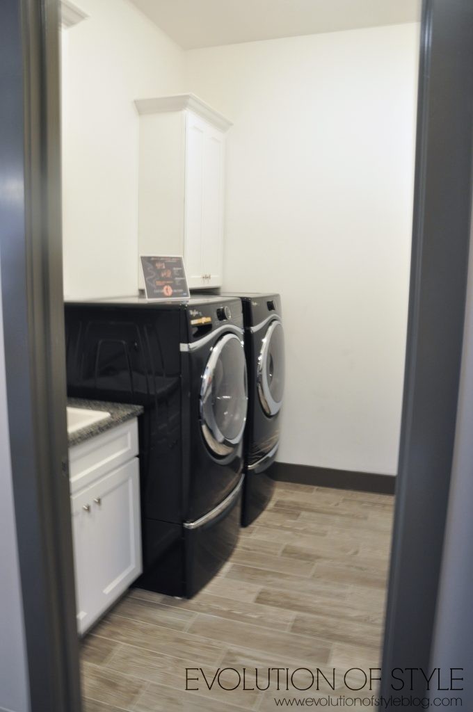
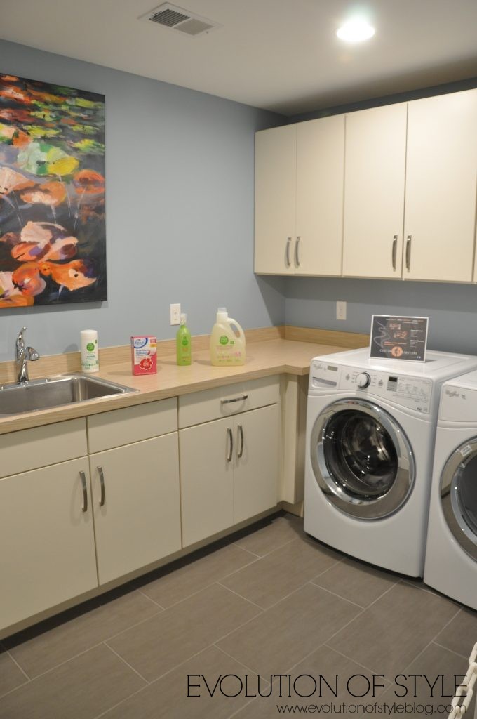
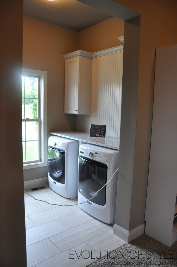
On the way out upstairs, you get a look at the laundry room –
The Monaco
Price: $899,000
Square Footage: 6800 sq. ft.
Builder: Infinity Homes
Website: www.infinityhomesllc.com
This home is described as “generously sized and richly appointed” – it’s the largest home on the tour, which had our interest as we went inside, but as I’ve mentioned on other tours, bigger isn’t always better.
As you enter the home, the dining room is to the left.
To the right is the office – the decor in here feels very 1990’s to me with the gold walls.

Although I like the chairs by the windows.
And this is where things get weird. Off of the office, is a bathroom.

We were like, “What the…?” Did I walk into a master bathroom or something? Why is there a shower in here? Why do you need all of this space? Why are the walls this hideous color? Just, why?
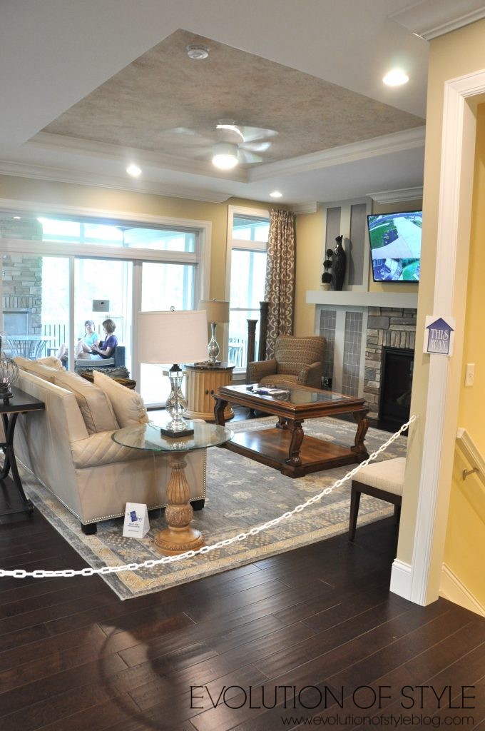
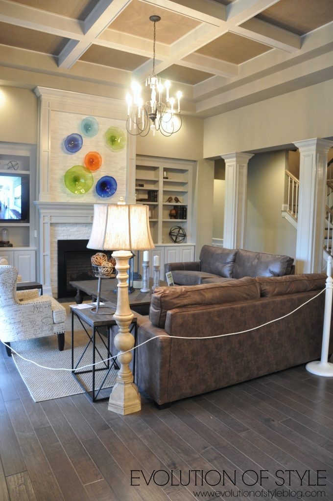
From here we saw the family room –
We made our way upstairs from here. Five bedrooms upstairs –
This is where we started saying that it didn’t seem like the house was finished, in that the staging seemed very haphazard. Like they just grabbed furniture from their friends’ homes and threw them into a room.
Is it just me, or are there no knobs on any of these cabinets? 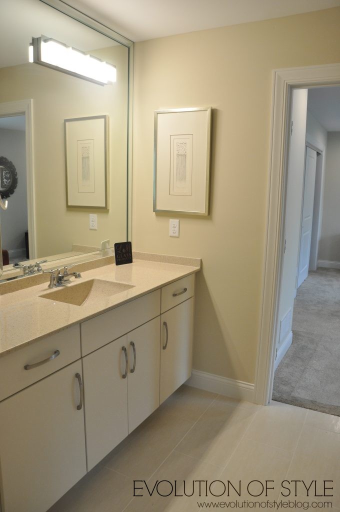
This bathroom vanity was just plain wrong. I don’t like the finishes in this home – they don’t seem well thought out or well planned. It’s as if they were buying what was on sale. Sorry if I sound harsh, but I have high expectations for Homearama! I want to put my name out there and volunteer as tribute to decorate one of the Homearama homes.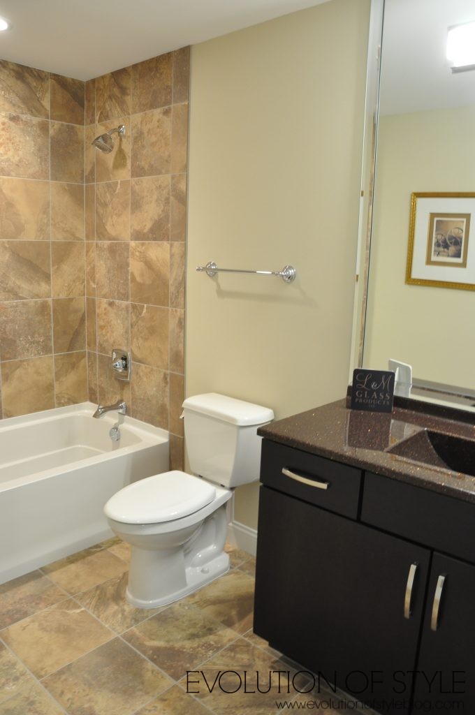
There is a laundry room up here as well. At least the flooring in here is nice. Not a fan of the cabinets though – they look cheap (and on sale).
And then we go in the massive master bedroom.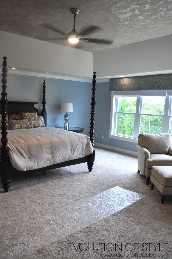
And the master bath.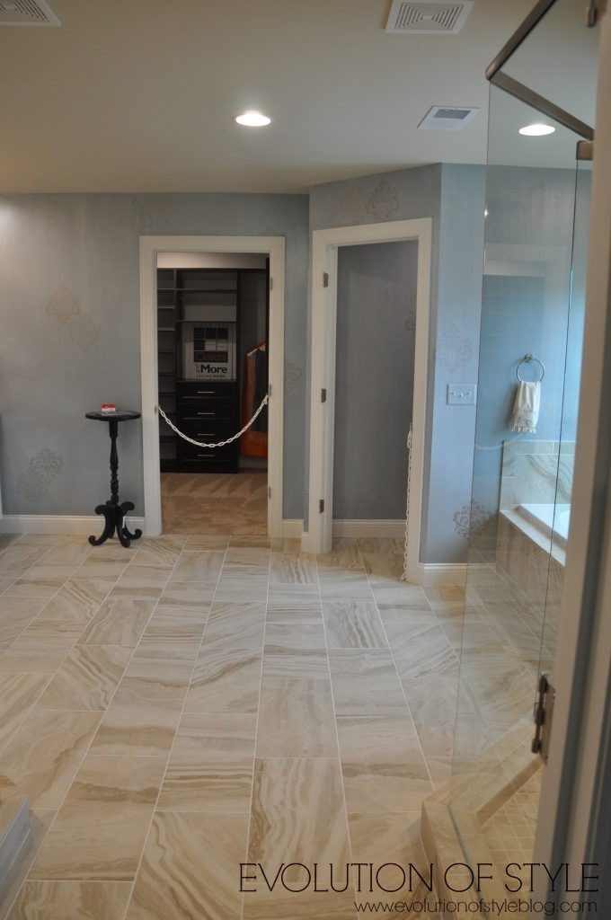
And because one shower isn’t enough – this master bathroom has two. Why? This is where I go back to my point that I would rather have a smaller, functional home, than a huge home that has a lot of wasted space. I wish I had taken a photo of the tub (yes, there is a tub) – the tub is tiny. There’s no reason to have a tiny tub in this massive bathroom. Poorly planned.
Then we made our way downstairs. Can someone tell me what’s going on with the tiny monitor/tv that’s hanging on the wall? And the paint color? I. don’t. get. it.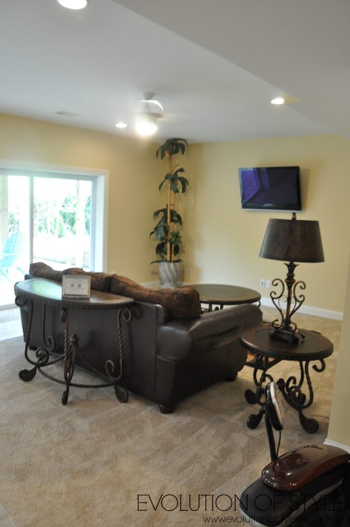
I kind of like the black tile in here, but I’m getting a bumblebee vibe with the yellow walls.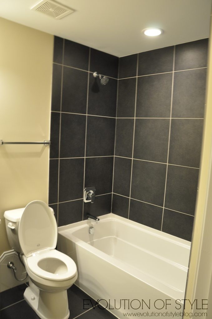
No bar, no media room, just a big bowling alley space down here. I’m sorry if I’m sounding hypercritical, but like I said before, this is Homearama, and the bar is high when it comes to expectations.
We went outside to the backyard area. The porch looks pretty.
Underneath the porch is an unfinished space – you can see that they didn’t get to mounting the tv on the fireplace and the adirondack chairs look like they were added to simply fill the space. Even the exposed deck trusses scream “unfinished”.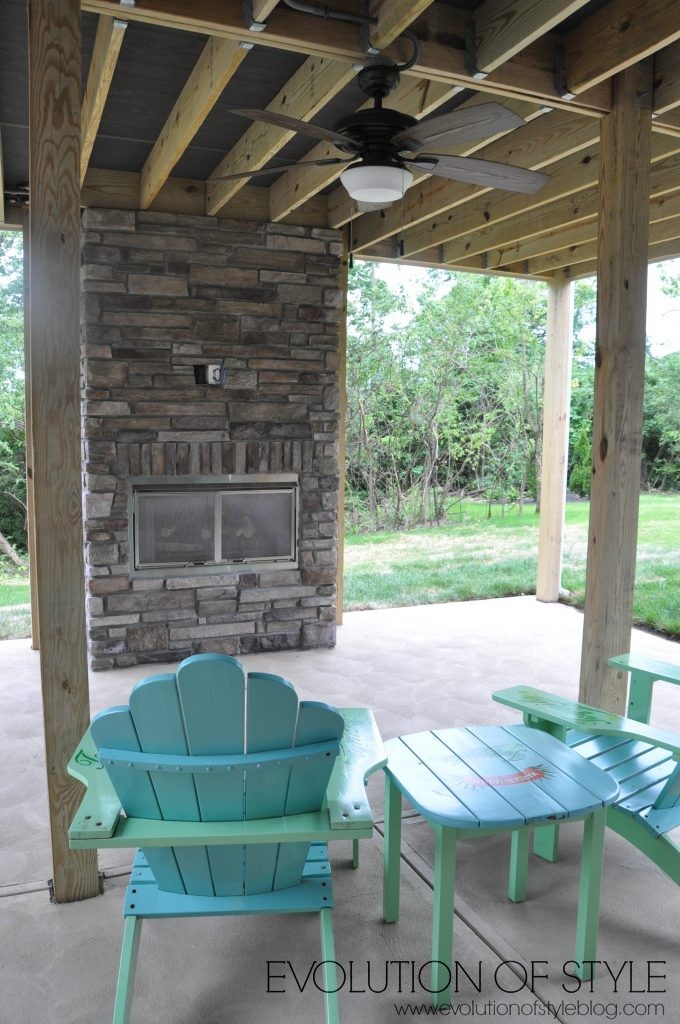
The screened porch has great boned, but again, is unfinished.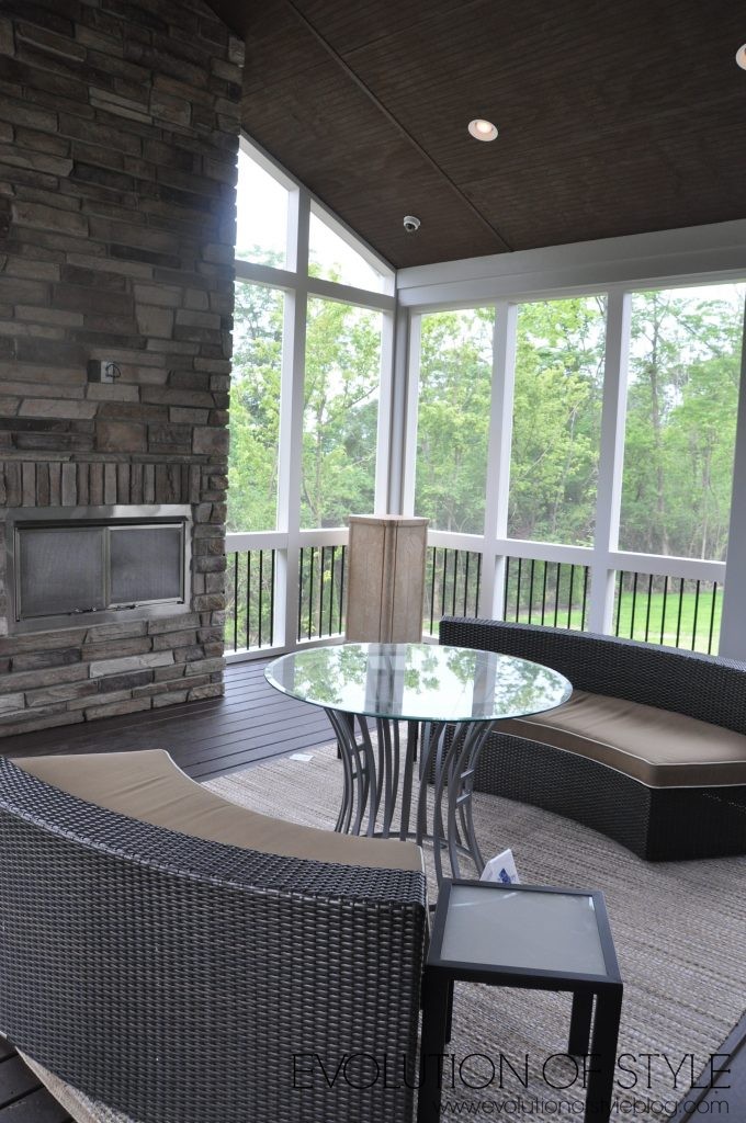
We go back inside to see the kitchen. It’s a massive space, but just doesn’t look like it lends itself to efficient cooking. It’s all spread out, with a lot of wasted space (and no knobs).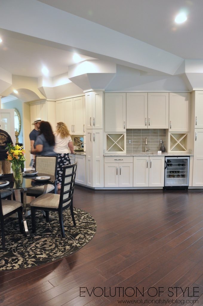
A nice big island at least.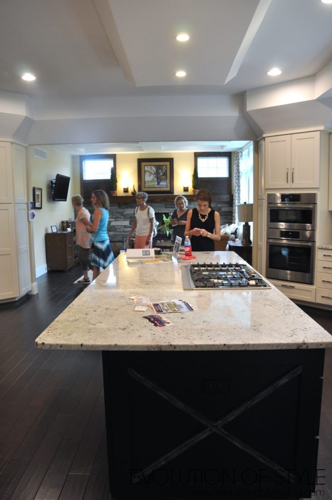
But that’s really all I can say about the kitchen.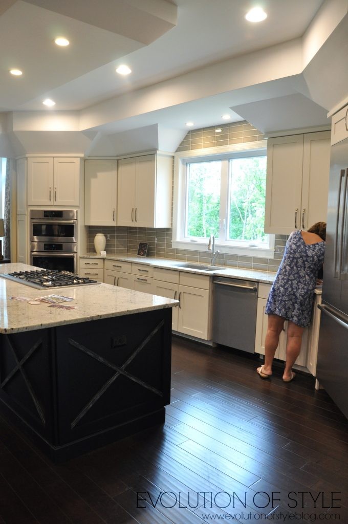
Off the kitchen is a “keeping room” that is completely disjointed in style from the rest of the home. Did I just walk into a Craftsman-style home?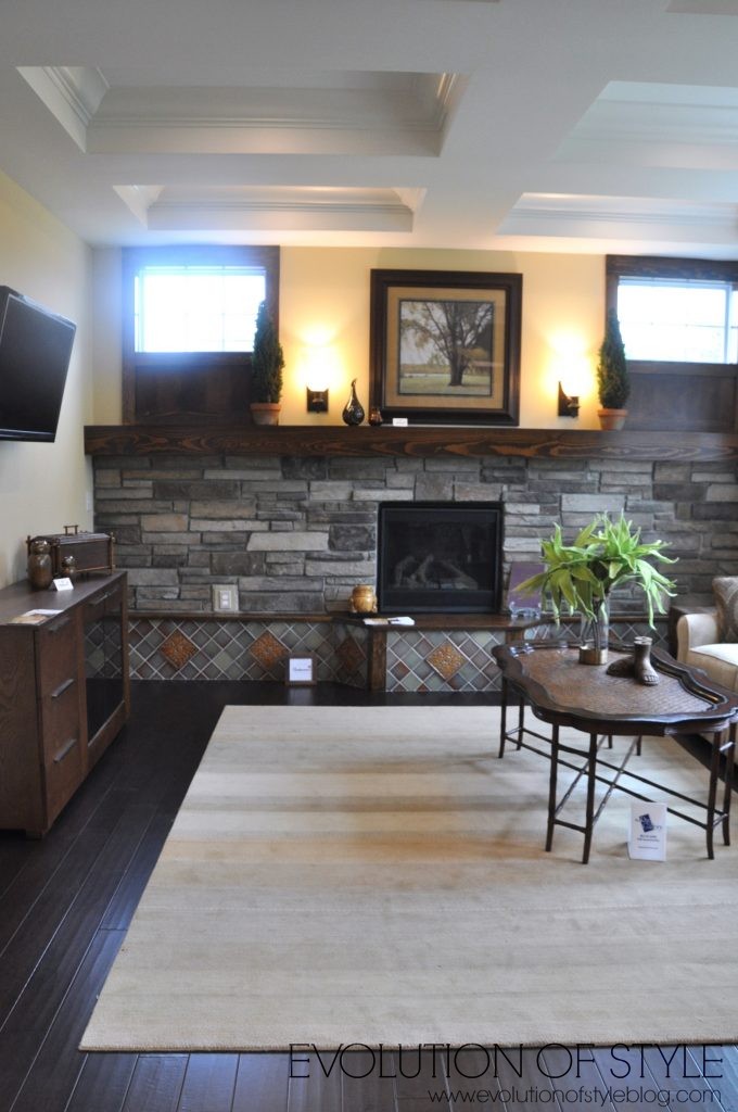
It’s not a bad looking room overall, it’s just like a puzzle piece that doesn’t fit. 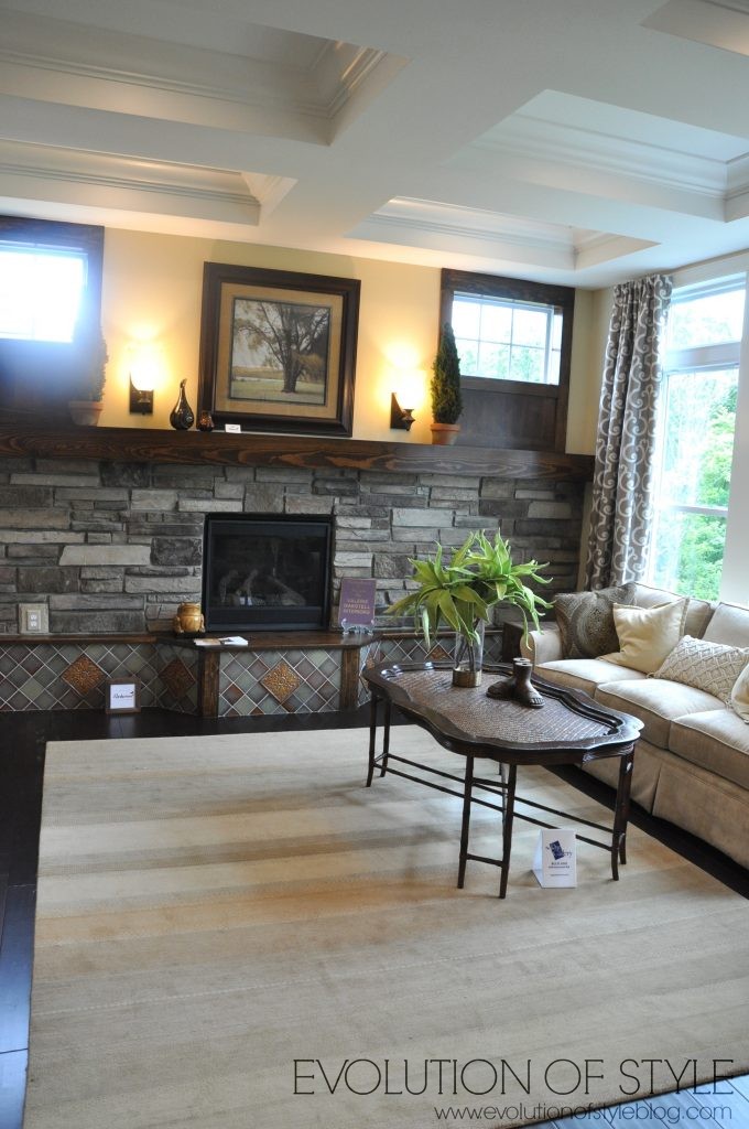
As you can guess, this was my least favorite home, and we got kind of irritated at the vast size of the home, but such inefficient use of space. Not to mention the colors and finishes didn’t seem well-planned or cohesive. A disappointing showing in my opinion.
And now we’re on to the last home on the tour.
The John Candle Estate
Price: $799,500
Square Footage: 5400 sq. ft.
Builder: John Candle Homes
Website: www.johncandlehomes.com
This is the second home in the tour from John Candle Homes (the first one is The Rustica earlier in this post). This is a two story home described as having an “inviting tone” where “clean lines and simple but elegant designs flow throughout.” You be the judge.
The exterior is very timeless and beautiful.
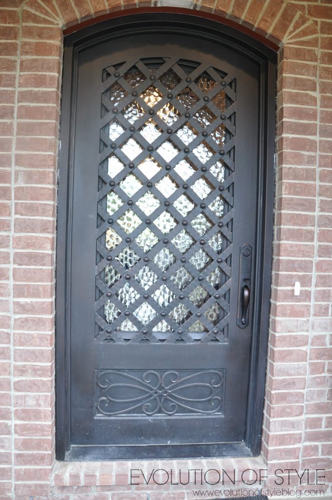
The front door has kind of a Game of Thrones vibe to it.
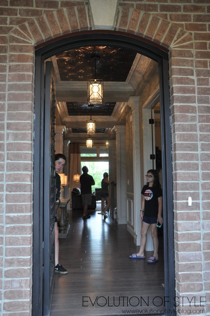
Notice the ceiling detail – while interesting, I didn’t care for the way the lighting reflected off of it as it impacted the overall feel of the rooms as a result.
To the right is the home office.
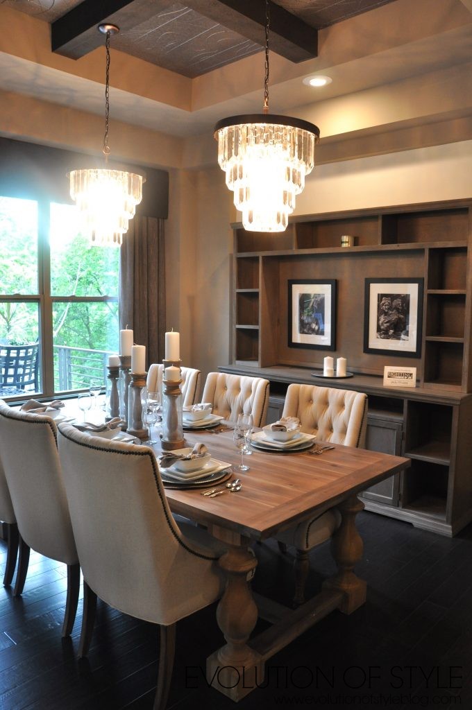
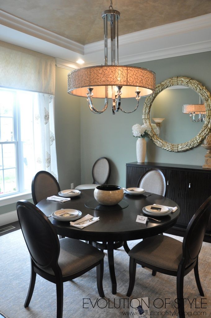
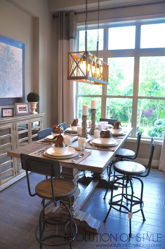
To the left, the formal dining room. While I like the “no formal dining room” movement, this one is pretty. I have been a fan of this chandelier style for awhile.
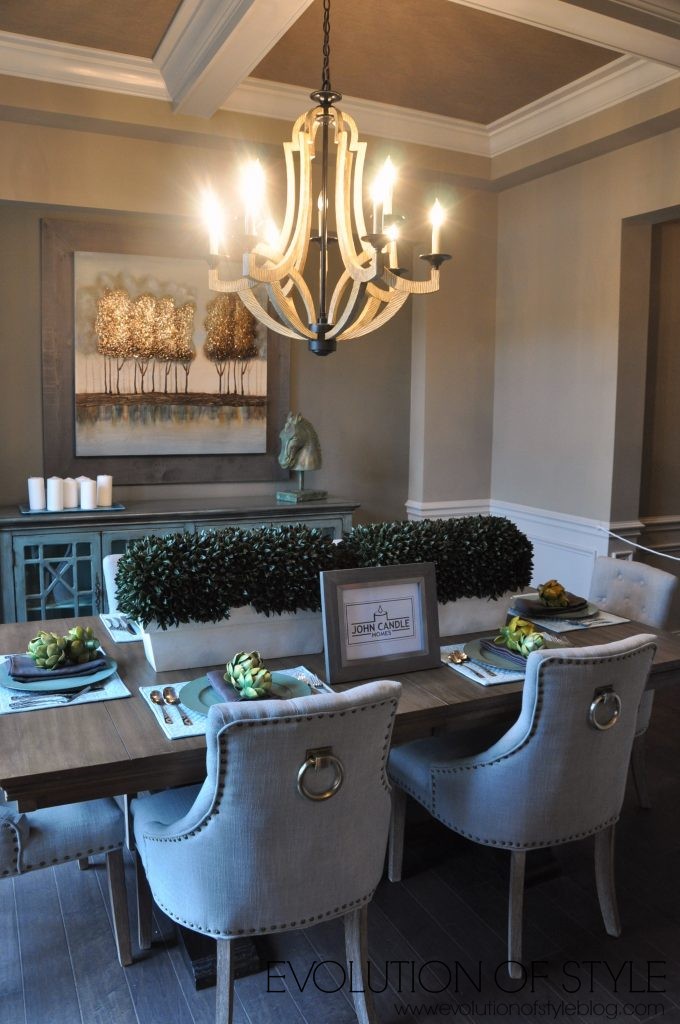
Striking artwork too. This is where the lighting reflecting off the dark ceiling tiles comes into play. It creates a darker feeling as a result, and I didn’t care for that.
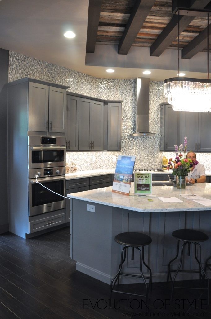
Walking to the back of the home you’ll find the large kitchen, family room and another dining space. And I know, the busy mosaic tile is here again. I’m just the messenger folks. I do like the pendants.
Like their first home in the tour, this one also has the retractable screens that allow for a huge indoor/outdoor living space, and I love that.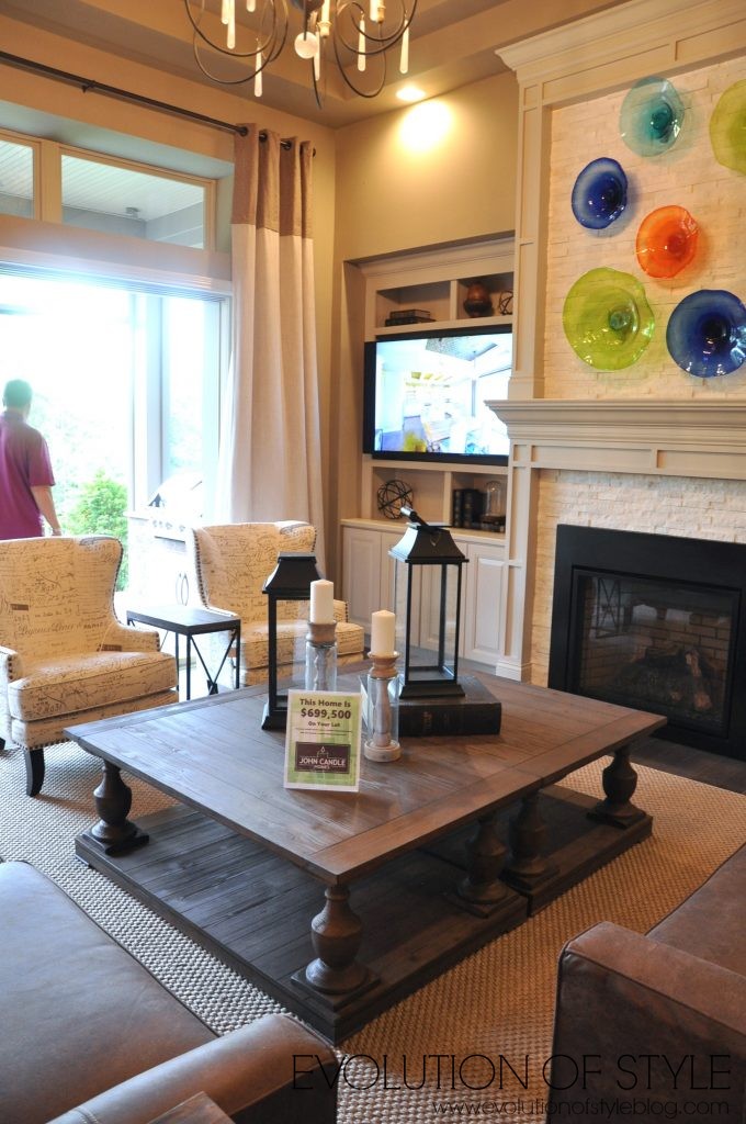
I really love all of the windows in this dining space, and how it looks out to the beautiful backyard.
My only qualm with this area is that the dining room chairs don’t look very comfortable.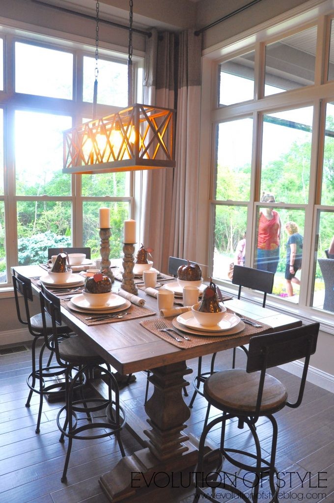
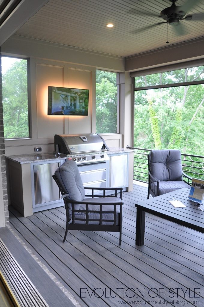
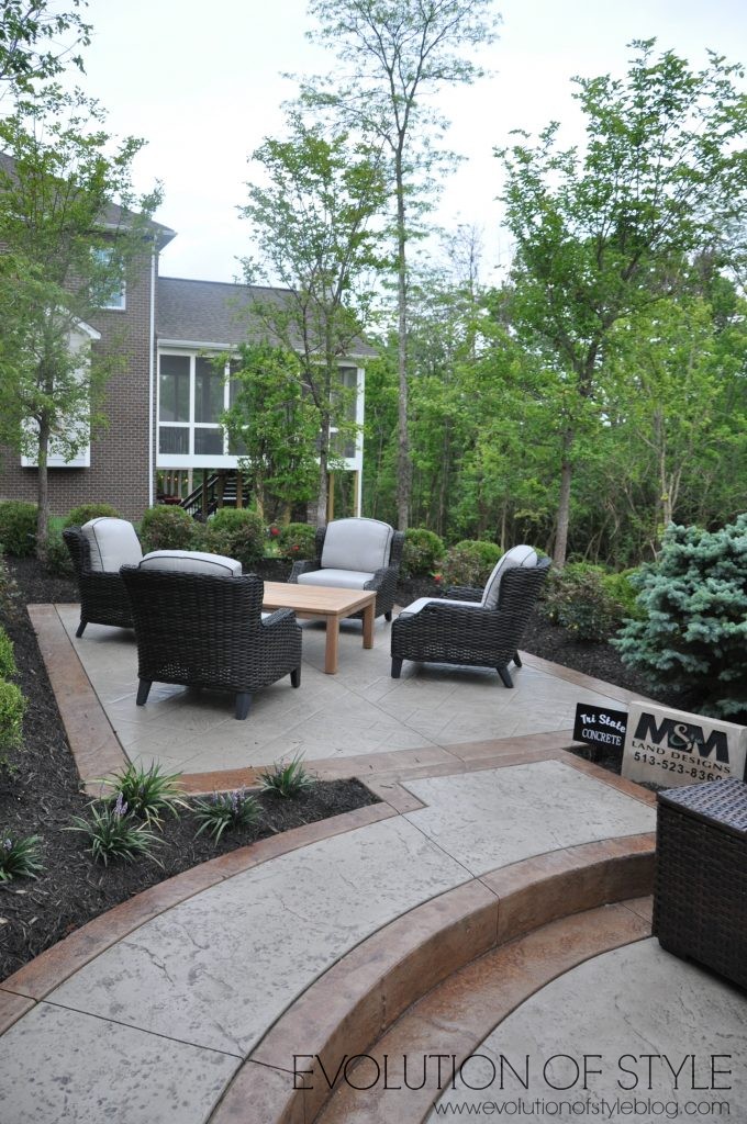
The outdoor area was gorgeous. An entertainer’s dream.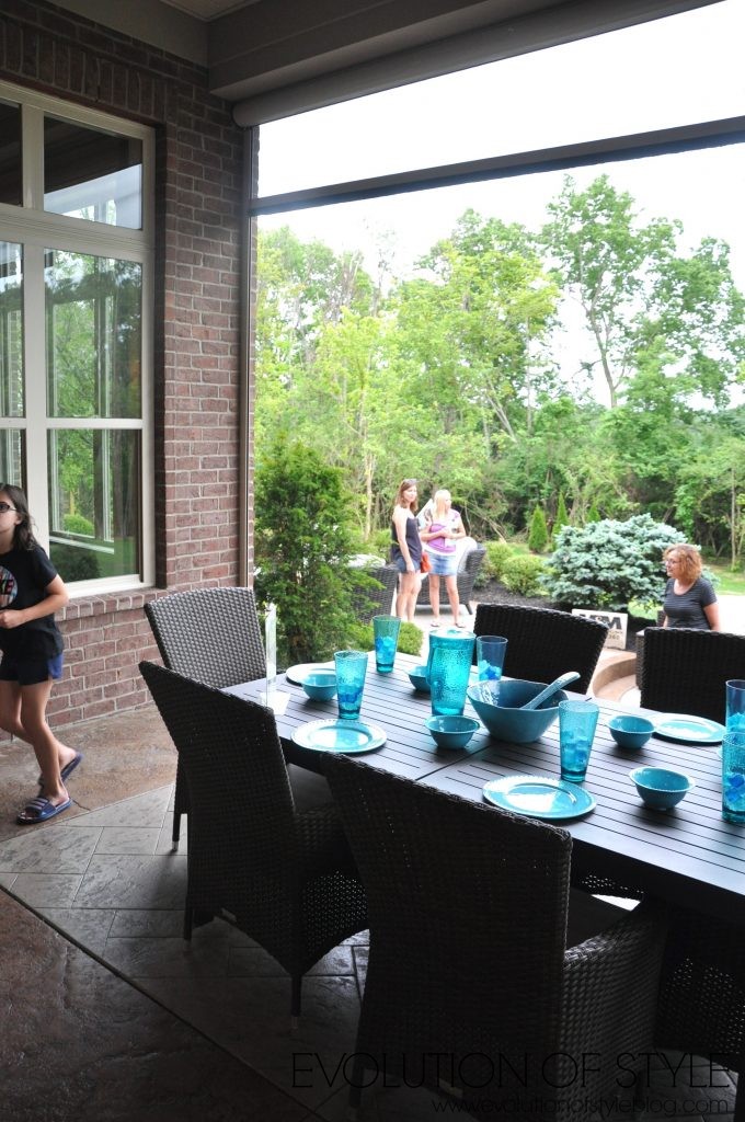
Back inside, let’s take a look at the master bedroom.
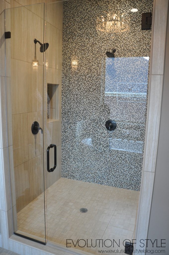
More busy tile, but a well-appointed master bath overall.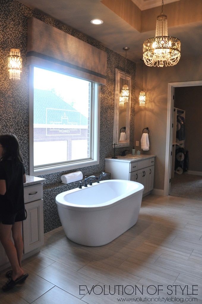
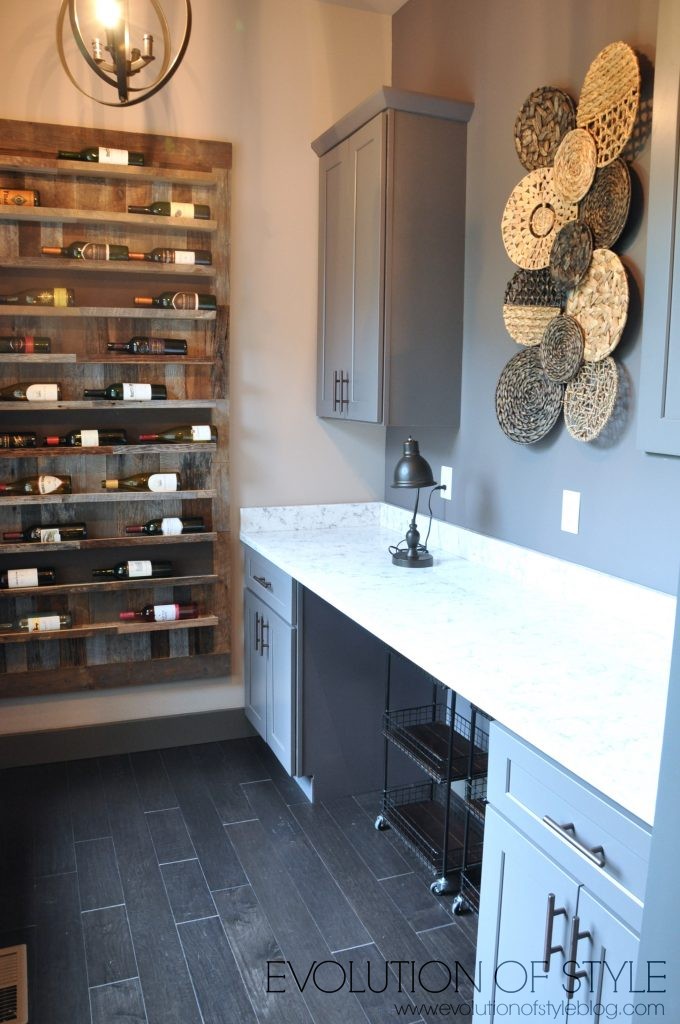
Huge master closet with another laundry area.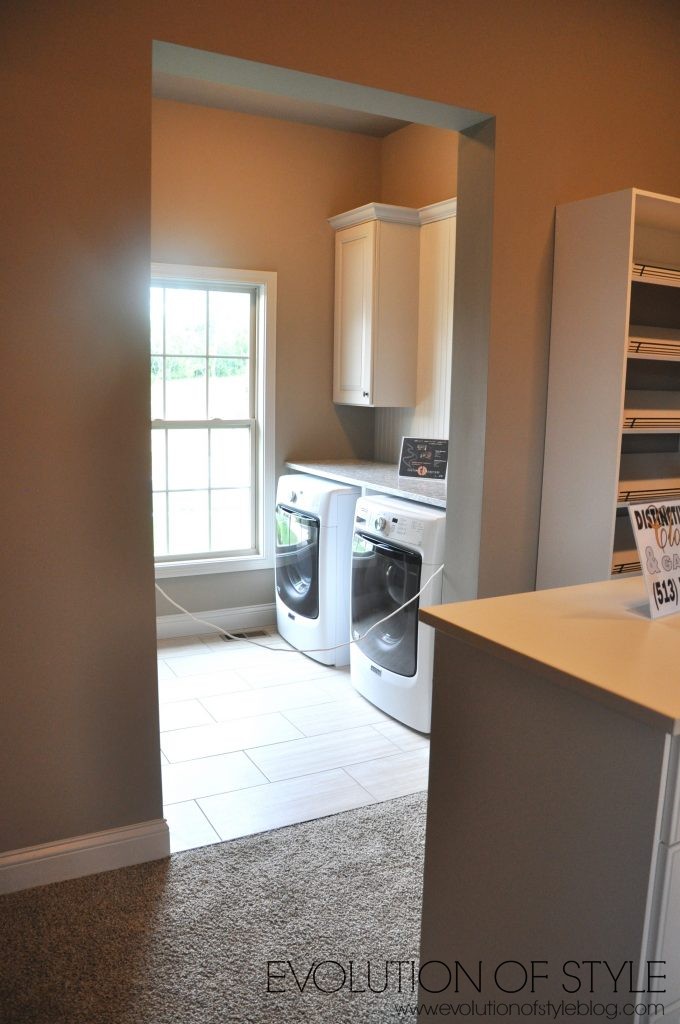
I wish I had cubbies like this in my laundry room – not too shabby for a second laundry area.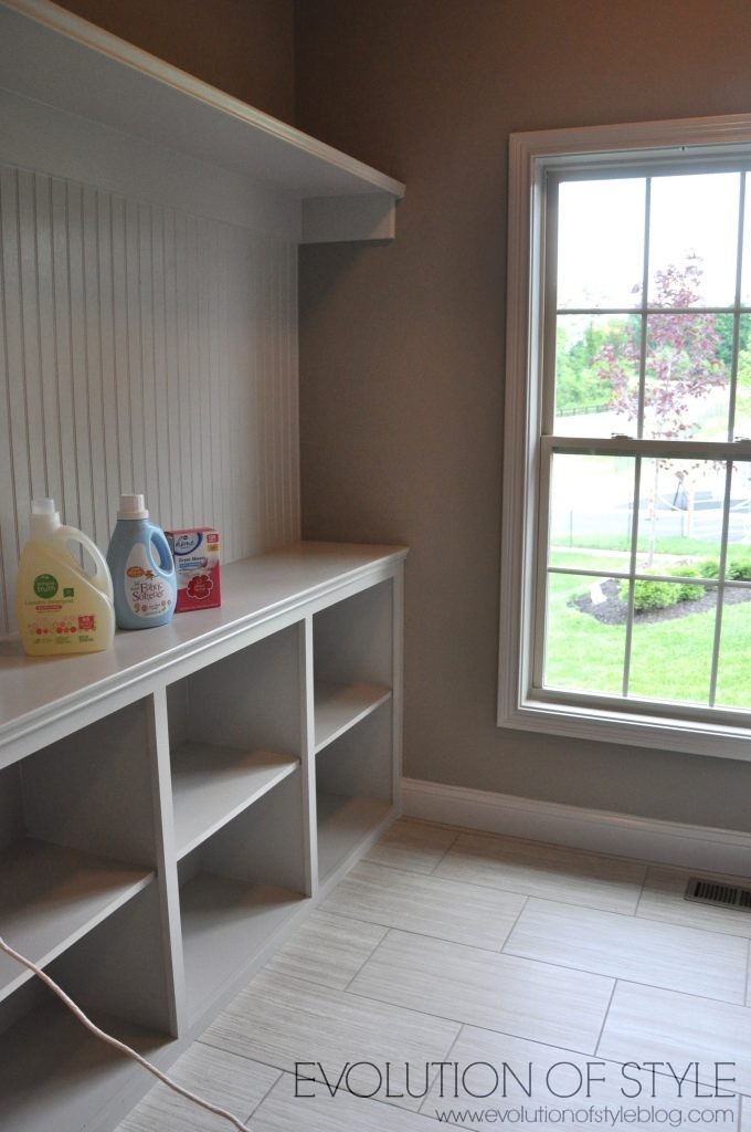
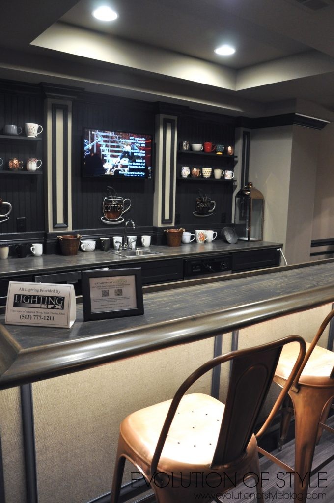
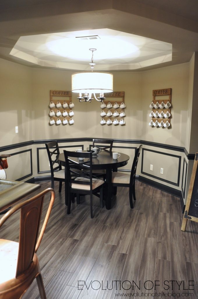
From here, let’s check out the basement. While I’m not so much a fan of themed spaces (this one has a coffee house theme), I love this huge chalkboard wall and the high impact artwork that they created with it.
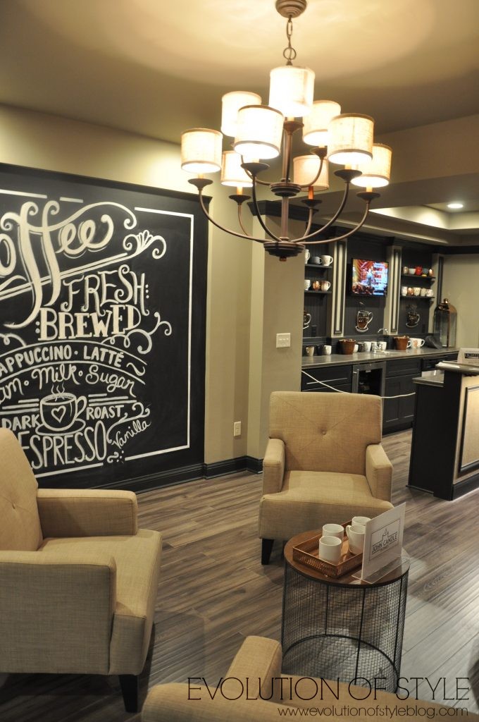
So cute.

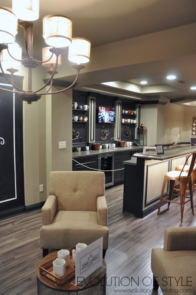
A great media room area.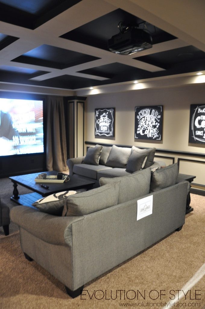
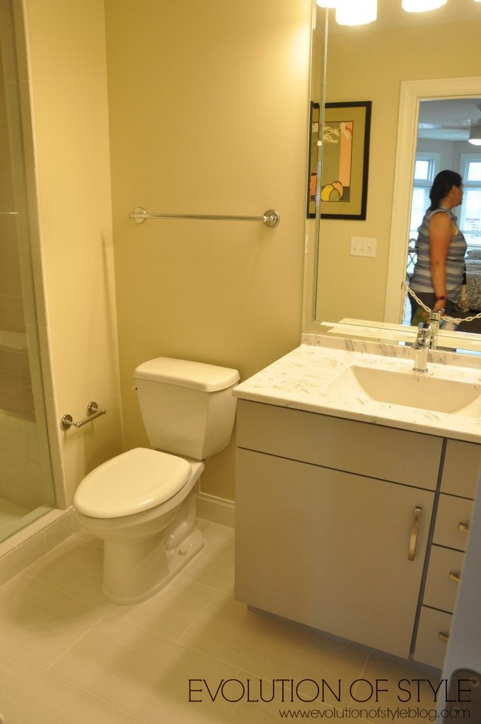
There is a bedroom and bathroom down here as well.
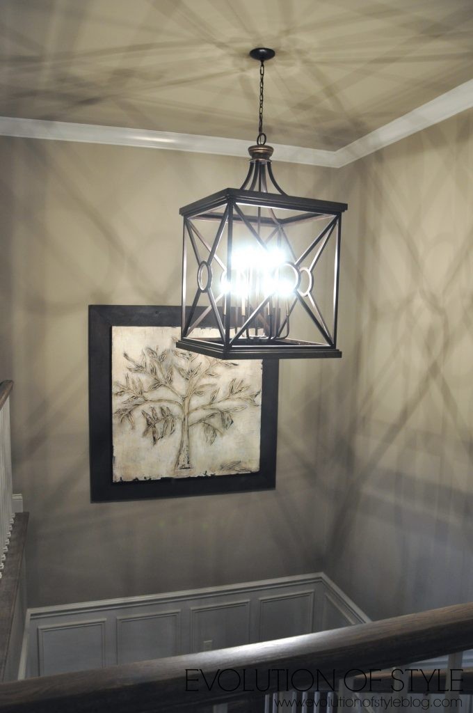
Let’s head upstairs. Massive light on the way up.
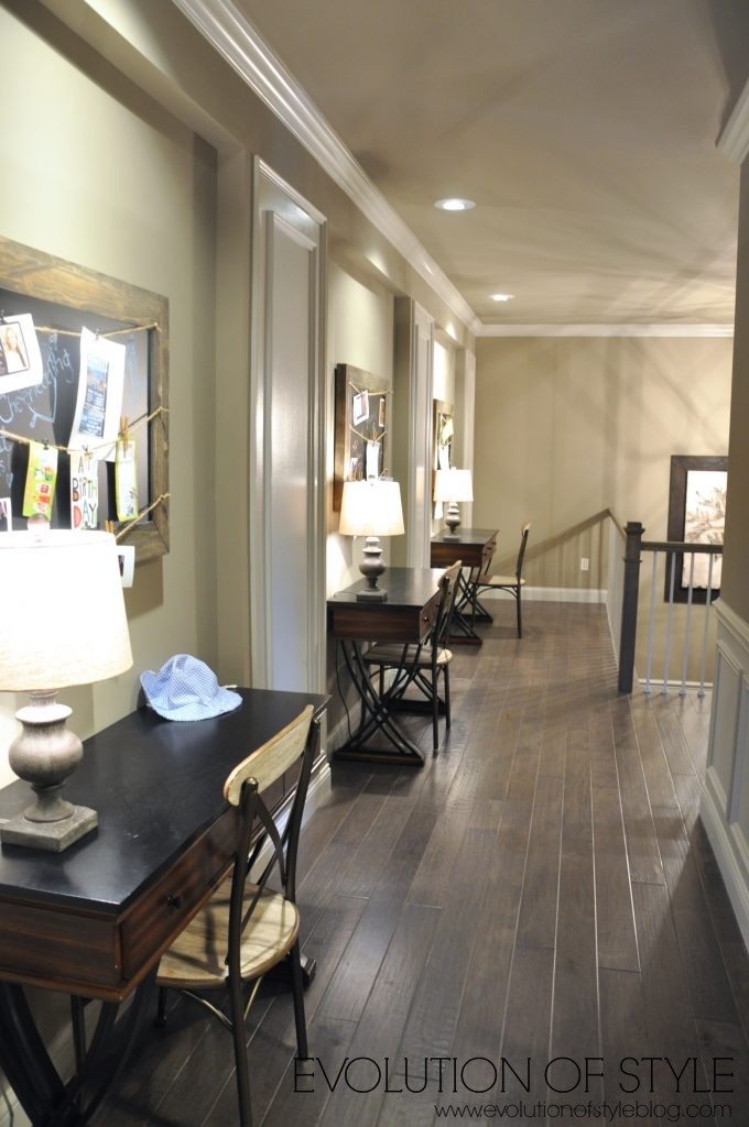
The hallway is utilized as a study space.
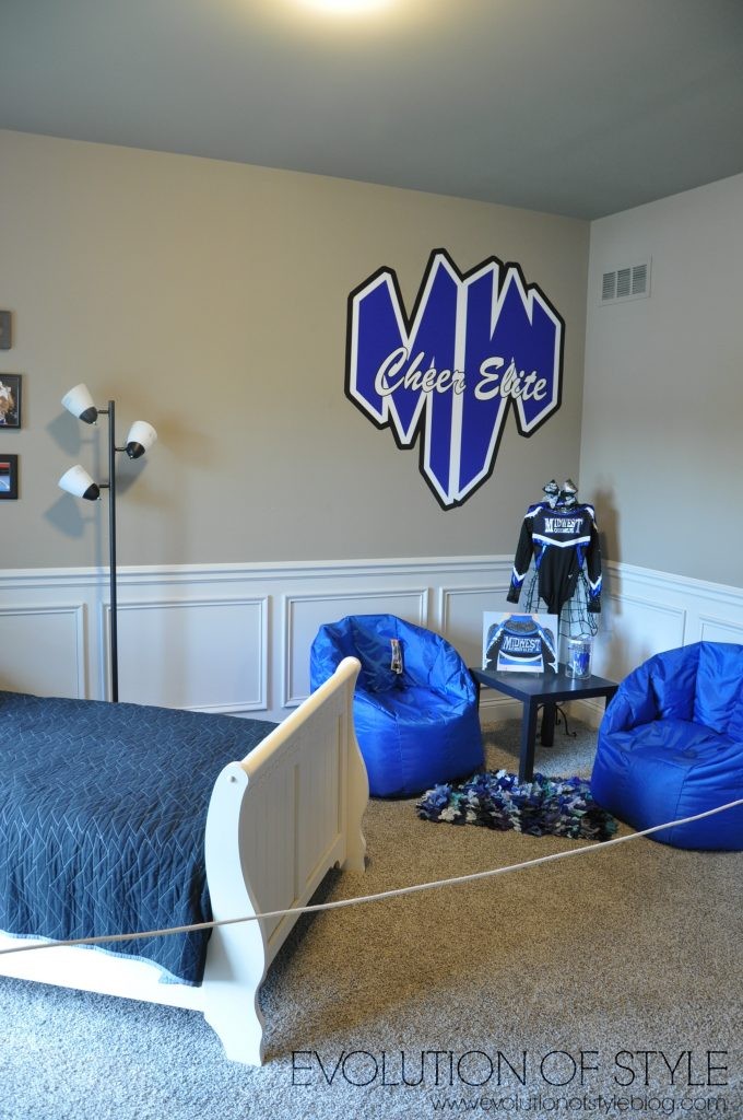
Then we’re on to the superhero bedroom.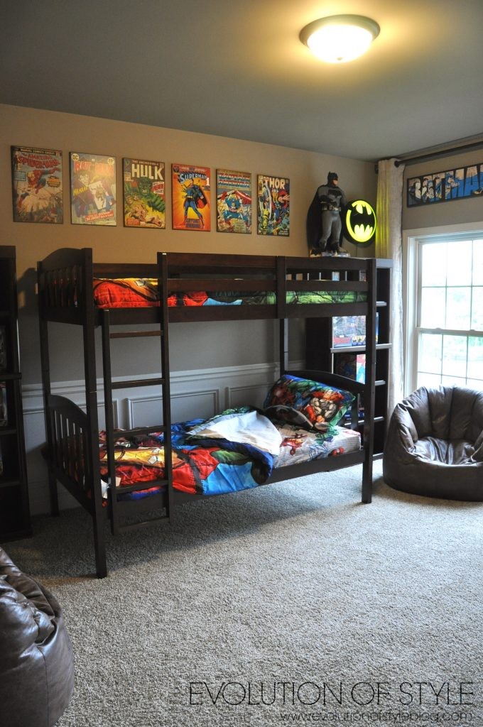
Jack and Jill bathroom – 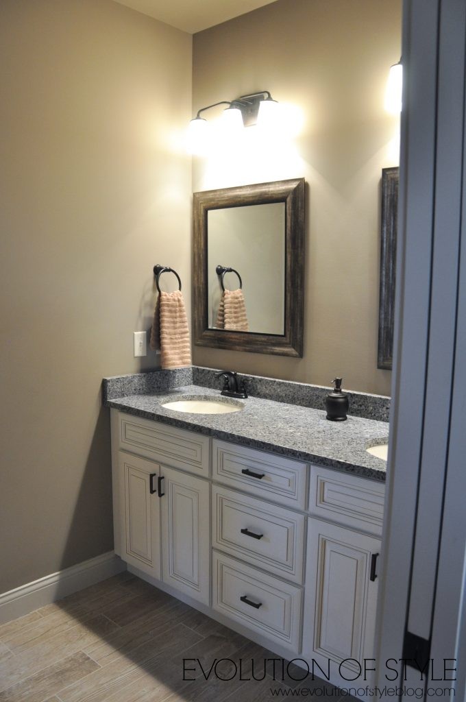
And another bedroom –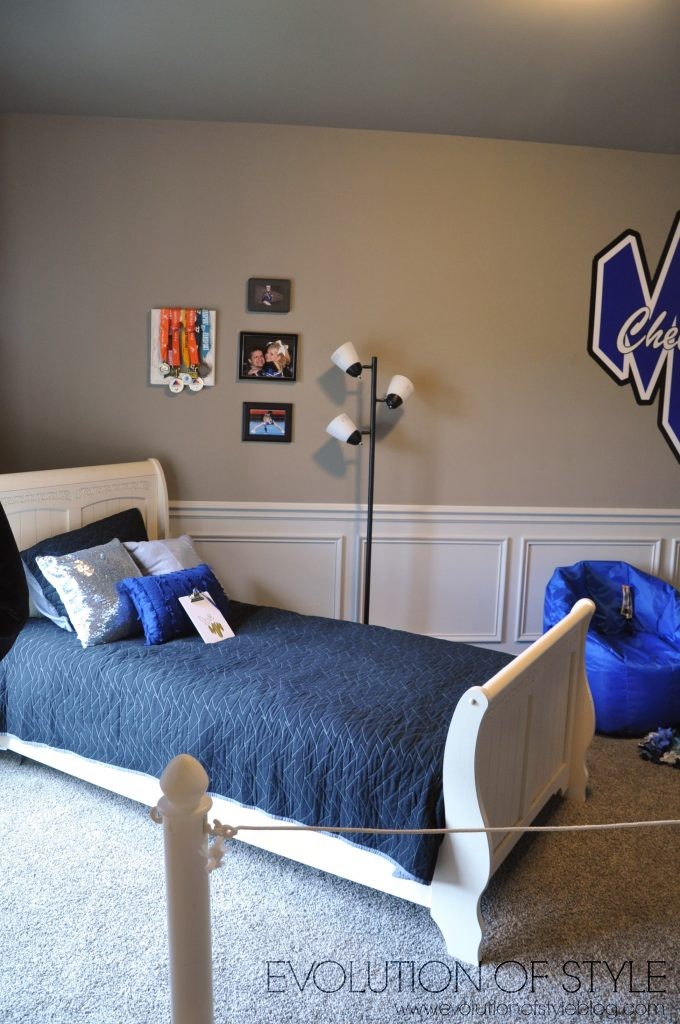
Upstairs laundry room –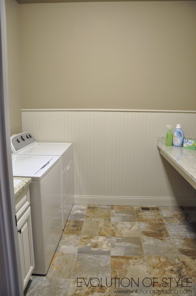
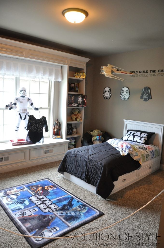
And a Star Wars room – for girls!

That wraps it up friends! Did you have a favorite? As you might expect, my favorite was the first home I shared with you. <<Swoon>>
I’d love to hear your thoughts, and I hope you enjoyed the tour and found some things that you like and might choose to incorporate in your own home.
Jenny

5 Comments
Tara
June 24, 2016 at 2:57 pmNot too long ago I read an article about interior design items on the way OUT. I didn’t agree 100% with it but Homearama obviously didn’t either. Granite was said to be out, giving way to quartz. I saw lots of granite! Letters and spelled words were also listed but there were plenty of those. Mosaic glass tile was said to be history but it seems there was a warehouse sale and the builders snapped up every piece they could. Did a few homes even have the same tile? One house had RED CHAIRS and I almost cheered because at that point, any color would do beyond gray, black, brown and beige. I loved the dining room wall color in The Monaco but not the gold tones elsewhere. Reminds me too much of my house in rooms we haven’t gotten around to painting recently. Is it because there is so much to see design-wise online that I’m spoiled? Where was the groundbreaking decor I’ve come to expect at Homearama? Am I jaded?! The first house was my favorite as well.
Jenny
June 24, 2016 at 3:15 pmGiven what I’ve seen in past Homearama shows, I’m hoping this year is a fluke. Some of the homes were like they went backward in design vs. forward, and if a designer is decorating the house, shouldn’t he/she be up on current trends? I don’t get it! I’m jaded as well. 🙂
Mary
June 24, 2016 at 3:46 pmThe Monaco was just a mess! Those designers should take their sign down because it’s not good publicity for them. The builder made so many weird choices, but the two showers and a tiny tub in the master is just ridiculous.
And all of the builders are killing me with the ugly tile! Walls of it! Bad paint colors are one thing, but who wants to buy a $1 million house and have to rip out walls of tile?
Ok, I know this sounds mean, sorry, but is this really the work of professional designers, or are the builders letting their wives make these choices?
And finally, any time I see a house that has a room with a theme, I know things are going to go downhill fast.
Heather
June 24, 2016 at 10:39 pmHi Jenny. Thanks for sharing! I always enjoy your homearama pictures:) As expected, I agree with you and like the first house the best. The other houses almost felt too”overdone” to me. Sometimes simple is better. I do wish you could decorate one of the homes. I know it would be beautiful (just like your home!) I really enjoy your blog and have been reading for quite awhile.
Jenny
July 8, 2016 at 12:00 amThanks so very much Heather. I would LOVE to decorate a Homearama home! What a fun job that would be!