Hello!
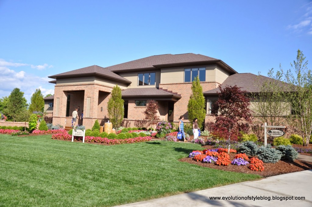
I hope you’re enjoying the tours so far. There were a total of nine homes on the tour, although there were supposed to be ten. Apparently one of the builders missed the deadline by three weeks. Can you imagine? I’m sure there were some heads rolling somewhere on that one. We could see the home (the exterior) from a distance, and it was impressive – we were told it was 12,000 square feet. Too massive for my taste, but I still would have liked to take a peek inside.
I’m going to have to double up here if I have any hope of wrapping this thing up in a week!
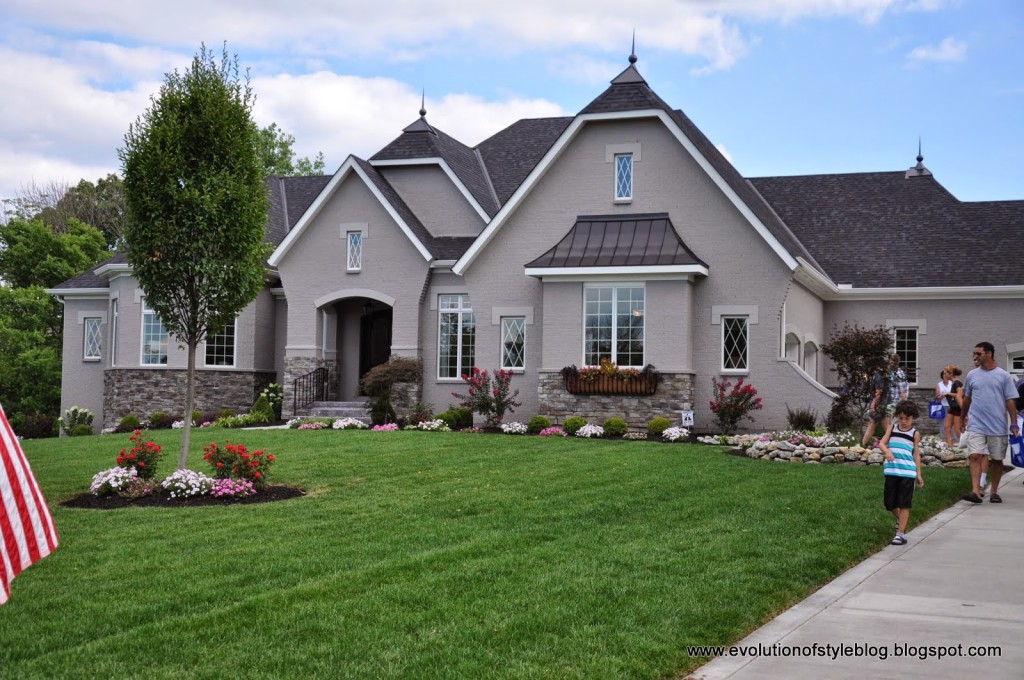
The Bordeaux
Price: $1.4M
Square Footage: 5,700 sq. ft.
Builder: The Robert Lucke Group
Website: www.robertluckegroup.com
A lot of single level homes with basements in this year’s tour, which I really enjoy.
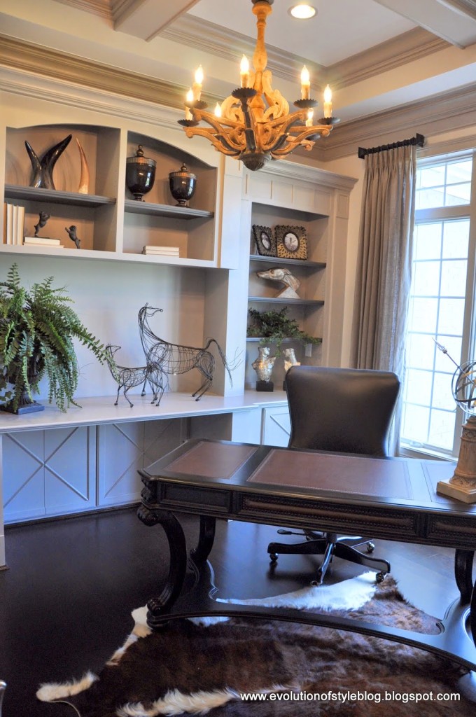
A gorgeous home office as you enter the home. Neutral, pretty and welcoming.
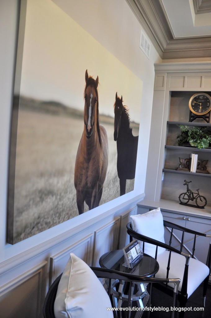
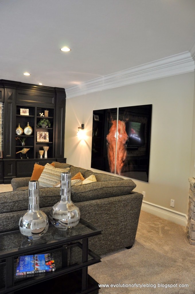
This stunning piece of artwork really caught my eye. It appears to be a photo, blown up on a huge canvas. Gorgeous.
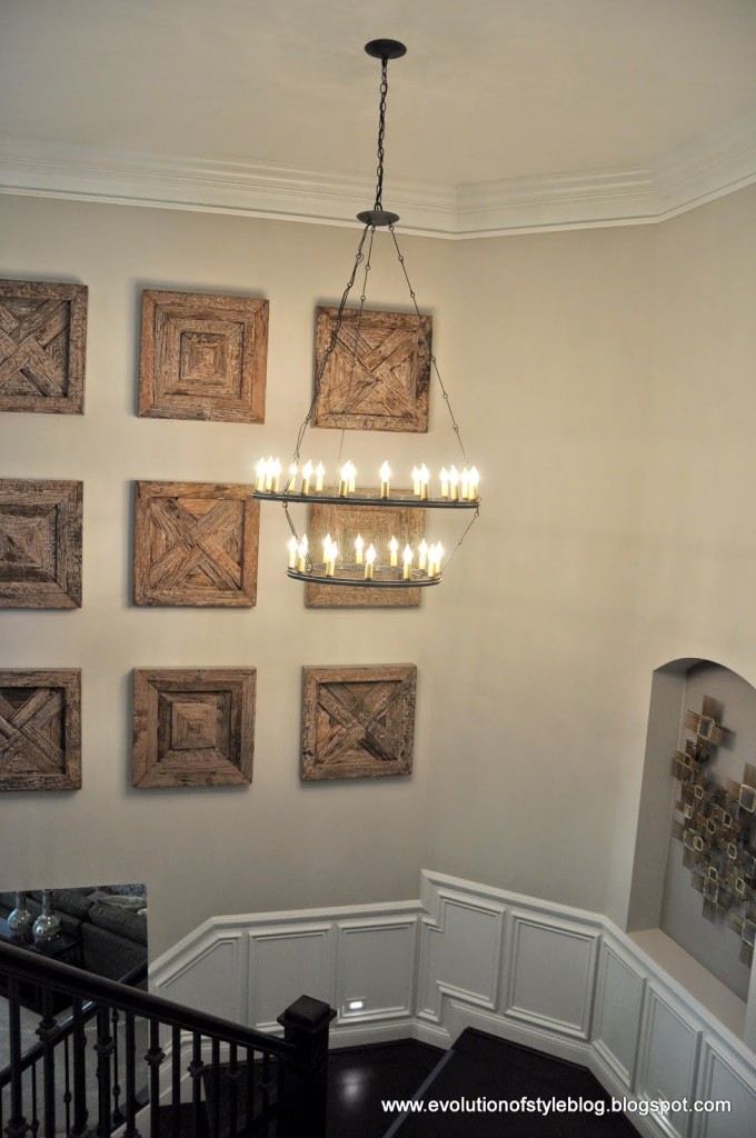
The light fixtures throughout this home were really beautiful, and worked well together. It really goes to show you what a difference lighting can make in a home.
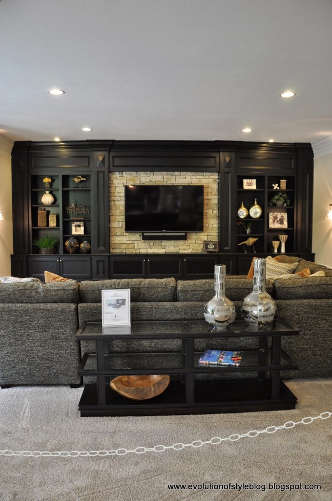
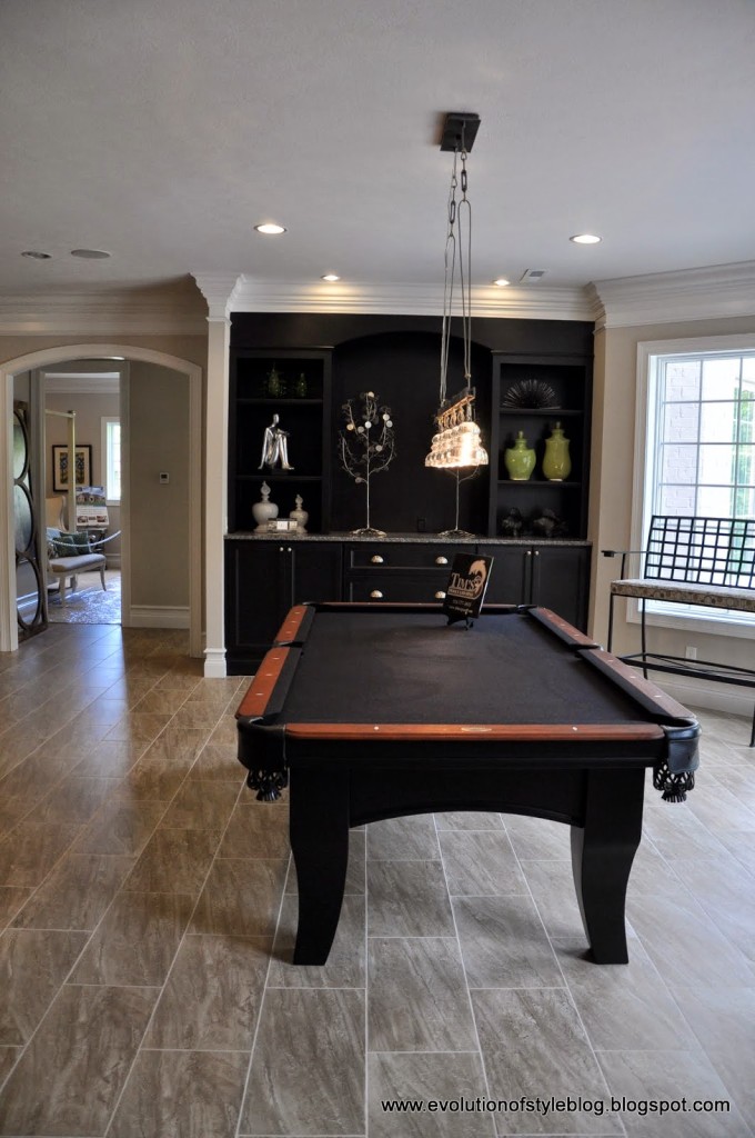
The basement had a large and open vibe, which is unusual for a basement space. Great built in entertainment area, and the tv mounted on the stone wall was a nice feature.
Another cool piece of horse artwork.
I had to snap a photo of this mirror – really neat, especially since they typically sell all of the Homearama furniture once the show is over.
Two bedrooms round out the basement.
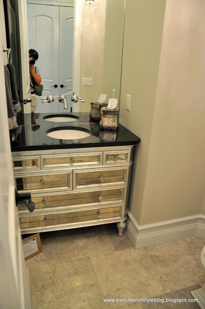
A glam powder room. Notice how the faucet is mounted.
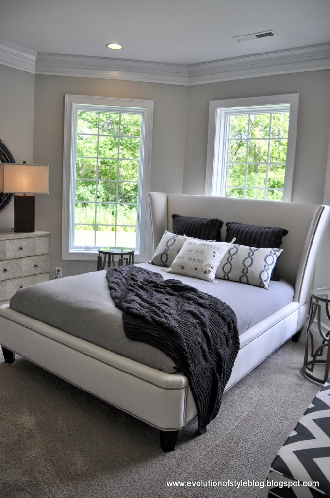
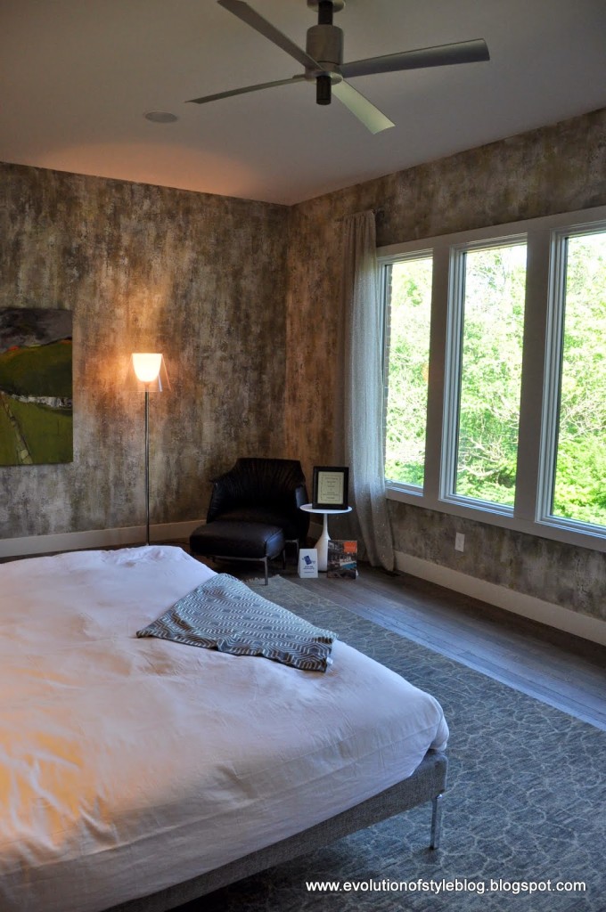
Another bedroom –
We made our way back to the laundry room, which is connected to the master bathroom.
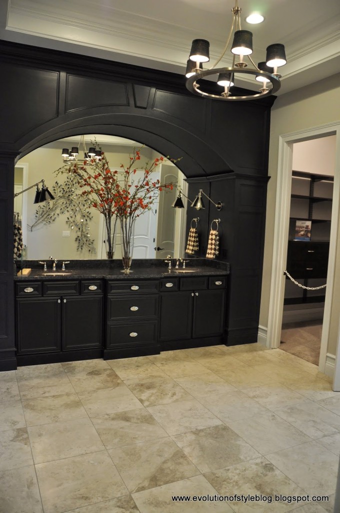
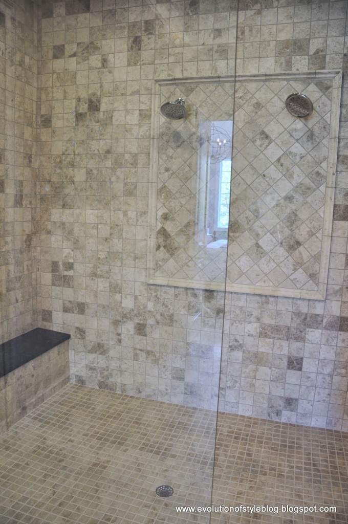
This master bathroom felt massive – then we realized what was missing – a tub! You could break dance on this floor.
They had a mac daddy of a shower though – which I personally prefer. I could do without my tub and have a break dancing bathroom without a problem.
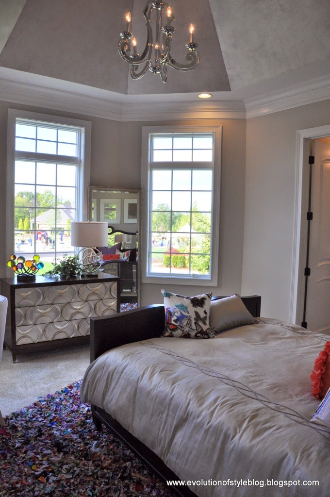
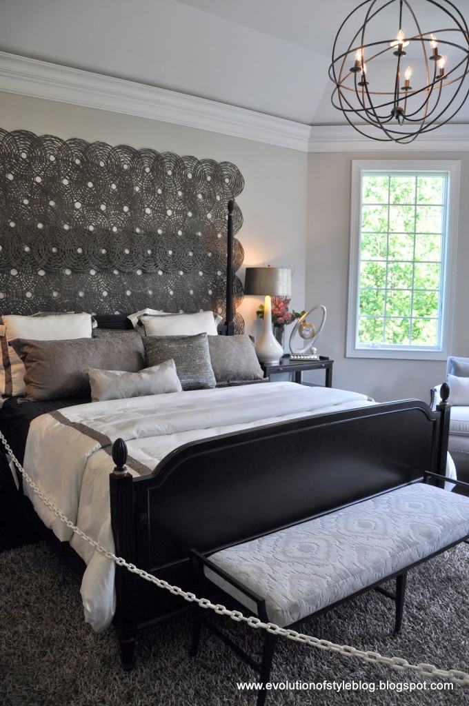
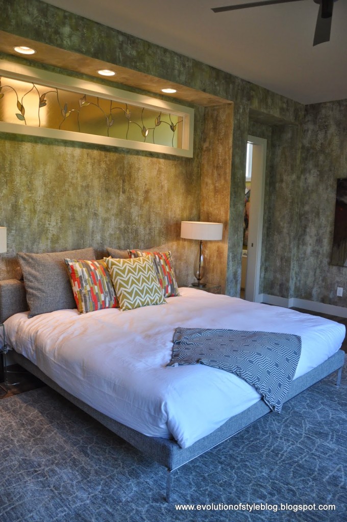
A pretty master bedroom – interesting that they had a large wall treatment with the headboard/posts of the bed. It’s growing on me, as I think it would feel really empty without it.
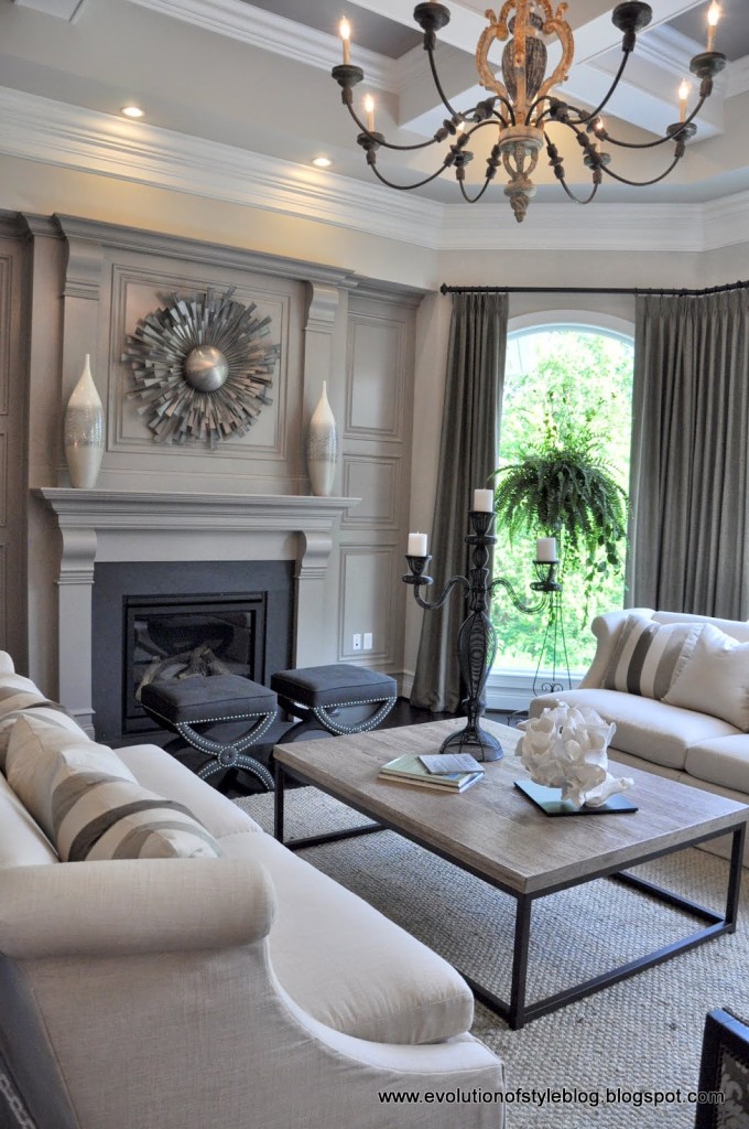
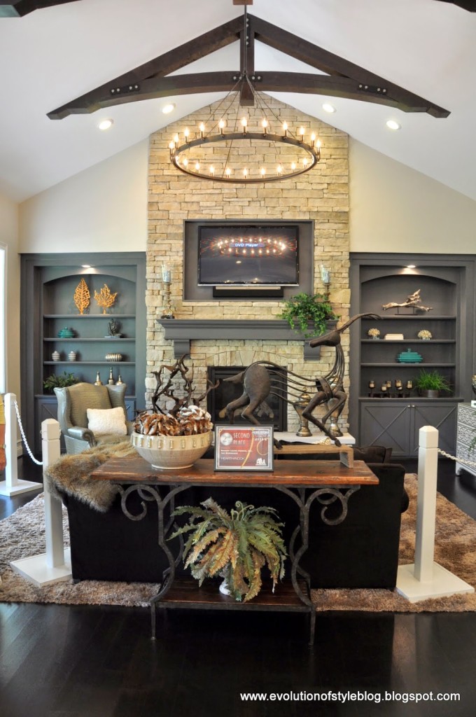
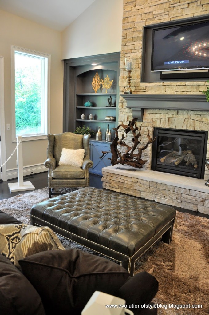
Making our way through the family room – again with the light fixture.
The only thing I wasn’t completely sure about in here is the fireplace wall. I love gray, but this seemed kind of flat to me. Maybe it’s because of the accessories they used, but it’s not my favorite, even though I love everything else about this room.
A pretty eating area off the kitchen.
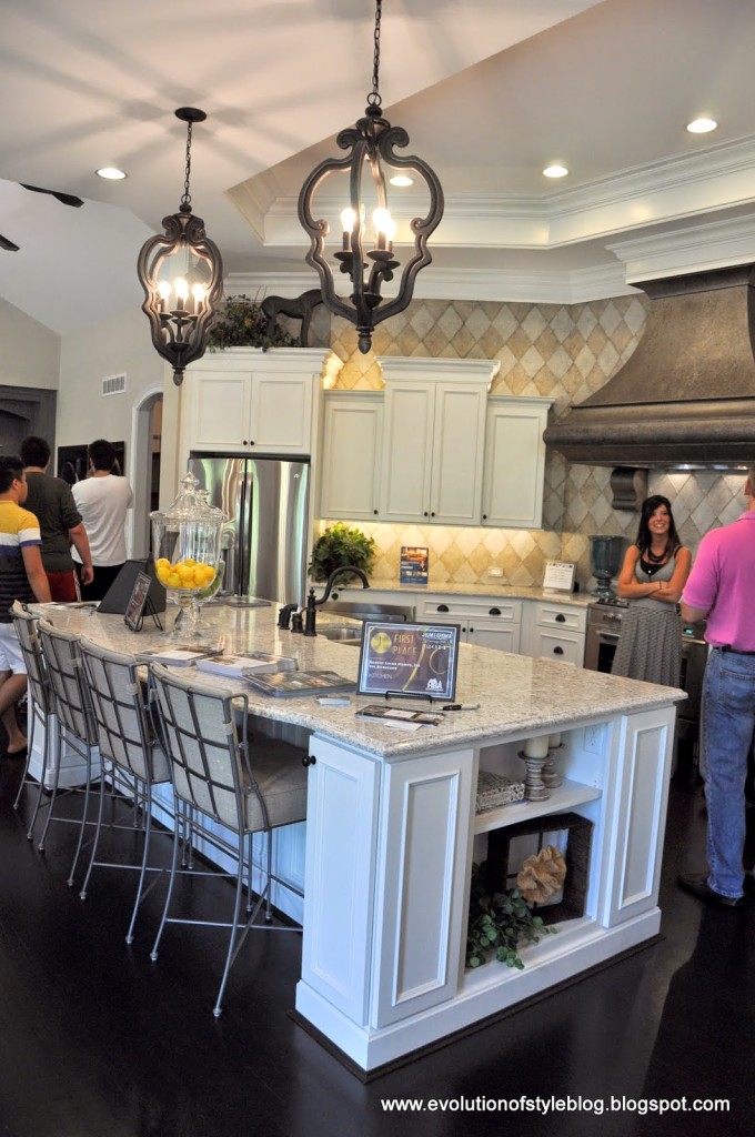
The kitchen was gorgeous –
I had to get a close up of this wall treatment. It’s a faux finish, and we were told that the finisher made the diamond pattern with string (glued to the wall), and then did the finish over top of it, finishing it off with a poly top coat of some sort, since it is a backsplash. She also did the finish on that amazing hood. Points for creativity and doing something different here – but I feel sorry for whoever has to remove this treatment at some point in the distant future.
There was another living area off of the kitchen, which was so warm and lovely. It was an interesting floor plan – very open. The family room, kitchen/eating nook, and this additional living space were all connected. Great for entertaining, that’s for sure. Beautiful.
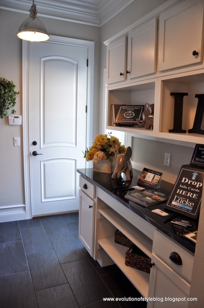
On the way out, we got a peek at the pantry – not as pretty as some, but functional.
And a cute office area nearby too.
The Virtuoso
Price: $1.4M
Square Footage: 6,300 sq. ft.
Builder: Daniels Homes
Website: www.danielshomes.com
This home was the most modern and the most different in terms of style, from the other homes on the tour. We thought it felt like a home you would find in Seattle, or maybe a suburb of another large city. It’s like the house for the city couple who had to move to the suburbs because they had kids. But they still wanted it to feel like a city loft. You’ll see what I mean as we move through the home.
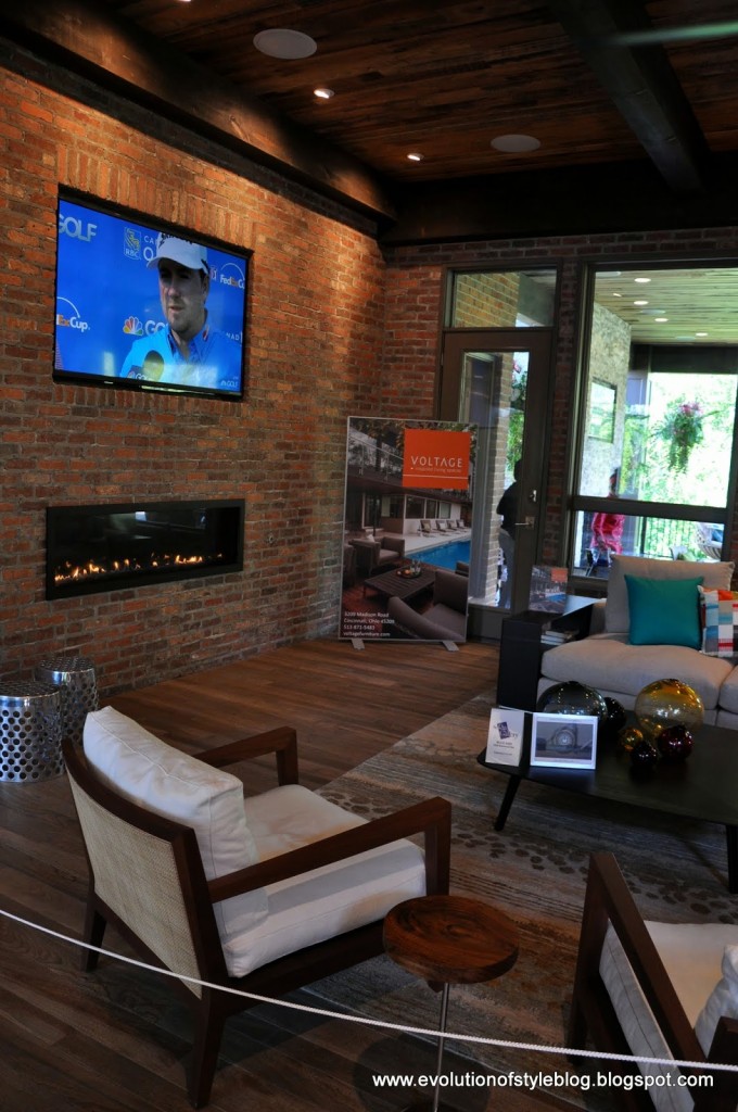
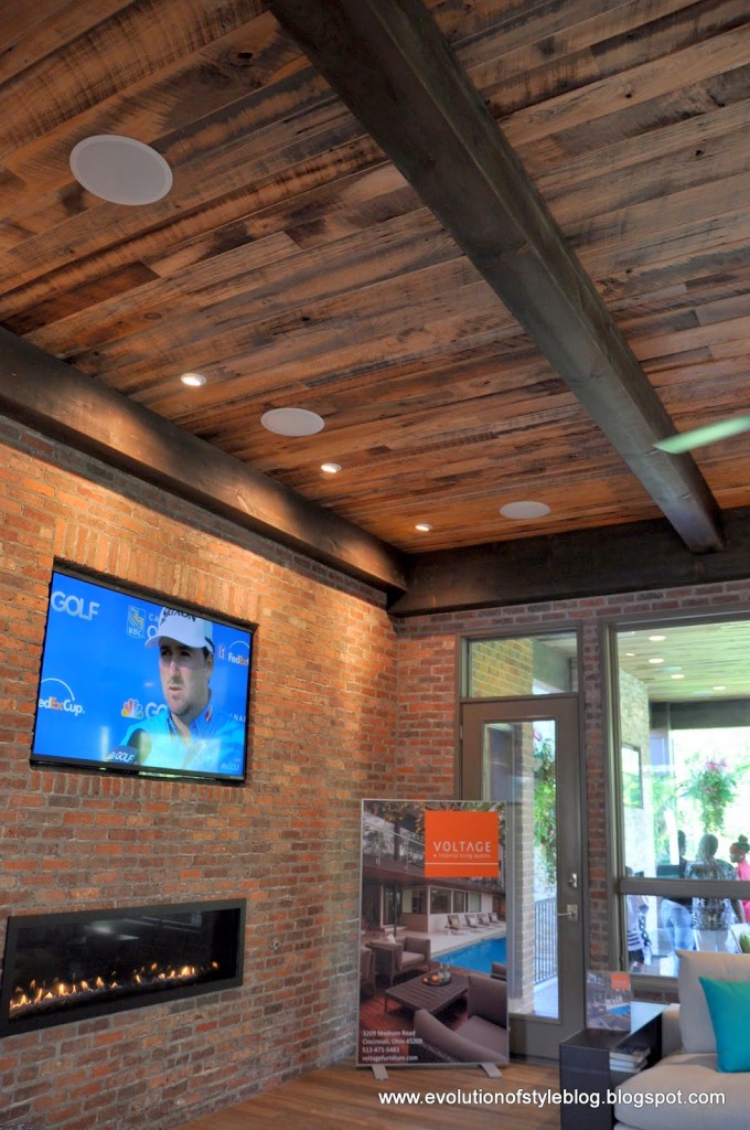
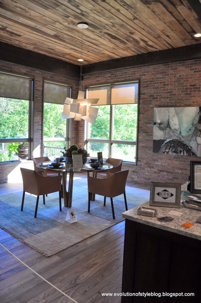
Great ceilings in this home, along with exposed brick, which certainly contributed to the loft feel. It looks like they used reclaimed wood, which really had a great effect.
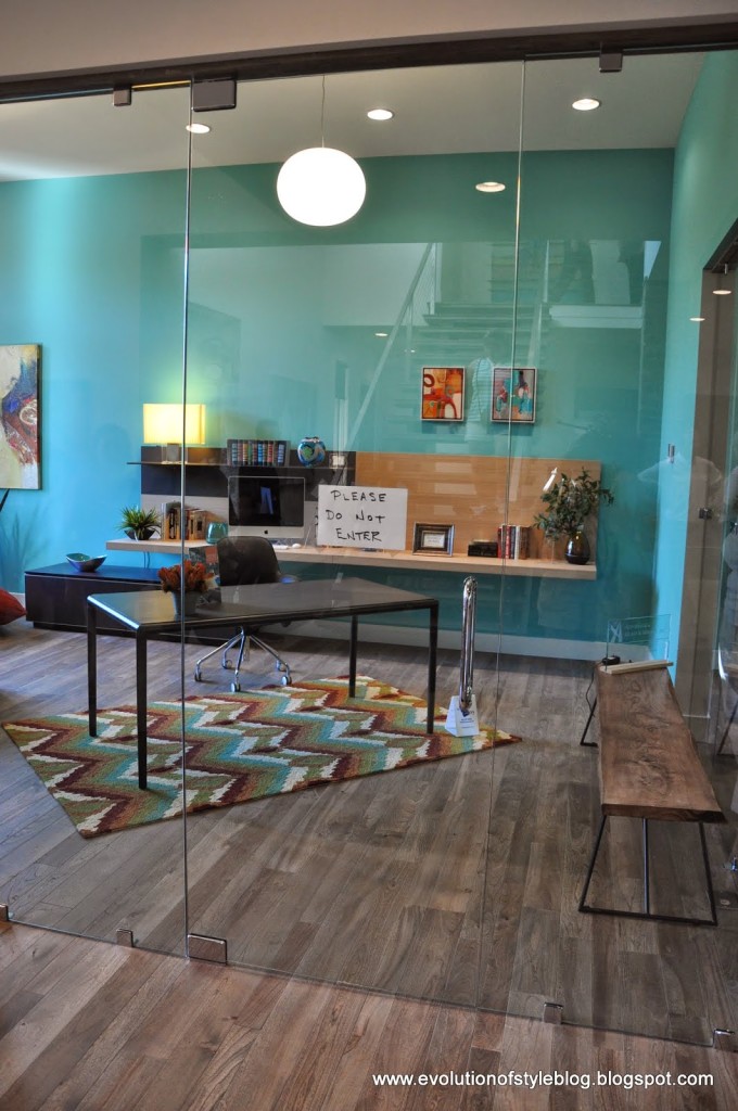
To the left of the entry was this glass enclosed office. Definitely on the odd side – it felt like it belonged in an office building. I just had visions of my kids smashing into it while playing around in the family room.
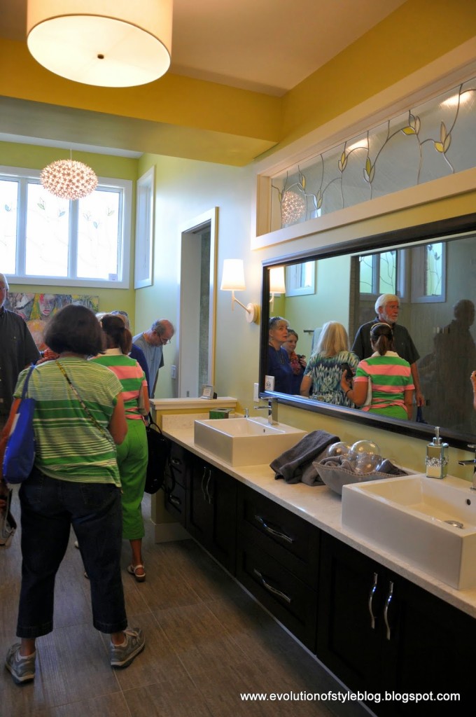
Master bathroom – not my favorite, I’ll admit. The stained glass above the vanity and on the window along the back, just didn’t make sense to me.
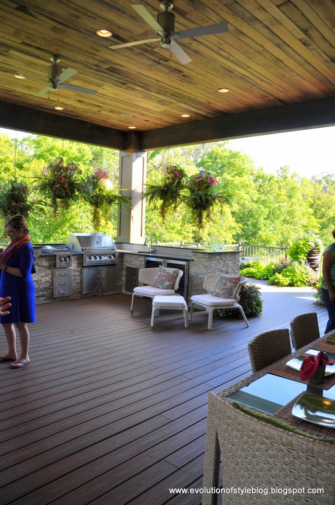
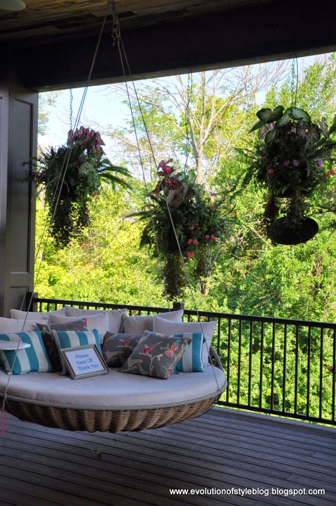
The outside area was amazing. Would you just look at those hanging baskets??
And I now want one of these swinging outdoor bed things. If you look closely, you can see a little tray for your drink.
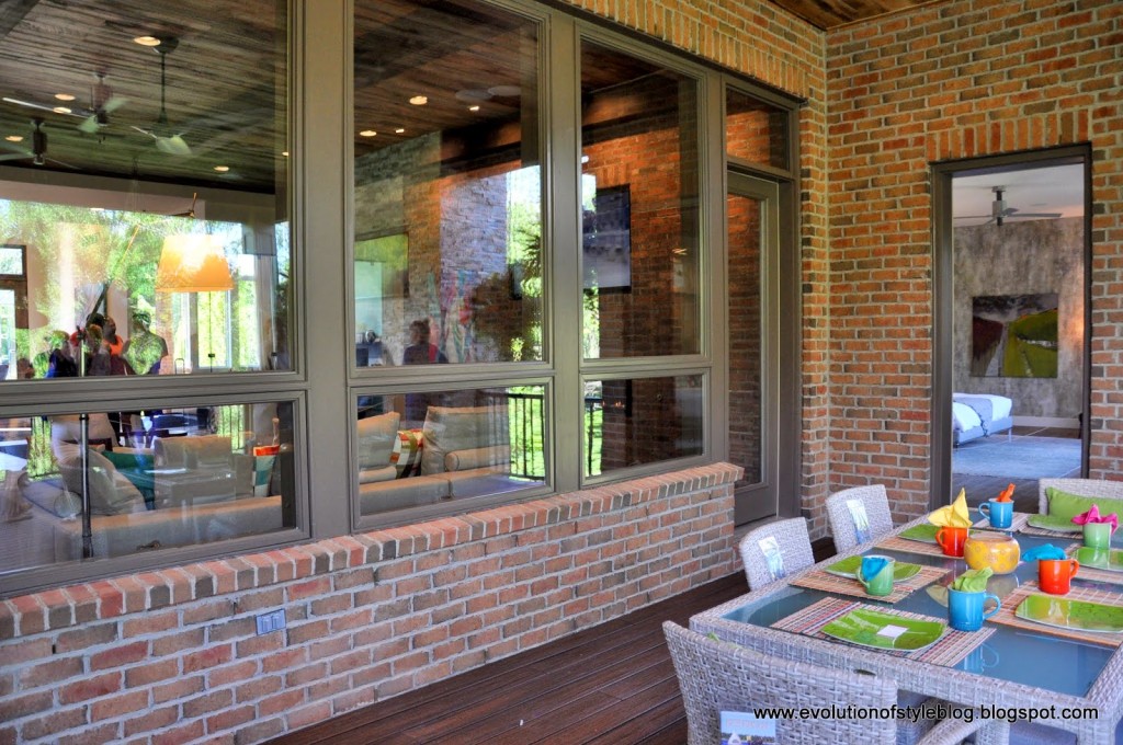
The wall of windows really opens things up, and the ceilings out here were crazy tall.
Again with the awesome wood ceiling.
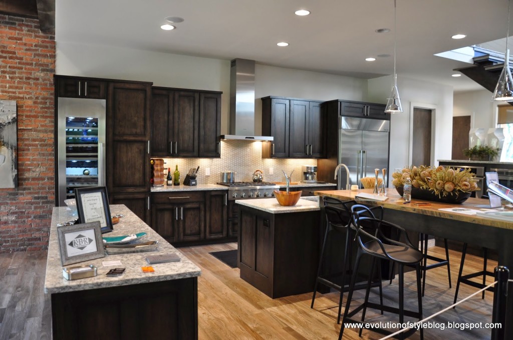
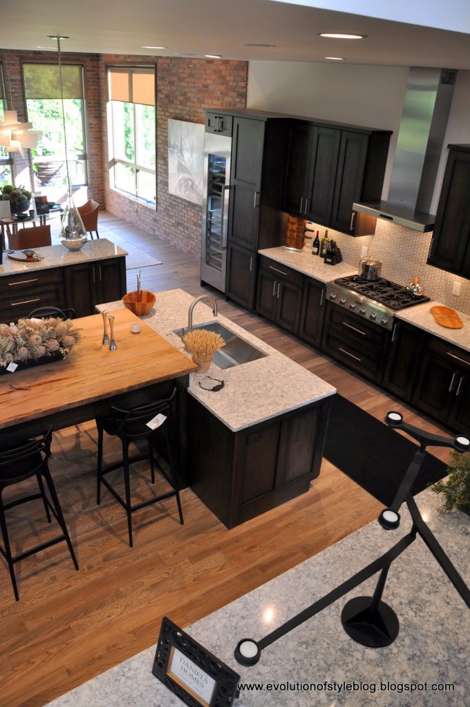
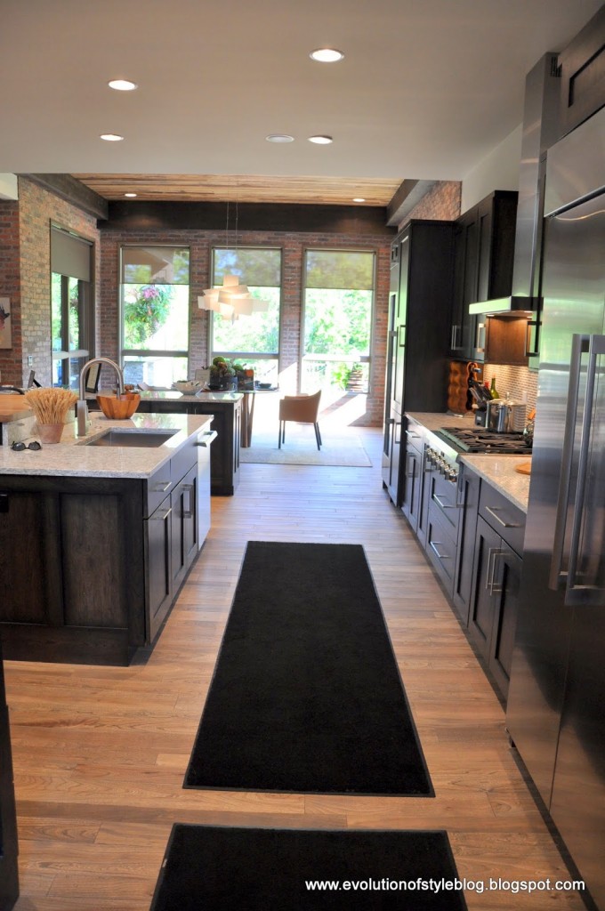
The kitchen continues with the loft vibe.
With the exposed brick continuing through the dining room. It just occurred to me that this is the only eating area – no separate “formal” space in this home. Which makes sense – it isn’t a formal living room kind of house.
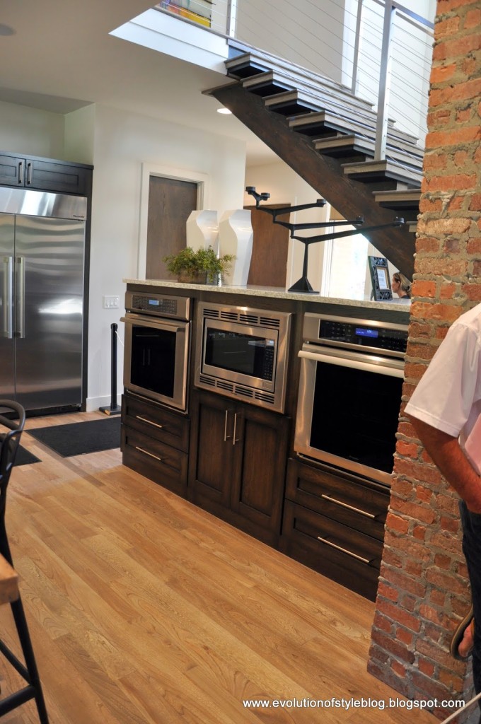
The oven set up is different than anything I’ve seen.
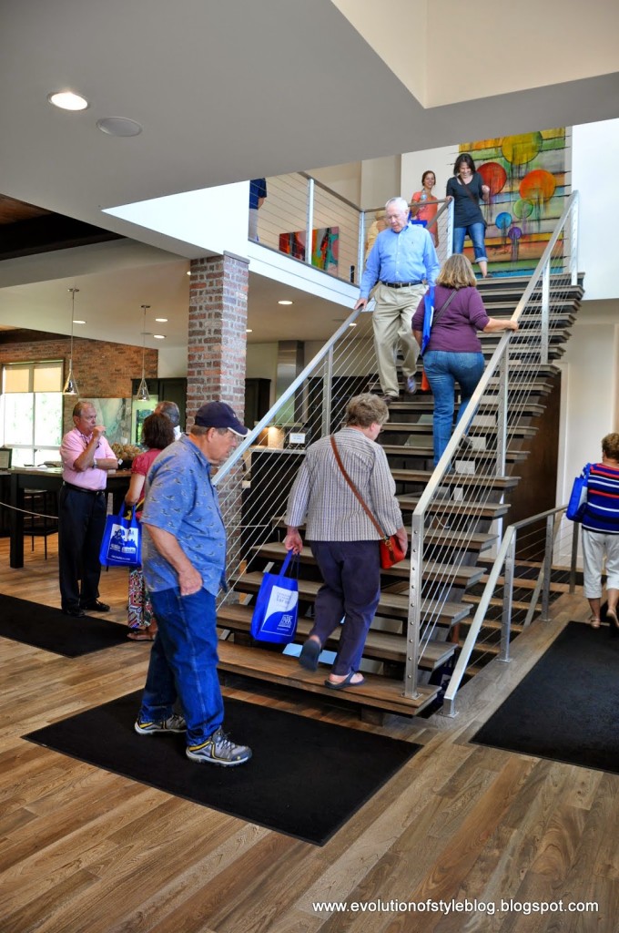
On our way upstairs…
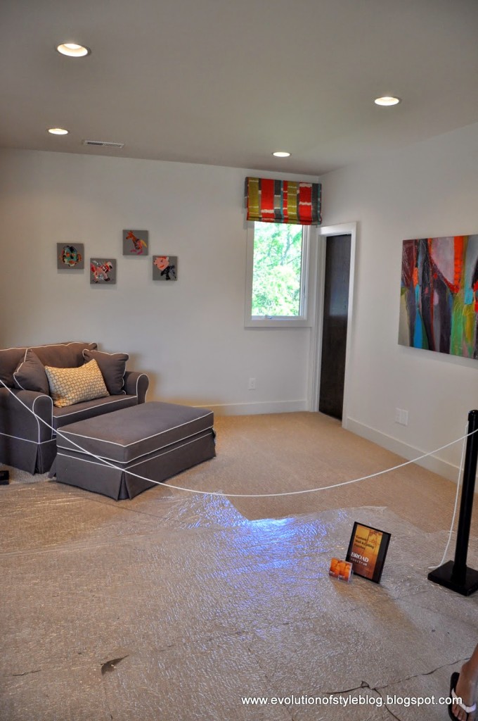
This house only had three bedrooms, but there is a loft space.
A nursery too – didn’t get a shot of the other bedroom though.
There is the wood topped bar height table in the kitchen, but it felt kind of like an afterthought, and didn’t really flow to me. And it just occurred to me that there is no pantry in this house (at least I didn’t see one). That could be a deal breaker.
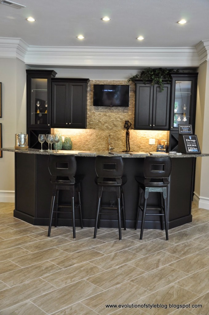
The basement had a bar area –
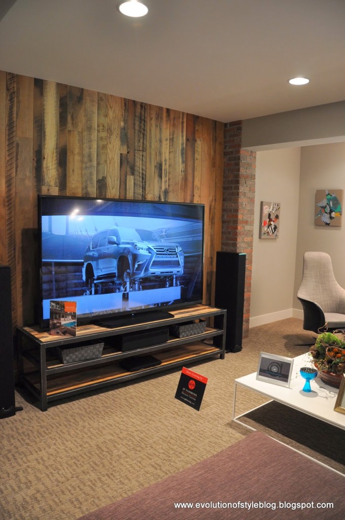
And a wood plank walled entertainment area.
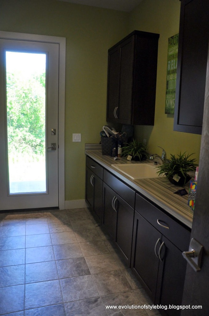
On the way out, we passed the laundry room –
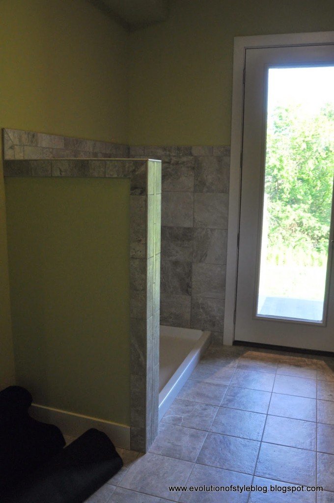
Complete with a dog washing area.
What do you think? Two totally different styles, but interesting elements in both of them.
In case you missed it:
















5 Comments
Simply LKJ
July 30, 2014 at 1:05 pmThanks for sharing the tours. The first house would have me cringing with all those black cabinets…dust city!! I would be dusting everyday. LOL And, the one bedroom looked so out of place style wise. The second has some great features, but way too modern for my taste.
Sheila
July 30, 2014 at 1:43 pmThe first one was gorgeous! However I didn't care for the modern one. I guess I am more of a traditional sort of person but the modern one just didn't feel like a house/home to me. I felt more like an institution and not someplace I would want to live.
Jenna
July 31, 2014 at 2:35 amOh we were wondering about the massive mansion — I'm so glad you mentioned that. I would have loved to peek inside!
Jenny
July 31, 2014 at 3:13 amThat place was HUGE, wasn't it? I was quite disappointed to not get a peek inside!
Calypso In The Country
July 31, 2014 at 3:14 pmI love the kitchen on the first one! The second was a bit too modern for me. Love these tours…
-Shelley