Hello!
I have shared some of the photos and work that we have done on our basement. We’ve added board and batten, a gallery wall and changed out some of the lighting so far. It’s a great space for family fun and entertaining, and we use it every day. The only thing I’m not jazzed about is the color palette that is down there now. I’ve blogged about it in the past, and it’s an intimidating space given that it is open and connected. I want it to flow and work together, and that requires some thought and planning.
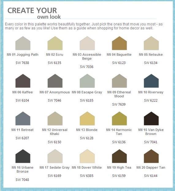
Enter HGTV & Sherwin Williams. They have come together and created some fabulous color palettes that work beautifully with our basement space.
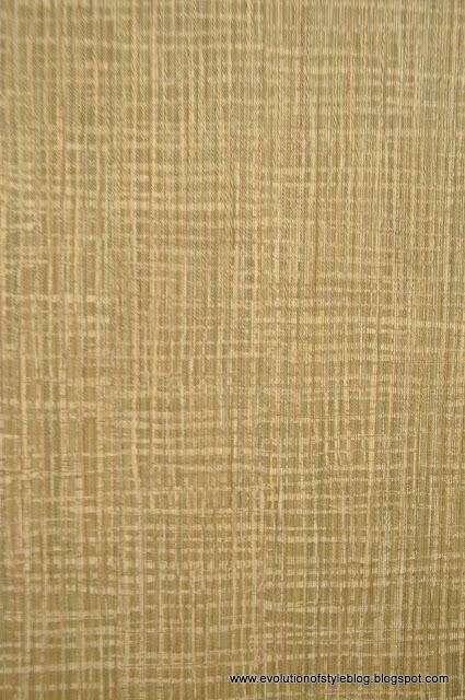
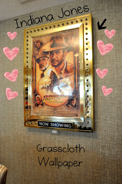
One element of our basement that I really like and want to keep is the grasscloth wallpaper that we have in a couple areas. There are a lot of great colors in this palette that will work with the grasscloth, while still injecting new life into the space.
Here’s another photo to give you the full effect:
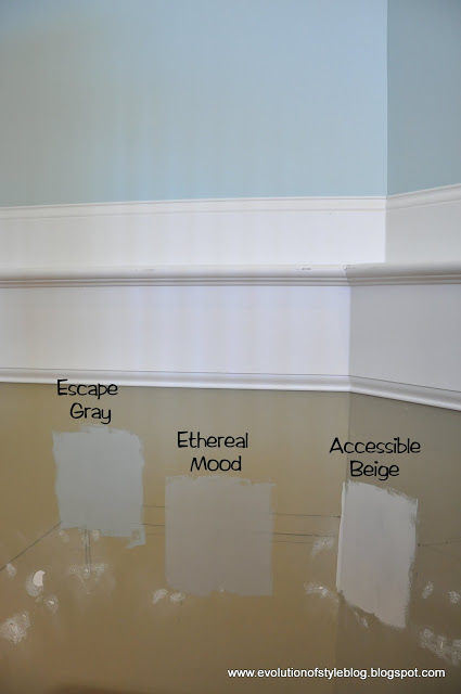
So, I bought a few sample quarts of paint to test them out and see how they looked with the family room color, Benjamin Moore’s Palladian Blue.
As you can see, I chose Escape Gray, Ethereal Mood and Accessible Beige. I’m sooo glad I got the sample quarts, because my initial thought was to get the Accessible Beige – too light in contrast with the Palladian Blue. The Escape Gray, while I really like it, wasn’t a good contrast to the Palladian Blue either. Ethereal Mood was the winner!
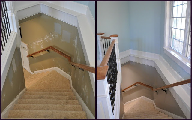
The walls have been an absolute mess ever since our epic fail attempt at bringing the board and batten up the stairs. We are carpentry impaired in trying to accomplish this task with all of the different angles going up the stairs. Angles in going up the stairs, angles with the turn in the stairs, it’s a nightmare! So, while we’re not giving up on the board and batten, I just couldn’t stand looking at the spackled walls anymore.
Side note – I have seen some of you out there with your mad carpentry skills. You know who you are – Lisa at Shine Your Light – check out her stairway and you’ll see what I’m talking about. Or this other amazing Lisa at A Vintage Vine. See her stairway makeover here. Maybe I need to change my name to Lisa. I am willing to offer up delicious baked goods in return for your services.
I could write a whole post on the issues we had here. It’s really quite embarrassing – two educated human beings, looking like monkeys with mitre saws.
I know the colors don’t look dramatically different in these photos, but trust me, they are. The previous color was more of a camouflage green, where as the new color is a grayish taupe. I really like it, and it’s opening up lots of possibilities for the rest of the basement.
As always, it’s a work in progress, right? And yes, the stairs are on my list for this year as well.
Carpet on the stairs + 3 kids + 1 enormous black dog = DISASTER.
Don’t forget about the Room Evolution linky party on Tuesday, January 31st!



12 Comments
Stacy Curran
January 26, 2012 at 1:08 pmYou cracked me up with the Harrison Ford poster with the hearts! And I love your paint choice 🙂 Have a great day!
Stacy
pam {simple details}
January 26, 2012 at 1:18 pmUmm..big difference! Beautiful choice! And, those angles give me a headaches just looking at it!
Jean @ Flower Hill
January 26, 2012 at 2:34 pmBeautiful color palette. I love your final choice. And the existing grasscloth is beautiful! Would love to find a place to use it in my home.
marty (A Stroll Thru Life)
January 26, 2012 at 2:47 pmThe new color looks fabulous. Hugs, Marty
Dixie Sargent Redmond
January 26, 2012 at 3:32 pmThe color palette is interesting. I notice they are all subdued grayed colors. Hmmmm.
Lisa Scibilia
January 27, 2012 at 4:23 amI need some grasscloth – you lucky girl! Loving the cooler palette you're thinking of….those greige colors are right up my alley. (And I think your lady cave is the same color as 3/4 of my house – Muslin, right?!) Apparently you have excellent taste!
Thanks for the shout out about the stairs!!
Looking forward to the party over here next week.
Kristel
January 27, 2012 at 3:02 pmLove the color you chose! I hear you about the board and batten, I so wish i could do that to my stairs, but I'm so SCARED! I will be here Tuesday….can't wait!
Anonymous
January 28, 2012 at 3:39 pmI really like the new color!!
Between U & Me
January 31, 2012 at 9:53 pmIt looks so wonderful! I was admiring how much I liked the Escape Grey and then I realized that's what we painted out living room! LOL!
Kristin
February 3, 2012 at 4:40 amBeautiful color combo! I love how calming it makes the stairwell look.- You're right, sometimes when a project doesn't go as planned, we just have to make the interim beautiful for the sake of our sanity instead of living with spackle indefinitely. 🙂
Anonymous
February 6, 2012 at 4:27 pmLove all the board and batten you've done in your home. I'm a big fan of your blog! I was so looking forward to seeing how you did your stairs because I have a set of stairs with many angles in my home that I am afraid to do! Having not yet done any board and batten I'm not sure what the angle problems were exactly, but it seems that the board and batten would look fabulous going straight up to the white moulding without regard for the angle of your railing. Then the only angles you would have to worry about are the ones at the baseboard. I think the stairwell would look fabulous all white board and batten with an additional horizontal board so it looks like the whole stairwell is all moulding.
Ahshanul Hoque
June 19, 2014 at 7:31 amIt is really a beautiful and creative blog having some vital information over the subject. Thank s
Clipping Path service